Code
# Load packages
library(tidyverse)
library(khroma)
library(scales)
library(labelled)
library(car)
library(here)
library(conflicted)

# Declare package conflict preferences
conflicts_prefer(dplyr::filter())# Load packages
library(tidyverse)
library(khroma)
library(scales)
library(labelled)
library(car)
library(here)
library(conflicted)
# Declare package conflict preferences
conflicts_prefer(dplyr::filter())# Daily average suspended sediment and turbidity data from the Sacramento at Freeport USGS station
df_sac_fpt_ssc_turb <- readRDS(here("data/processed/wq/sac_fpt_ssc_turb.rds"))
# Storm data set
load(here("data/processed/storms/StormData.RData"))
# Clean up Sacflow_wstorms data set
df_sac_storm <- Sacflow_wstorms %>%
mutate(
Storm_cat = case_when(
FirstStorm == "First Storm" ~ "First Storm",
YSStorm == "STORM" ~ "Storm, but not first",
Month %in% c(1, 2 ,12) ~ "No Storm, during winter",
.default = "No Storm, not during winter"
),
Storm_cat = factor(
Storm_cat,
levels = c(
"First Storm", "Storm, but not first",
"No Storm, during winter", "No Storm, not during winter"
)
)
) %>%
set_variable_labels(Storm_cat = "Storm Category", YoloSac = "Sac + Yolo Flow (cfs)")
# Combine storm data set with suspended sediment and turbidity data
ls_sac_fpt_storm <-
list(
ssc = df_sac_fpt_ssc_turb %>% select(-Turbidity) %>% drop_na(SSC),
turb = df_sac_fpt_ssc_turb %>% select(-SSC) %>% drop_na(Turbidity),
ssc_turb = df_sac_fpt_ssc_turb %>% drop_na(SSC, Turbidity)
) %>%
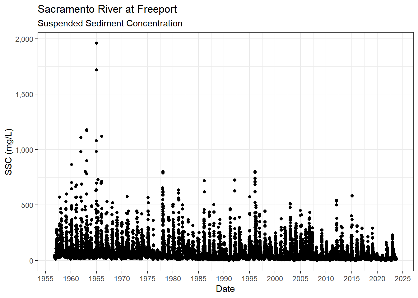
map(\(x) left_join(x, df_sac_storm, by = join_by(Date)))ls_sac_fpt_storm$ssc %>%
ggplot(aes(x = Date, y = SSC)) +
geom_point() +
scale_x_date(breaks = breaks_pretty(15)) +
scale_y_continuous(labels = label_comma()) +
theme_bw() +
labs(
title = "Sacramento River at Freeport",
subtitle = "Suspended Sediment Concentration"
)
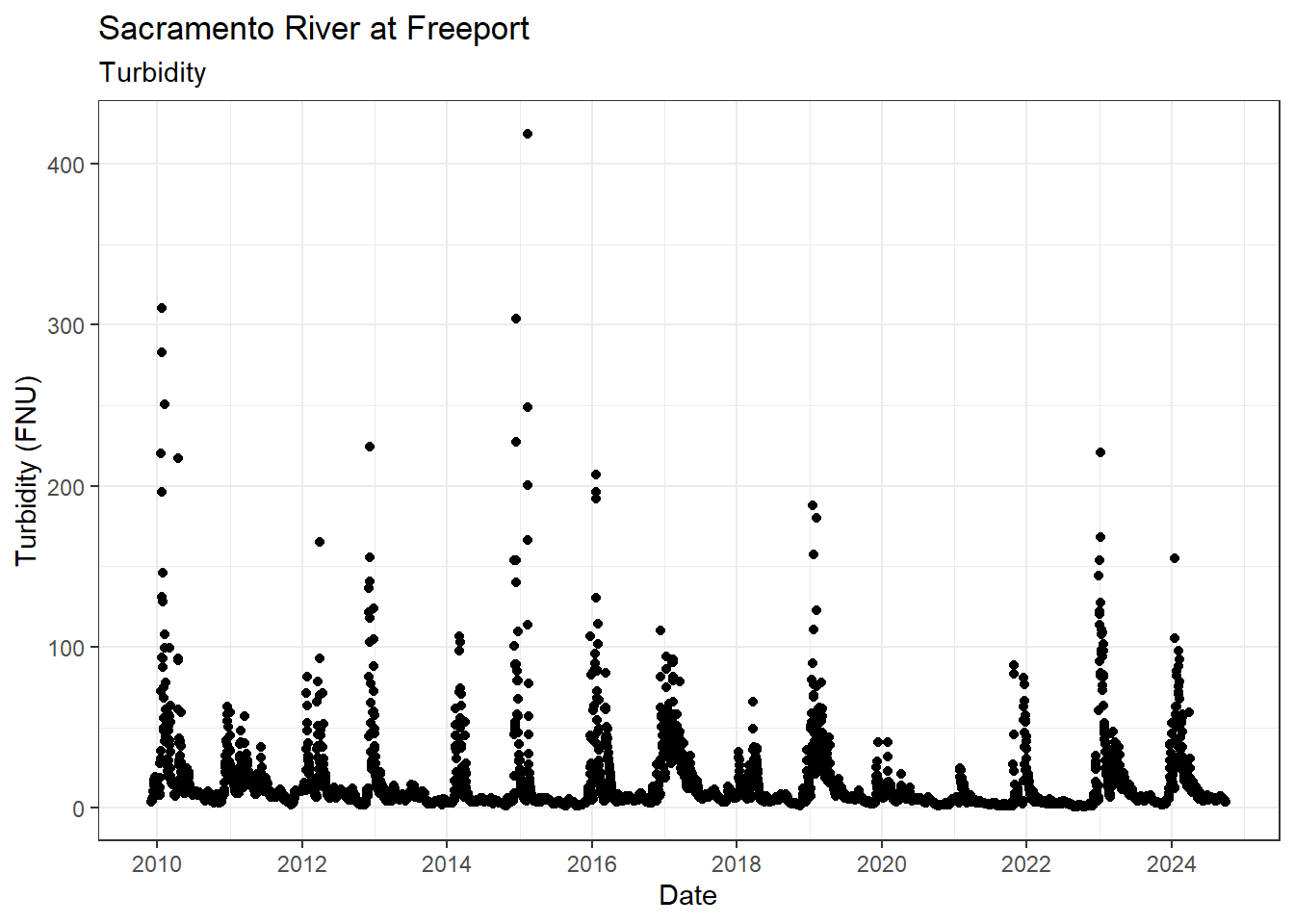
ls_sac_fpt_storm$turb %>%
  ggplot(aes(x = Date, y = Turbidity)) +
  geom_point() +
  scale_x_date(breaks = breaks_pretty(10)) +
  theme_bw() +
  labs(
    title = "Sacramento River at Freeport",
    subtitle = "Turbidity"
  )
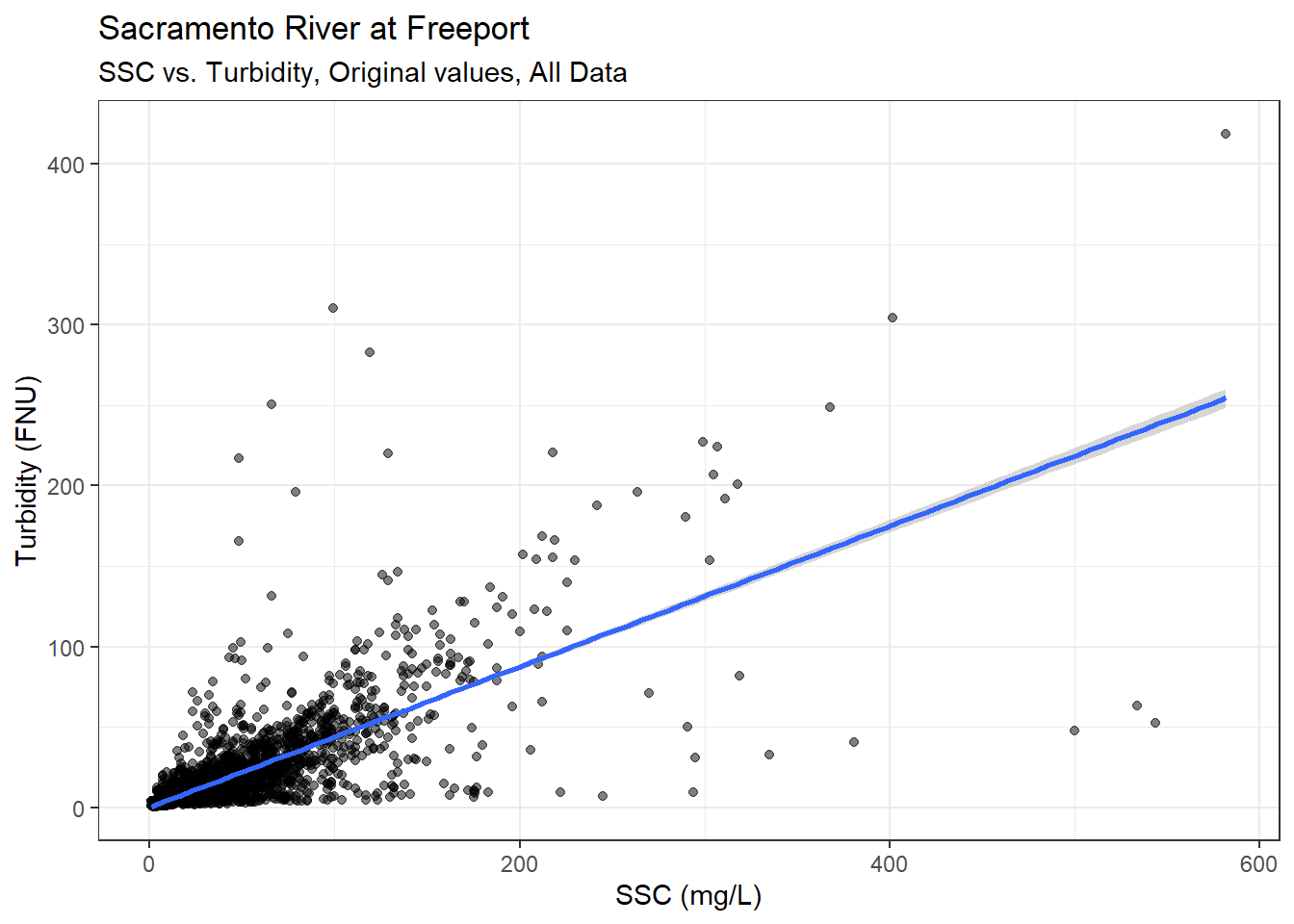
Start with all the paired data:
ls_sac_fpt_storm$ssc_turb %>%
  ggplot(aes(x = SSC, y = Turbidity)) +
  geom_point(alpha = 0.5) +
  theme_bw() +
  geom_smooth(method = "lm", formula = y ~ x) +
  labs(
    title = "Sacramento River at Freeport",
    subtitle = "SSC vs. Turbidity, Original values, All Data"
  )
Try log-log transformation:
ls_sac_fpt_storm$ssc_turb %>%
  ggplot(aes(x = log(SSC), y = log(Turbidity))) +
  geom_point(alpha = 0.5) +
  theme_bw() +
  geom_smooth(method = "lm", formula = y ~ x) +
  labs(
    title = "Sacramento River at Freeport",
    subtitle = "SSC vs. Turbidity, Log-transformed values, All Data"
  )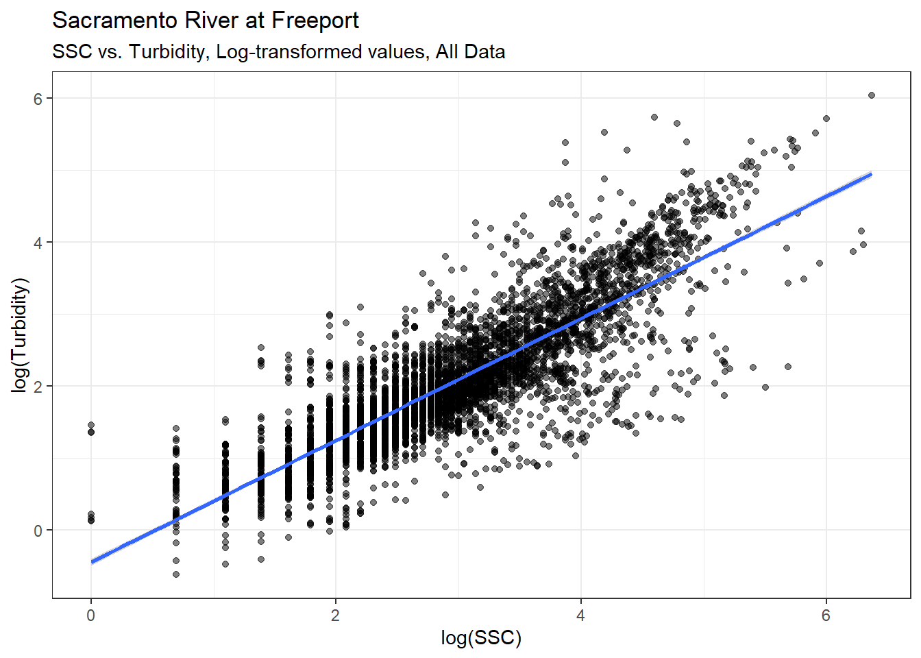
The relationship between SSC and Turbidity looks much clearer with the log-transformed data. Here is a simple linear model predicting Turbidity with SSC.
lm_sac_fpt_ssc_turb_all <- ls_sac_fpt_storm$ssc_turb %>% lm(log(Turbidity) ~ log(SSC), data = .)

summary(lm_sac_fpt_ssc_turb_all)
Call:
lm(formula = log(Turbidity) ~ log(SSC), data = .)

Residuals:
     Min       1Q   Median       3Q      Max
-2.23359 -0.26780 -0.02425  0.26764  2.54686

Coefficients:
             Estimate Std. Error t value Pr(>|t|)
(Intercept) -0.449317   0.023810  -18.87   <2e-16 ***
log(SSC)     0.847853   0.007718  109.86   <2e-16 ***
---
Signif. codes:  0 '***' 0.001 '**' 0.01 '*' 0.05 '.' 0.1 ' ' 1

Residual standard error: 0.5105 on 4888 degrees of freedom
Multiple R-squared:  0.7117,    Adjusted R-squared:  0.7117
F-statistic: 1.207e+04 on 1 and 4888 DF,  p-value: < 2.2e-16
Predict the change in suspended sediment needed to go from 180 FNU to 20 FNU
Newdat = data.frame(Turb = c(20, 180))

#log(Turb) = 0.84783*log(SSC)-0.449317
#so, SSC = exp(log(Turb)/0.84783+ 0.449317)

#I'm not sure I did the standard error right.
Newdat = mutate(Newdat, SSC = exp(log(Turb)/0.84785+ 0.449317),
                SSC_SE = exp(log(Turb)/(0.84785-0.007718)+ 0.449317),
SSC_SE2 = exp(log(Turb)/(0.84785+0.007718)+ 0.449317))Now restrict the correlation to just the defined storms:
ls_sac_fpt_storm$ssc_turb %>%
  filter(YSStorm == "STORM") %>%
  ggplot(aes(x = log(SSC), y = log(Turbidity))) +
  geom_point(alpha = 0.5) +
  theme_bw() +
  geom_smooth(method = "lm", formula = y ~ x) +
  labs(
    title = "Sacramento River at Freeport",
    subtitle = "SSC vs. Turbidity, Log-transformed values, During storms"
  )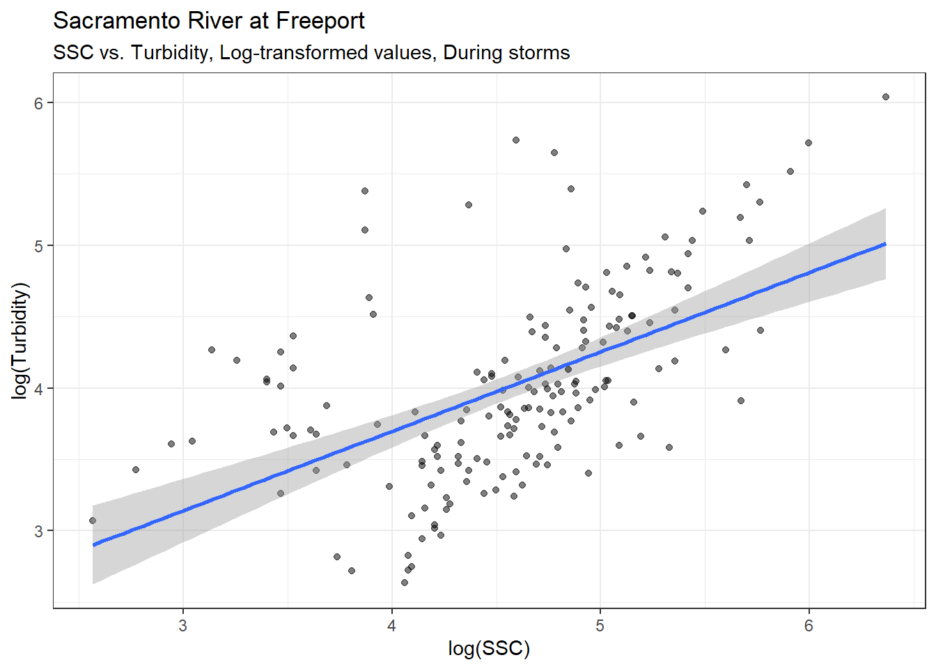
Here is a simple linear model predicting Turbidity with SSC for just the defined storm periods:
lm_sac_fpt_ssc_turb_storm <- ls_sac_fpt_storm$ssc_turb %>%
  filter(YSStorm == "STORM") %>%
  lm(log(Turbidity) ~ log(SSC), data = .)

summary(lm_sac_fpt_ssc_turb_storm)
Call:
lm(formula = log(Turbidity) ~ log(SSC), data = .)

Residuals:
     Min       1Q   Median       3Q      Max
-1.09334 -0.35729 -0.09015  0.34314  1.75388

Coefficients:
            Estimate Std. Error t value Pr(>|t|)
(Intercept)  1.47418    0.30580   4.821 3.16e-06 ***
log(SSC)     0.55582    0.06621   8.395 1.76e-14 ***
---
Signif. codes:  0 '***' 0.001 '**' 0.01 '*' 0.05 '.' 0.1 ' ' 1

Residual standard error: 0.5623 on 170 degrees of freedom
Multiple R-squared:  0.2931,    Adjusted R-squared:  0.2889
F-statistic: 70.47 on 1 and 170 DF,  p-value: 1.756e-14
Now, try separating by first storm vs. all other storms:
ls_sac_fpt_storm$ssc_turb %>%
  filter(YSStorm == "STORM") %>%
  mutate(Storm_cat = fct_drop(Storm_cat)) %>%
  ggplot(aes(x = log(SSC), y = log(Turbidity), color = Storm_cat)) +
  geom_point(alpha = 0.5) +
  scale_color_highcontrast() +
  theme_bw() +
  geom_smooth(method = "lm", formula = y ~ x) +
  labs(
    title = "Sacramento River at Freeport",
    subtitle = "SSC vs. Turbidity, Log-transformed values, During storms"
  )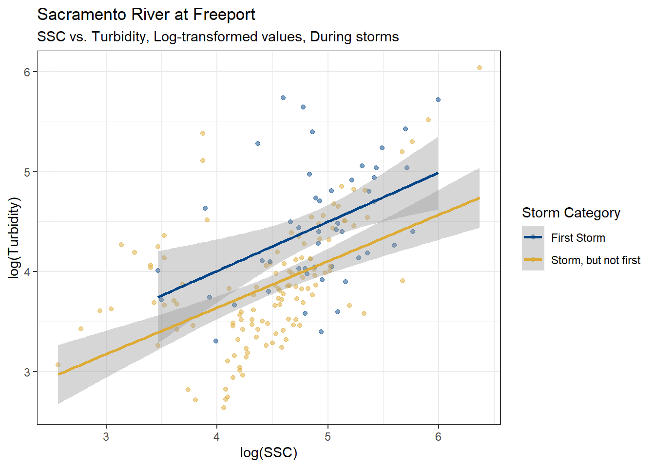
The slopes for each linear model appear parallel, but the First Storm intercept is higher. Let’s try a linear model adding Storm Category as a fixed effect.
lm_sac_fpt_ssc_turb_storm_cat <- ls_sac_fpt_storm$ssc_turb %>%
  filter(YSStorm == "STORM") %>%
  mutate(Storm_cat = fct_drop(Storm_cat)) %>%
  lm(log(Turbidity) ~ log(SSC) + Storm_cat, data = .)

summary(lm_sac_fpt_ssc_turb_storm_cat)
Call:
lm(formula = log(Turbidity) ~ log(SSC) + Storm_cat, data = .)

Residuals:
     Min       1Q   Median       3Q      Max
-1.06899 -0.40920 -0.06721  0.30688  1.80237

Coefficients:
                              Estimate Std. Error t value Pr(>|t|)
(Intercept)                    2.14552    0.33711   6.364 1.78e-09 ***
log(SSC)                       0.47030    0.06690   7.030 4.87e-11 ***
Storm_catStorm, but not first -0.38879    0.09658  -4.026 8.56e-05 ***
---
Signif. codes:  0 '***' 0.001 '**' 0.01 '*' 0.05 '.' 0.1 ' ' 1

Residual standard error: 0.5387 on 169 degrees of freedom
Multiple R-squared:  0.3549,    Adjusted R-squared:  0.3473
F-statistic: 46.49 on 2 and 169 DF, p-value: < 2.2e-16Anova(lm_sac_fpt_ssc_turb_storm_cat, type = 2)Anova Table (Type II tests)
Response: log(Turbidity)
Sum Sq Df F value Pr(>F)
log(SSC) 14.344 1 49.425 4.866e-11 ***
Storm_cat 4.703 1 16.205 8.565e-05 ***
Residuals 49.048 169
---
Signif. codes: 0 '***' 0.001 '**' 0.01 '*' 0.05 '.' 0.1 ' ' 1It looks like the intercept for the “Storm, but not first” category is significantly lower than the intercept for the “First Storm”.
Maybe restricting the correlation to just the defined storms is too restrictive. Let’s try restricting the data to the months when storms are most prevalent, but include data outside of defined storms.
df_sac_storm %>%
  filter(YSStorm == "STORM") %>%
  count(Month)
# A tibble: 10 × 2
Month n
<dbl> <int>
1 1 380
2 2 353
3 3 311
4 4 119
5 5 50
6 6 14
7 7 1
8 10 7
9 11 79
10 12 296It looks like storms are most common during December - April, so we’ll use that time period.
ls_sac_fpt_storm$ssc_turb %>%
  filter(Month %in% c(1:4, 12)) %>%
  ggplot(aes(x = log(SSC), y = log(Turbidity))) +
  geom_point(alpha = 0.5) +
  theme_bw() +
  geom_smooth(method = "lm", formula = y ~ x) +
  labs(
    title = "Sacramento River at Freeport",
    subtitle = "SSC vs. Turbidity, Log-transformed values, December - April"
  )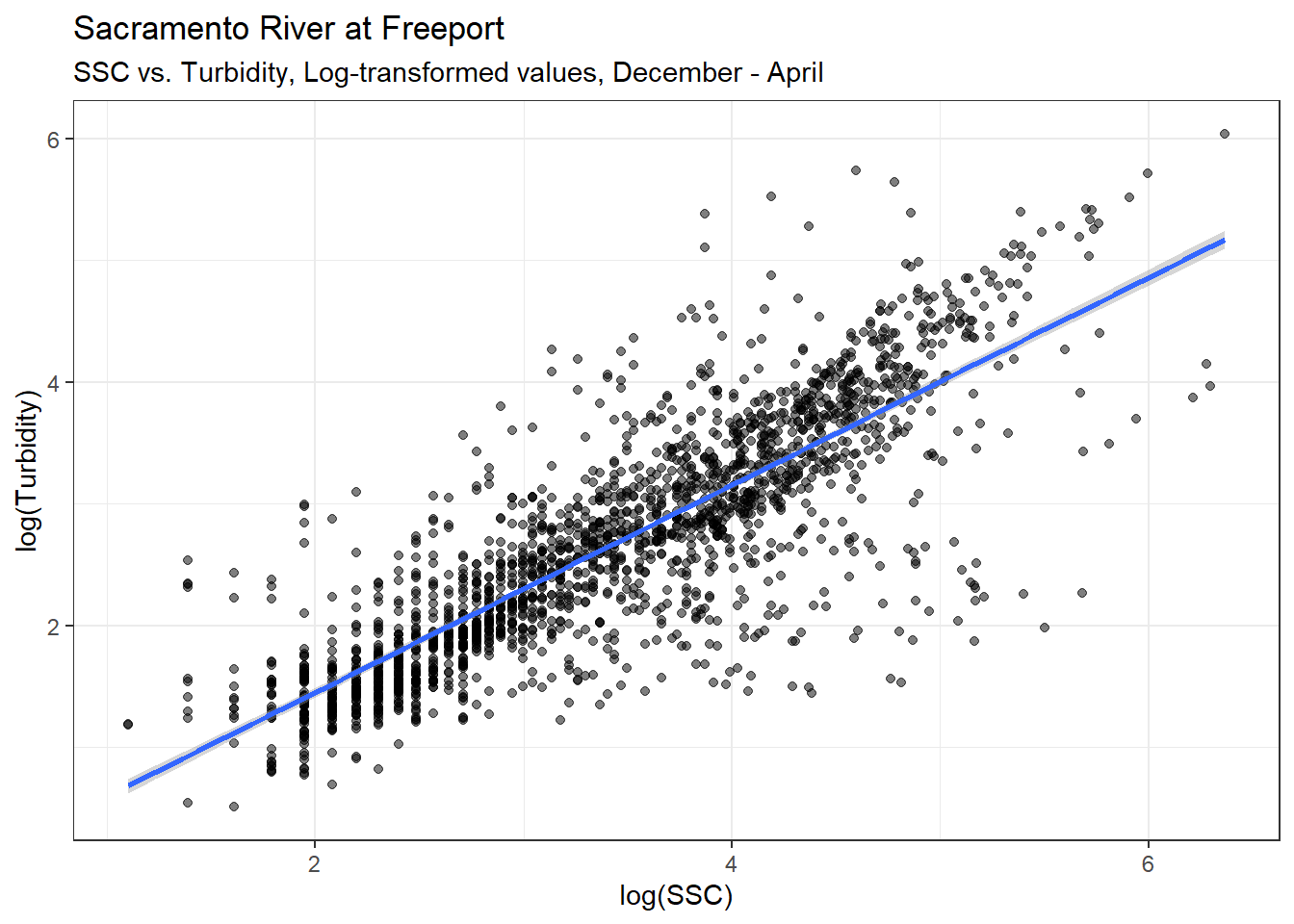
Here is a simple linear model predicting Turbidity with SSC for December - April data:
lm_sac_fpt_ssc_turb_wint <- ls_sac_fpt_storm$ssc_turb %>%
  filter(Month %in% c(1:4, 12)) %>%
  lm(log(Turbidity) ~ log(SSC), data = .)

summary(lm_sac_fpt_ssc_turb_wint)
Call:
lm(formula = log(Turbidity) ~ log(SSC), data = .)

Residuals:
     Min       1Q   Median       3Q      Max
-2.45176 -0.24646 -0.01933  0.28302  2.33503

Coefficients:
            Estimate Std. Error t value Pr(>|t|)
(Intercept) -0.25254    0.04409  -5.728 1.17e-08 ***
log(SSC)     0.85174    0.01243  68.546  < 2e-16 ***
---
Signif. codes:  0 '***' 0.001 '**' 0.01 '*' 0.05 '.' 0.1 ' ' 1

Residual standard error: 0.5354 on 2055 degrees of freedom
Multiple R-squared:  0.6957,    Adjusted R-squared:  0.6956
F-statistic:  4699 on 1 and 2055 DF,  p-value: < 2.2e-16
Now, try separating by first storm vs. all other storms vs. no storm:
ls_sac_fpt_storm$ssc_turb %>%
  filter(Month %in% c(1:4, 12)) %>%
  mutate(
    Storm_cat = fct_collapse(
      Storm_cat,
      "No Storm" = c("No Storm, during winter", "No Storm, not during winter")
    )
  ) %>%
  ggplot(aes(x = log(SSC), y = log(Turbidity), color = Storm_cat)) +
  geom_point(alpha = 0.5) +
  scale_color_highcontrast() +
  theme_bw() +
  geom_smooth(method = "lm", formula = y ~ x) +
  labs(
    title = "Sacramento River at Freeport",
    subtitle = "SSC vs. Turbidity, Log-transformed values, December - April"
  )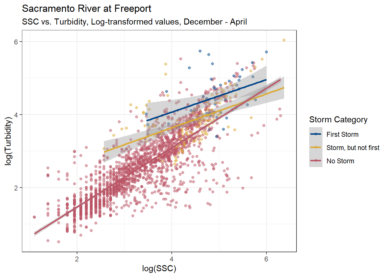
The relationships between Turbidity and SSC look very similar between all data and when its restricted to December - April. Either one of these linear models would probably work well to estimate turbidity from SSC.
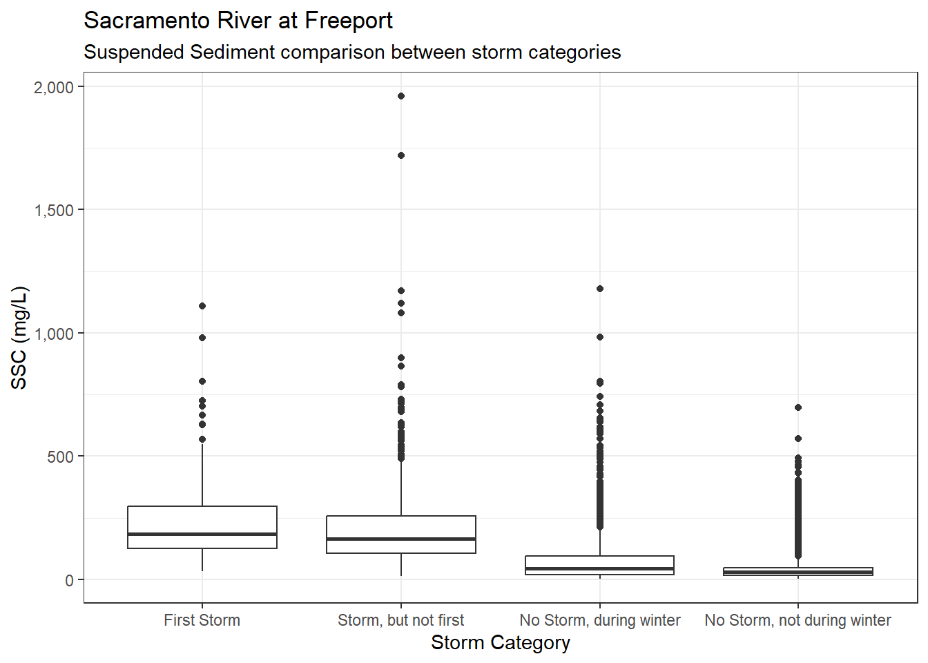
ls_sac_fpt_storm$ssc %>%
  ggplot(aes(x = Storm_cat, y = SSC)) +
  geom_boxplot() +
  scale_y_continuous(labels = label_comma()) +
  theme_bw() +
  labs(
    title = "Sacramento River at Freeport",
    subtitle = "Suspended Sediment comparison between storm categories"
  )
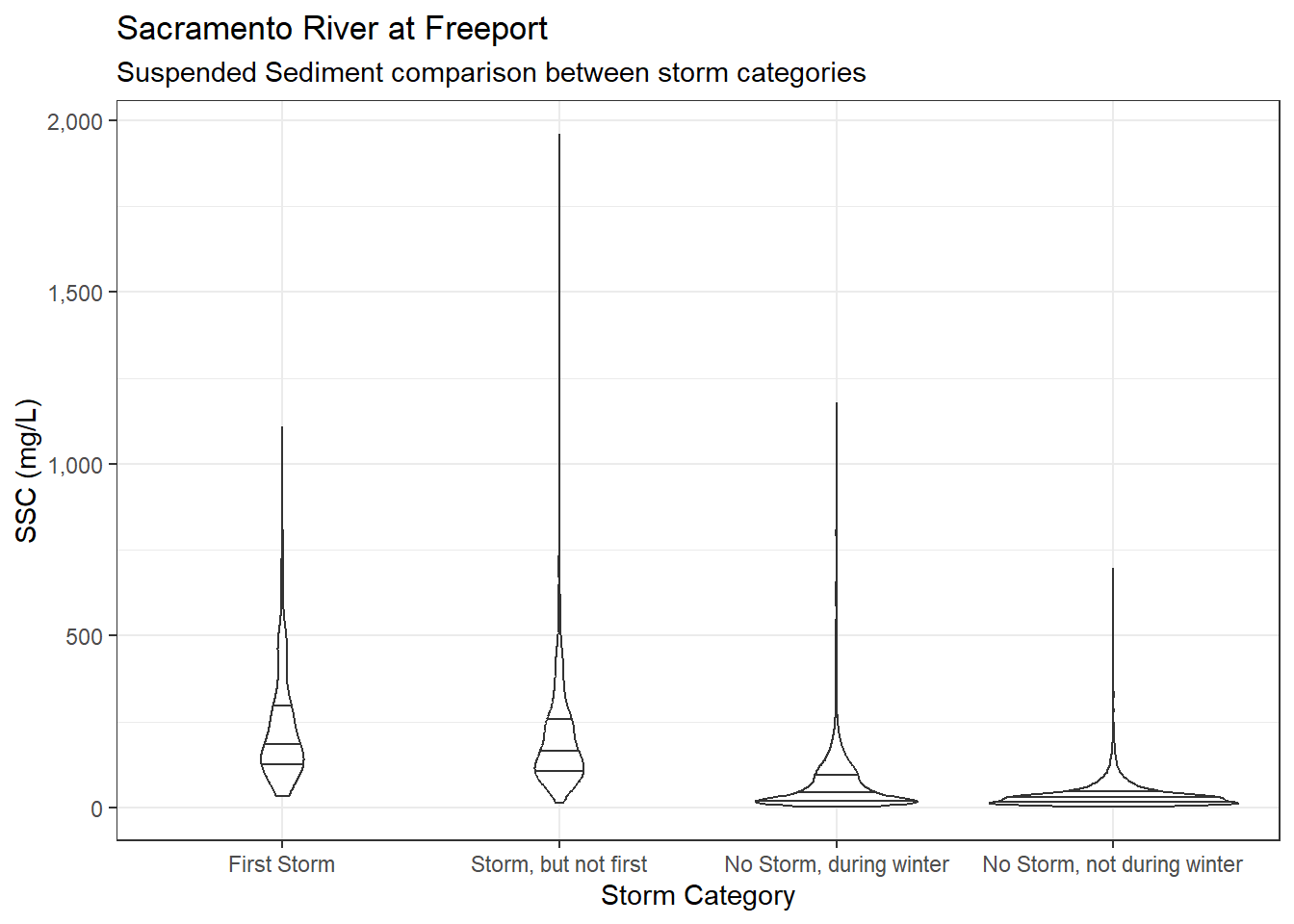
ls_sac_fpt_storm$ssc %>%
  ggplot(aes(x = Storm_cat, y = SSC)) +
  geom_violin(quantile.linetype = 1) +
  scale_y_continuous(labels = label_comma()) +
  theme_bw() +
  labs(
    title = "Sacramento River at Freeport",
    subtitle = "Suspended Sediment comparison between storm categories"
  )
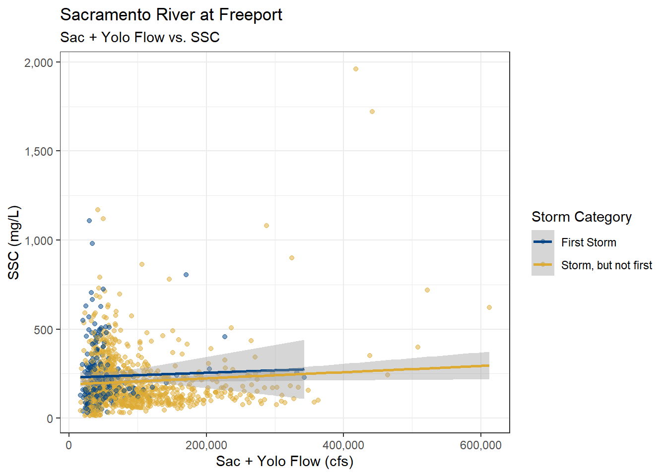
ls_sac_fpt_storm$ssc %>%
  filter(YSStorm == "STORM") %>%
  mutate(Storm_cat = fct_drop(Storm_cat)) %>%
  ggplot(aes(x = YoloSac, y = SSC, color = Storm_cat)) +
  geom_point(alpha = 0.5) +
  geom_smooth(method = "lm", formula = y ~ x) +
  scale_color_highcontrast(name = "Storm Category") +
  scale_x_continuous(labels = label_comma()) +
  scale_y_continuous(labels = label_comma()) +
  theme_bw() +
  labs(
    title = "Sacramento River at Freeport",
    subtitle = "Sac + Yolo Flow vs. SSC"
  )
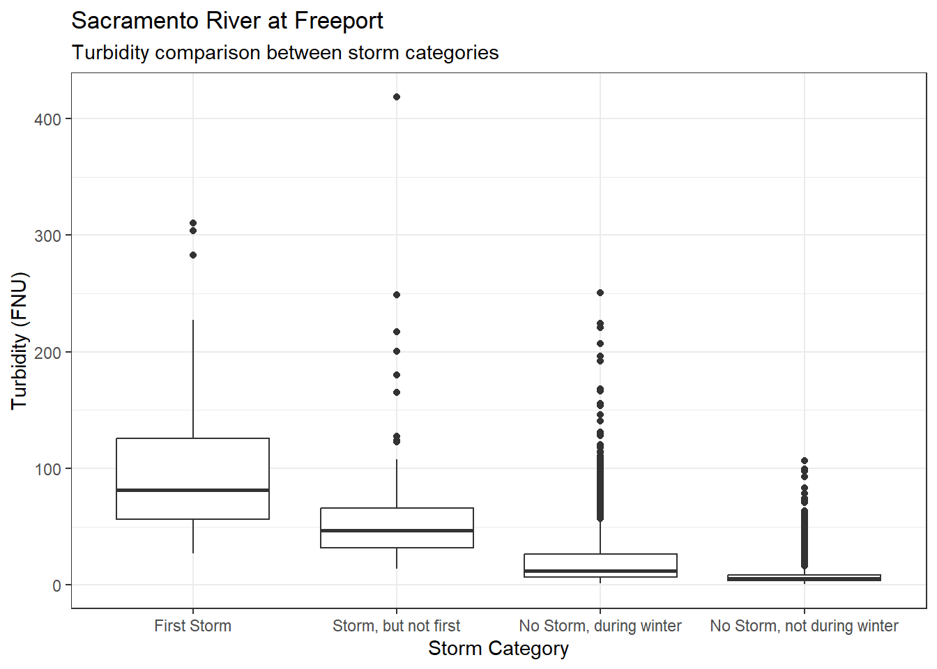
ls_sac_fpt_storm$turb %>%
  ggplot(aes(x = Storm_cat, y = Turbidity)) +
  geom_boxplot() +
  theme_bw() +
  labs(
    title = "Sacramento River at Freeport",
    subtitle = "Turbidity comparison between storm categories"
  )
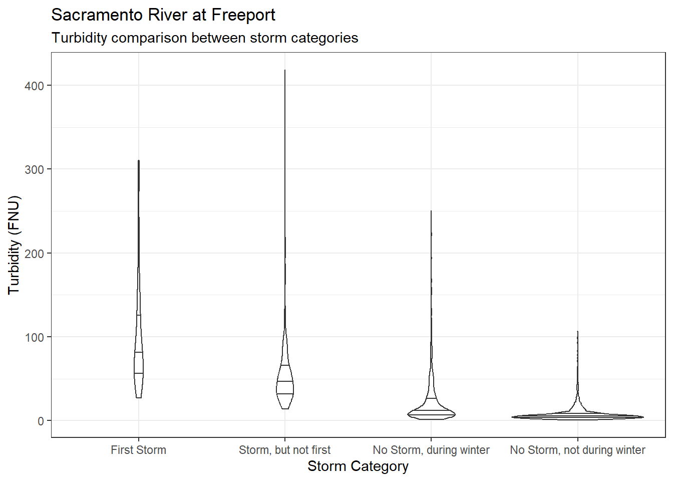
ls_sac_fpt_storm$turb %>%
  ggplot(aes(x = Storm_cat, y = Turbidity)) +
  geom_violin(quantile.linetype = 1) +
  theme_bw() +
  labs(
    title = "Sacramento River at Freeport",
    subtitle = "Turbidity comparison between storm categories"
  )
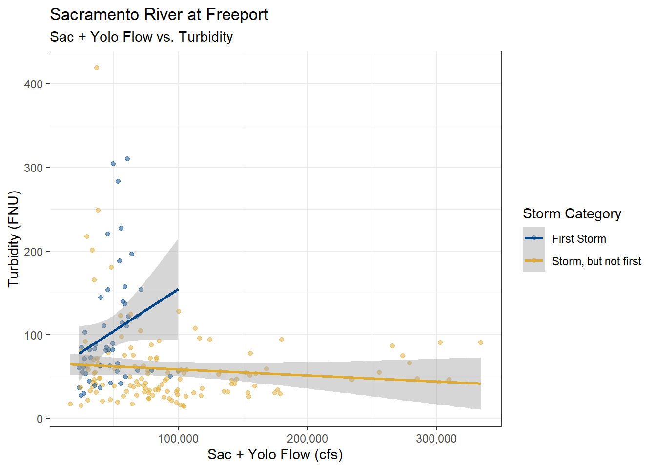
ls_sac_fpt_storm$turb %>%
  filter(YSStorm == "STORM") %>%
  mutate(Storm_cat = fct_drop(Storm_cat)) %>%
  ggplot(aes(x = YoloSac, y = Turbidity, color = Storm_cat)) +
  geom_point(alpha = 0.5) +
  geom_smooth(method = "lm", formula = y ~ x) +
  scale_color_highcontrast(name = "Storm Category") +
  scale_x_continuous(labels = label_comma()) +
  scale_y_continuous(labels = label_comma()) +
  theme_bw() +
  labs(
    title = "Sacramento River at Freeport",
    subtitle = "Sac + Yolo Flow vs. Turbidity"
  )
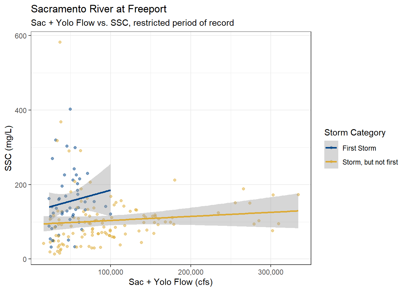
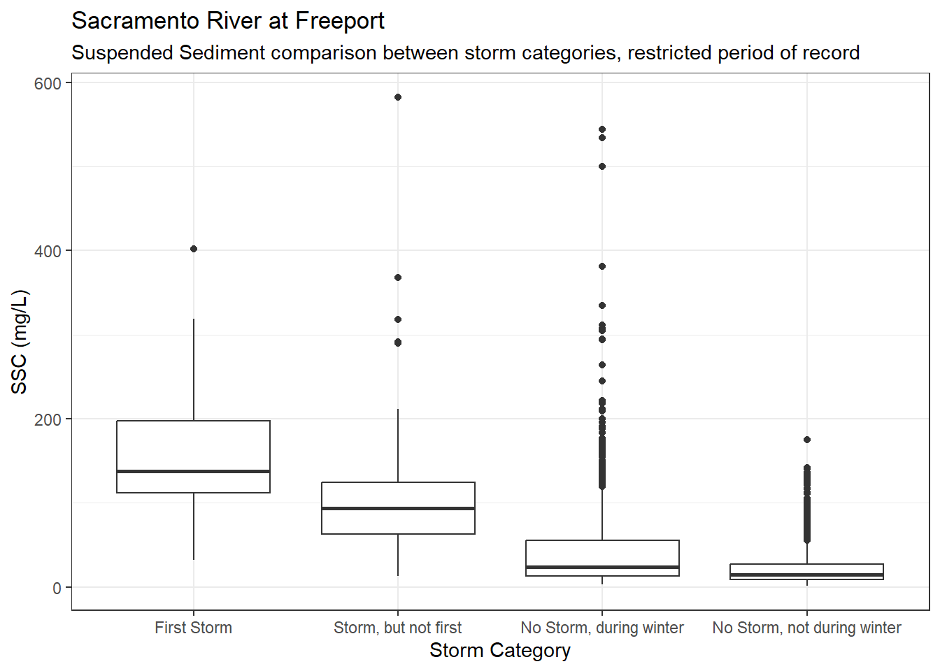
Suspended sediment concentration has a much longer period of record than Turbidity. What does this first flush analysis look like if we restricted the SSC values to the period of record for Turbidity.
turb_por <- interval(min(ls_sac_fpt_storm$turb$Date), max(ls_sac_fpt_storm$turb$Date))

df_sac_fpt_ssc_storm_rst <- ls_sac_fpt_storm$ssc %>% filter(Date %within% turb_por)df_sac_fpt_ssc_storm_rst %>%
ggplot(aes(x = Storm_cat, y = SSC)) +
geom_boxplot() +
scale_y_continuous(labels = label_comma()) +
theme_bw() +
labs(
title = "Sacramento River at Freeport",
subtitle = "Suspended Sediment comparison between storm categories, restricted period of record"
)
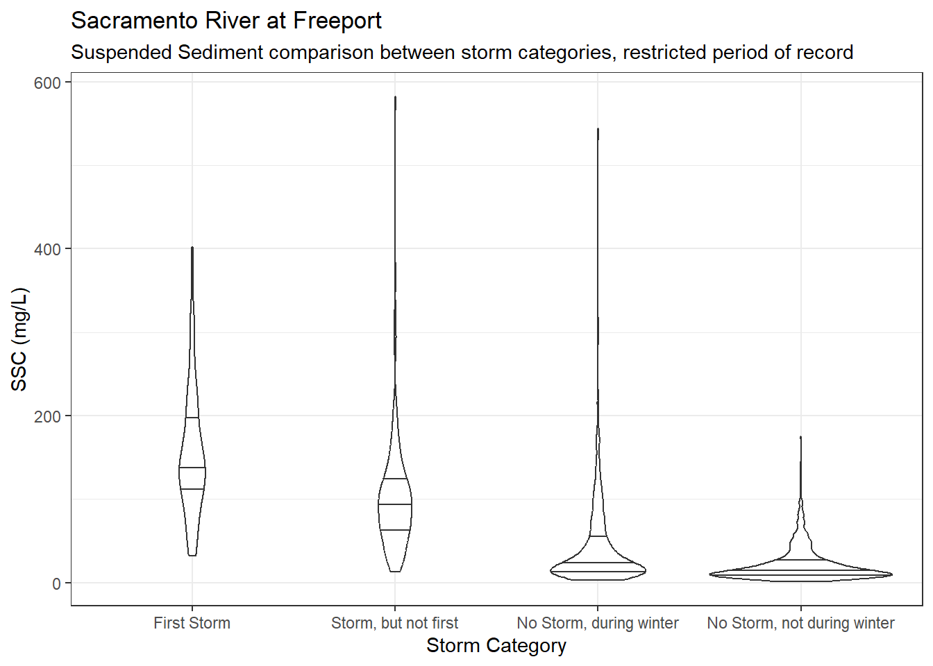
df_sac_fpt_ssc_storm_rst %>%
  ggplot(aes(x = Storm_cat, y = SSC)) +
  geom_violin(quantile.linetype = 1) +
  scale_y_continuous(labels = label_comma()) +
  theme_bw() +
  labs(
    title = "Sacramento River at Freeport",
    subtitle = "Suspended Sediment comparison between storm categories, restricted period of record"
  )
df_sac_fpt_ssc_storm_rst %>%
  filter(YSStorm == "STORM") %>%
  mutate(Storm_cat = fct_drop(Storm_cat)) %>%
  ggplot(aes(x = YoloSac, y = SSC, color = Storm_cat)) +
  geom_point(alpha = 0.5) +
  geom_smooth(method = "lm", formula = y ~ x) +
  scale_color_highcontrast(name = "Storm Category") +
  scale_x_continuous(labels = label_comma()) +
  scale_y_continuous(labels = label_comma()) +
  theme_bw() +
  labs(
    title = "Sacramento River at Freeport",
    subtitle = "Sac + Yolo Flow vs. SSC, restricted period of record"
  )