---
title: "SEM Template"
author: "Perry"
date: today
date-format: long
format:
html:
toc: true
code-fold: show
code-tools: true
df-print: kable
execute:
message: false
warning: false
---
# Analysis Example
This is a quick example of SEM analysis, covering data exploration + model creation + model interpretation.
My models will be:
$$
\text{log(Chlorophyll)} \sim \text{log(DissAmmonia)} + \text{...} + \text{RE(Region)}
$$
$$
\text{log(DissAmmonia)} \sim \text{...} + \text{RE(Region)}
$$
I used the monthly nutrient data for this.
```{r}
library(tidyverse)
library(emmeans)
library(car)
library(lme4)
library(lmerTest)
library(performance)
library(piecewiseSEM)
library(lavaan)
library(semPlot)
library(mgcv)
library(here)
library(conflicted)
theme_set(theme_bw())
options(contrasts = c('contr.sum', 'contr.poly'))

# Declare package conflict preferences
conflicts_prefer(dplyr::filter(), dplyr::lag(), lme4::lmer())
```
```{r}
# Define WQ parameters included in this example
wq_param <- c(
  "DissAmmonia",
  "DissNitrate",
  "DissNitrateNitrite",
  "DissOrthophos",
  "DON",
  "TKN",
  "TotPhos",
  "Temperature",
  "Salinity",
  "Turbidity",
  "DissolvedOxygen",
  "Chlorophyll",
  "pH",
  "Microcystis",
  "Sac_Inflow",
  "SJR_Inflow",
  "Total_Inflow"
)

df_monthly <- readRDS(here("data/processed/monthly_values.rds")) %>%
  mutate(Region = factor(Region), Date = make_date(Year, Month, 1)) %>%
  select(MonthYear, Year, Month, Date, Region, all_of(wq_param)) %>%
  arrange(Region, Date)

df_monthly_long <- df_monthly %>%
  pivot_longer(
    cols = all_of(wq_param),
    names_to = "Variable",
    values_to = "Value"
  )
```
# Exploratory Analysis (Data)
First we investigate our individual variables.
## Balance check
When you have categorical variables (like Region), it's best to have balanced data -- the same number per category.
How many samples do we have per Region?
```{r}
df_monthly %>%
  count(Region)
```
Basically even, but how many are non-NAs for relevant variables?
```{r}
df_monthly_long %>%
  drop_na(Value) %>%
  count(Region, Variable) %>%
  pivot_wider(names_from = Region, values_from = n, values_fill = 0)
```
There are missing values for certain analytes. To group them:
**balanced:** Temperature, Salinity, Turbidity, DissolvedOxygen, Inflows
**relatively balanced (\>= 75%):** Chlorophyll, pH, MVI
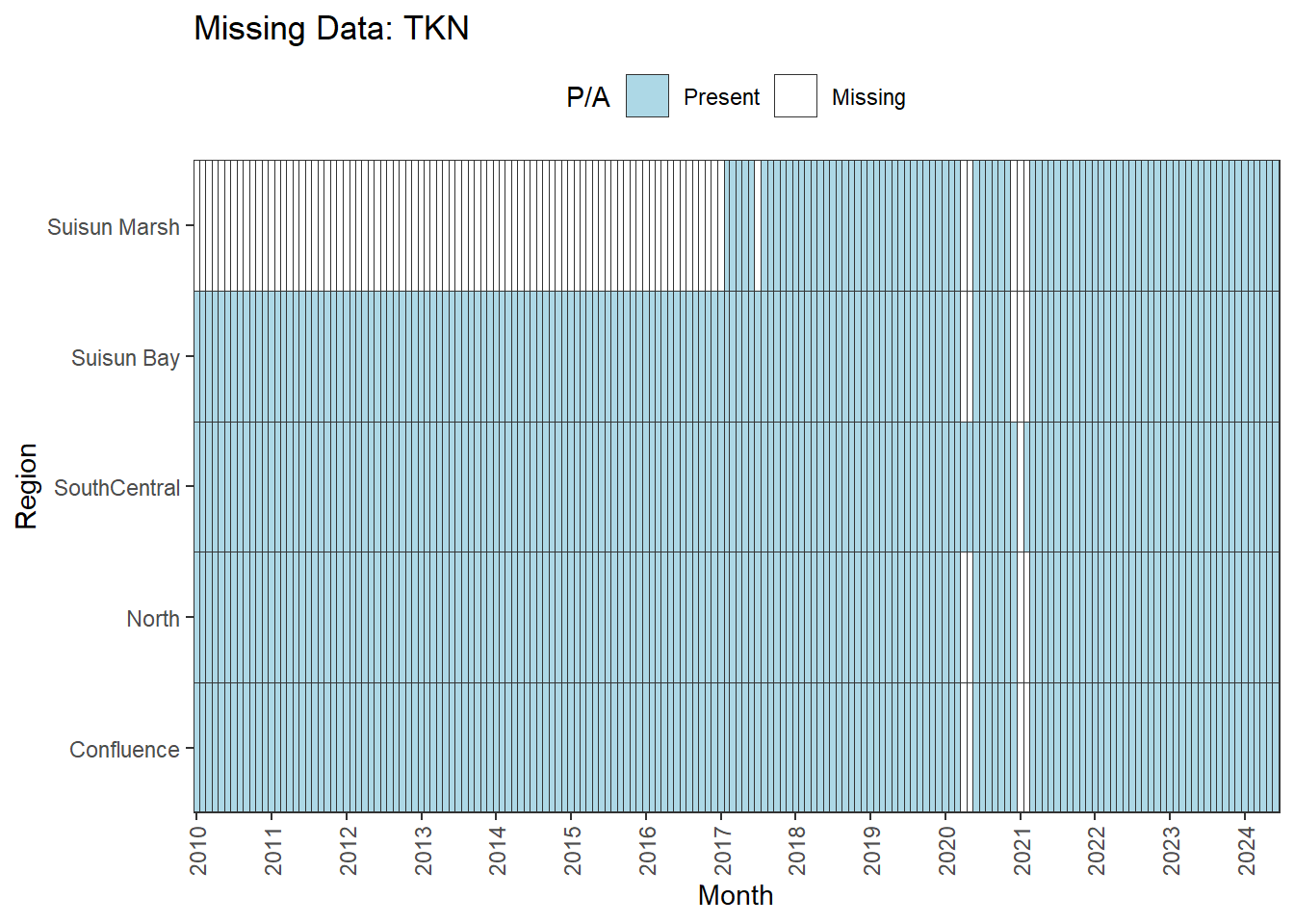
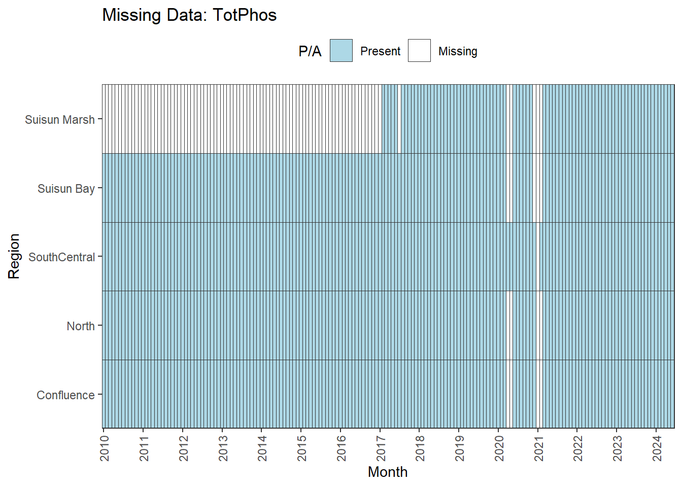
**missing data (Suisun Marsh):** DissAmmonia, DissNitrateNitrite, DissOrthophos, DON, TKN, TotPhos
**missing a lot of data:** DissNitrate
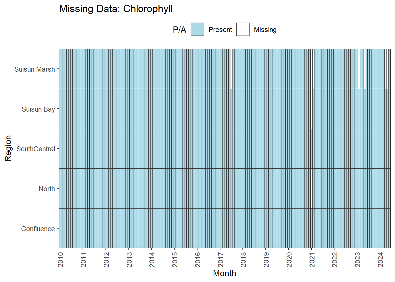
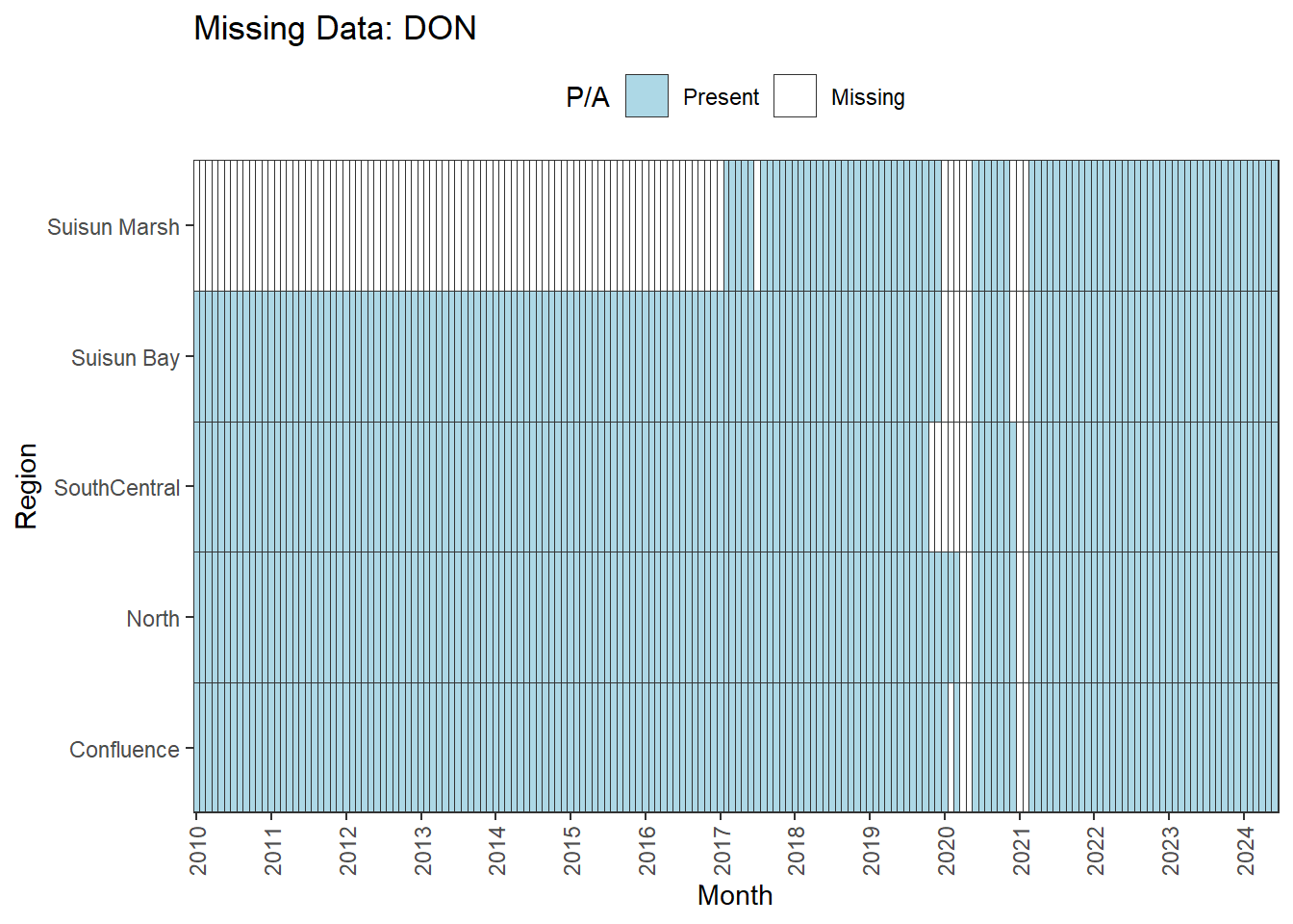
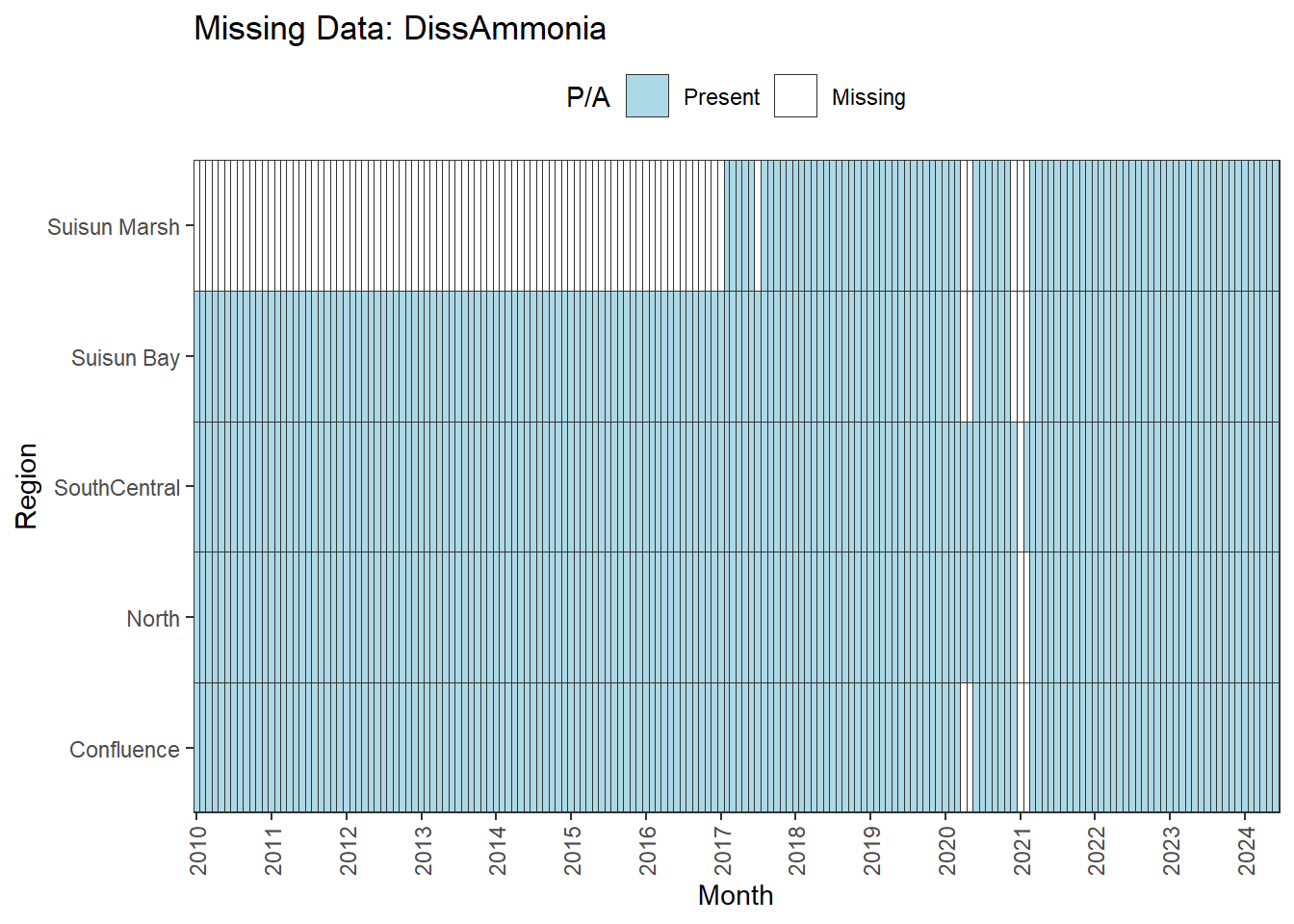
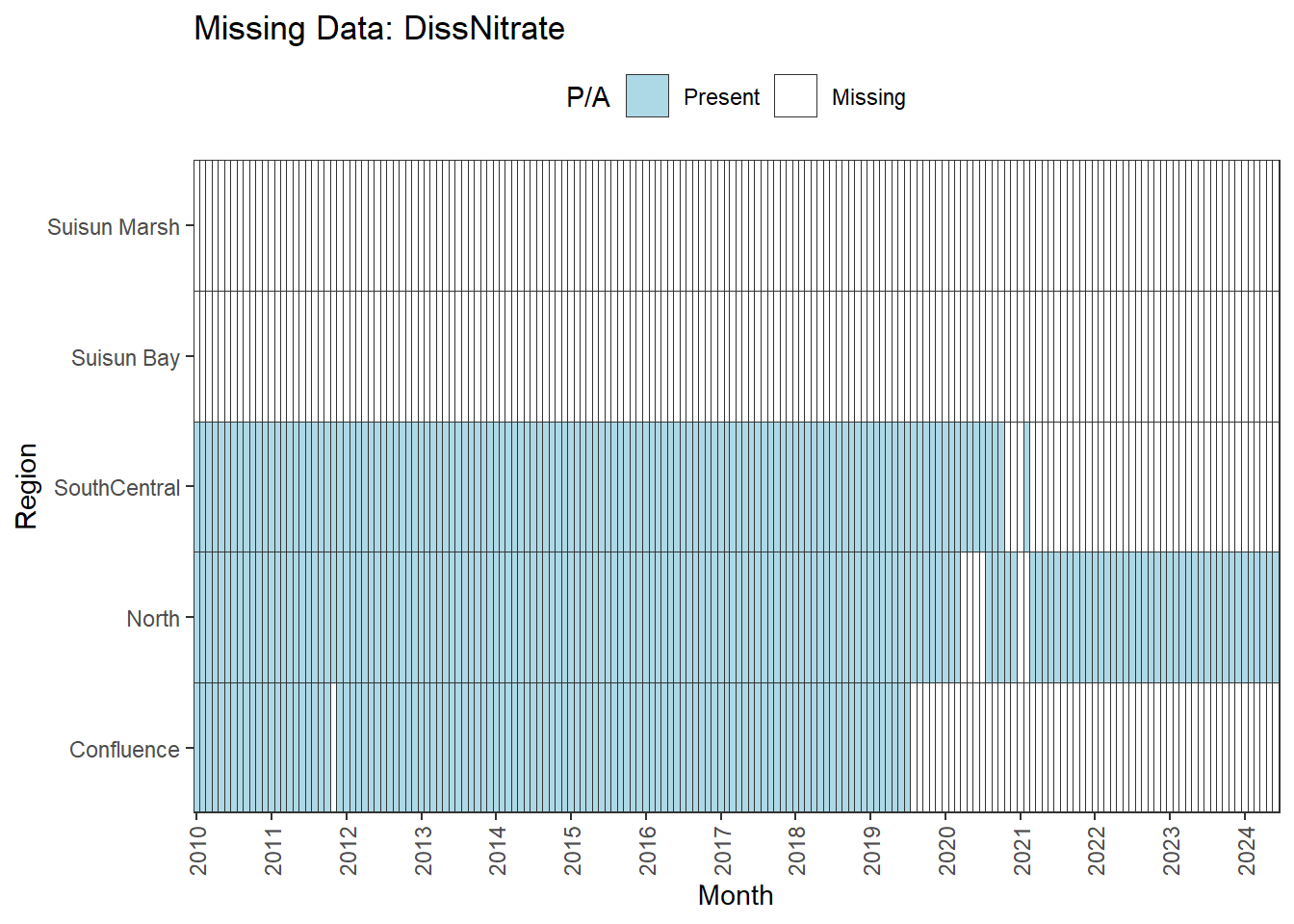
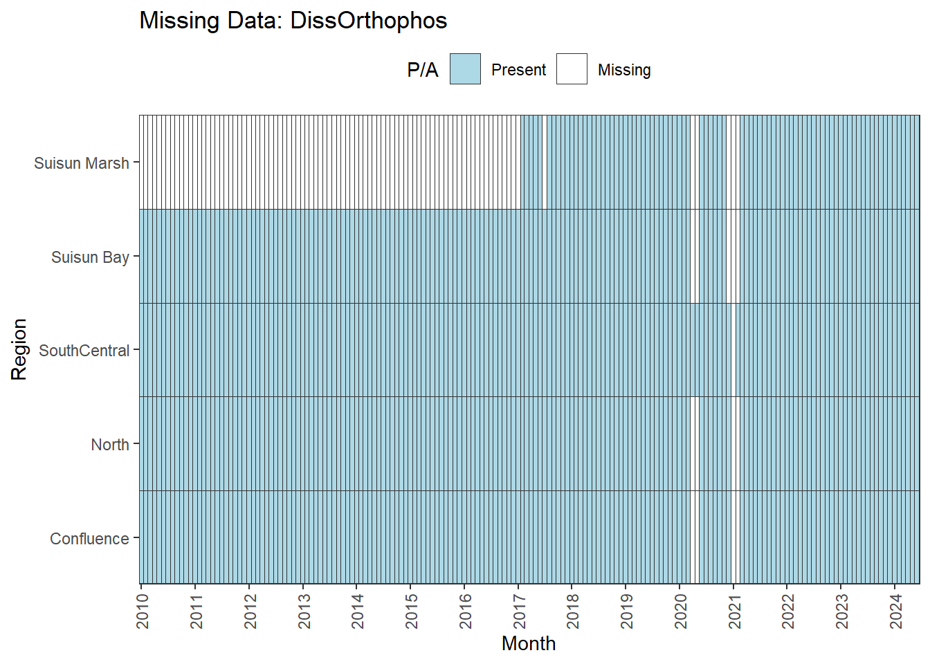
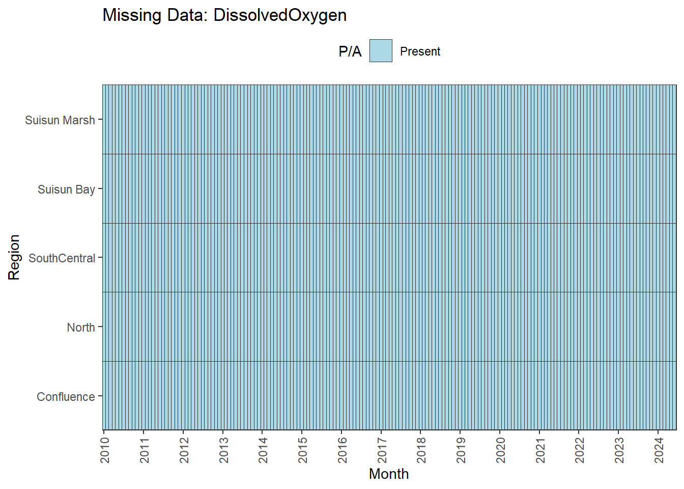
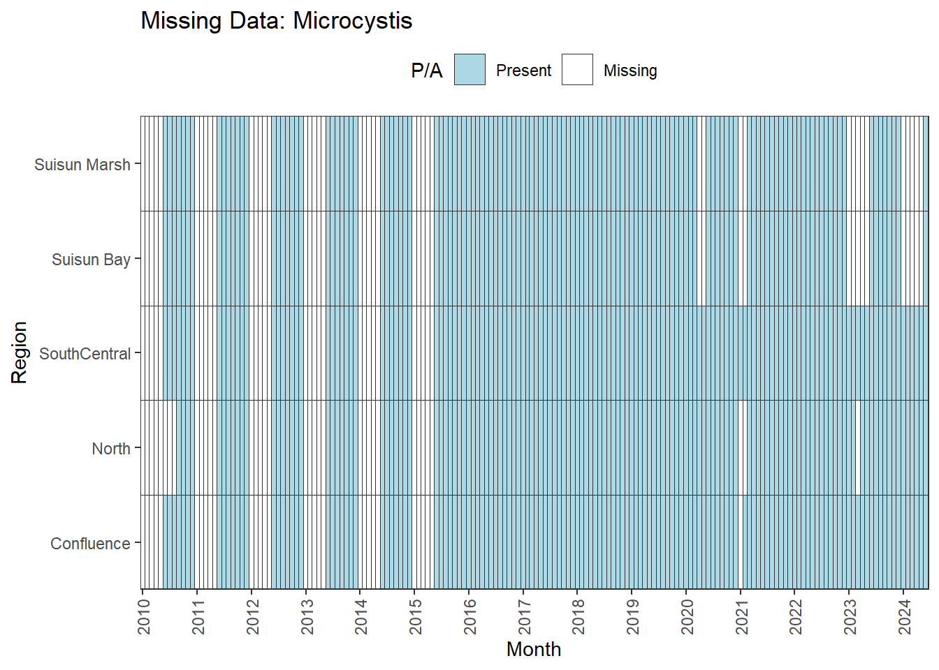
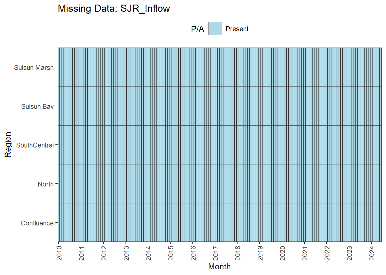
We can break this down by month to see if the missing data is interpolable or not:
```{r}
df_missing <- df_monthly_long %>%
  mutate(
    Missing = factor(
      if_else(is.na(Value), 1, 0),
      levels = c(0, 1),
      labels = c('Present', 'Missing')
    )
  )

plots <- df_missing %>%
  group_by(Variable) %>%
  group_split() %>%
  lapply(function(df) {
    ggplot(df, aes(x = Date, y = Region, fill = Missing)) +
      geom_tile(color = 'grey20', linewidth = 0.3, width = 35) +
      scale_fill_manual(
        values = c('Present' = 'lightblue', 'Missing' = 'white')
      ) +
      scale_x_date(
        name = "Month",
        date_breaks = '1 year',
        date_labels = '%Y',
        expand = expansion(mult = 0)
      ) +
      scale_y_discrete(expand = expansion(add = 0)) +
      theme_bw() +
      labs(
        title = paste0('Missing Data: ', unique(df$Variable)),
        fill = 'P/A'
      ) +
      theme(
        axis.text.x = element_text(angle = 90, hjust = 1, vjust = 0.5),
        legend.position = "top",
        panel.grid = element_blank()
      )
  })

walk(plots, print)
```
Findings:
**No data until 02-2017 (for Suisun Marsh):** DON, DissAmmonia, DissNitrateNitrite, DissOrthophos, TKN, TotPhos
- rest of missing data is interpolable
**Lots of missing data:** DissNitrate
**Large gaps until 06-2015:** MVI
- all 5 month gaps between Jan-May
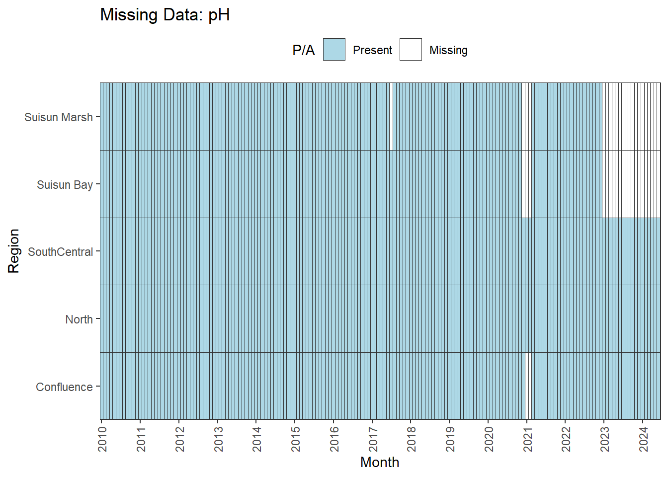
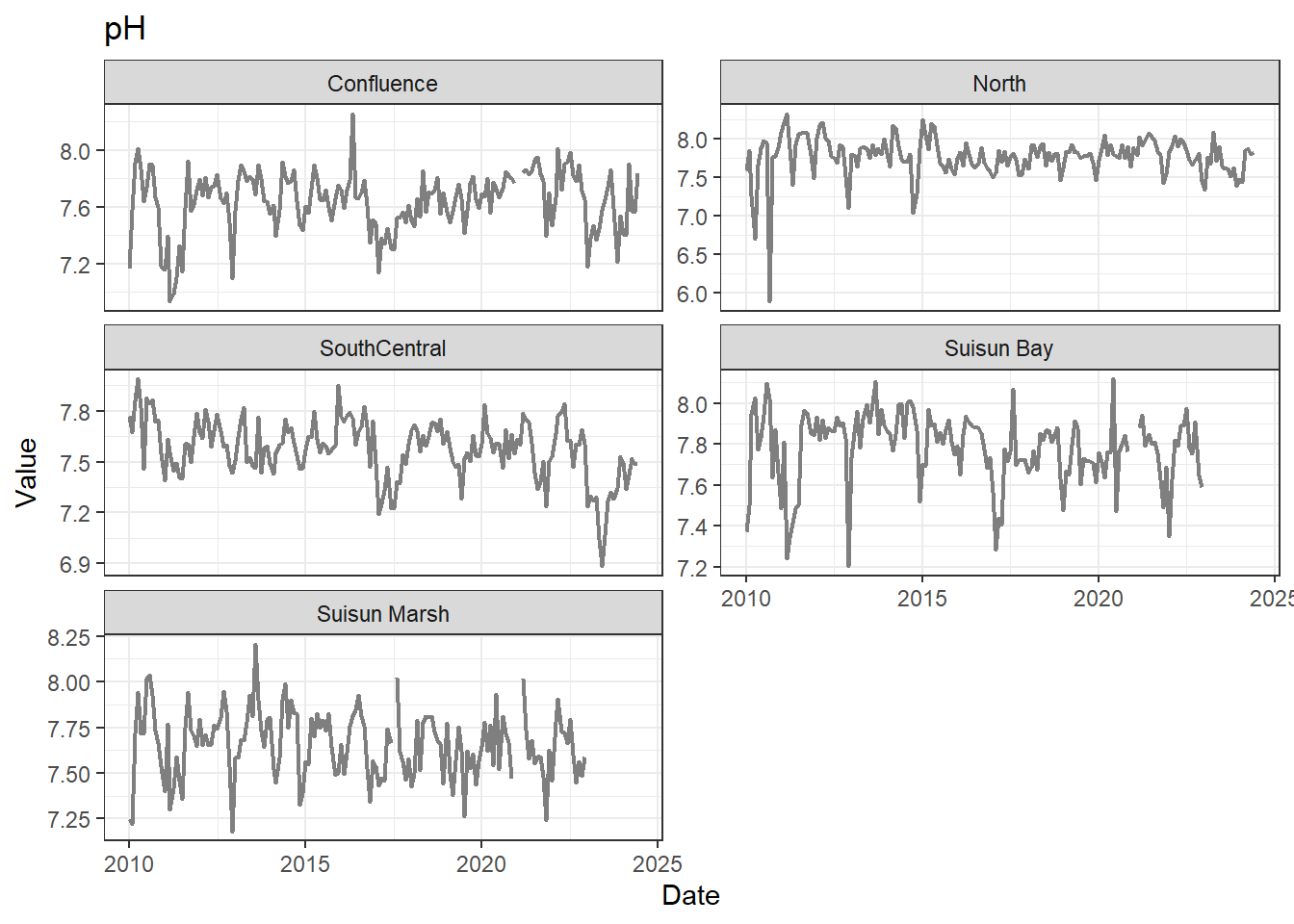
**Missing after 01-2023 for Suisun Marsh/Suisun Bay:** pH
**Small interpolable gaps:** Chlorophyll
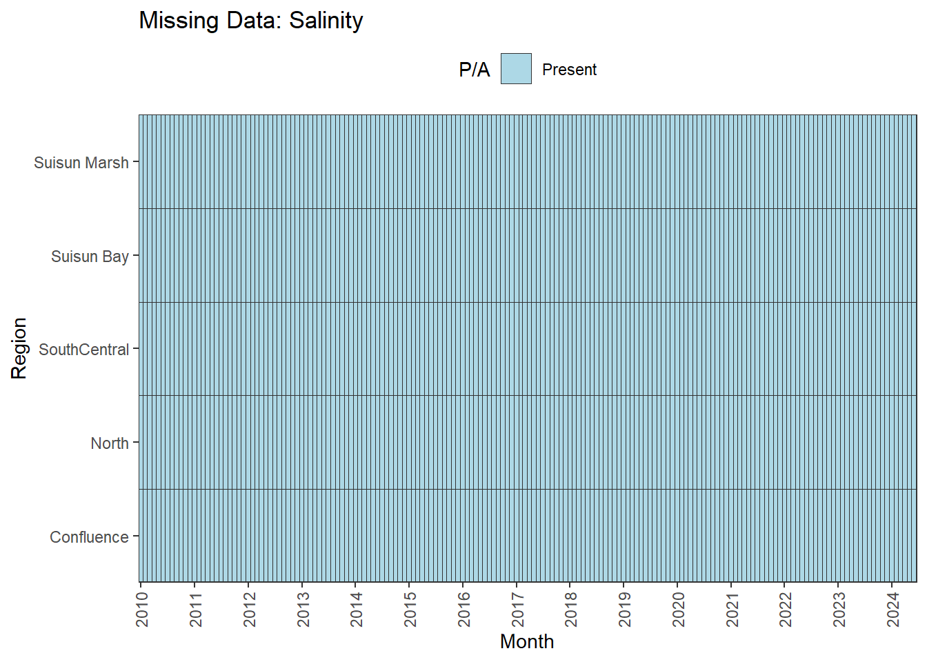
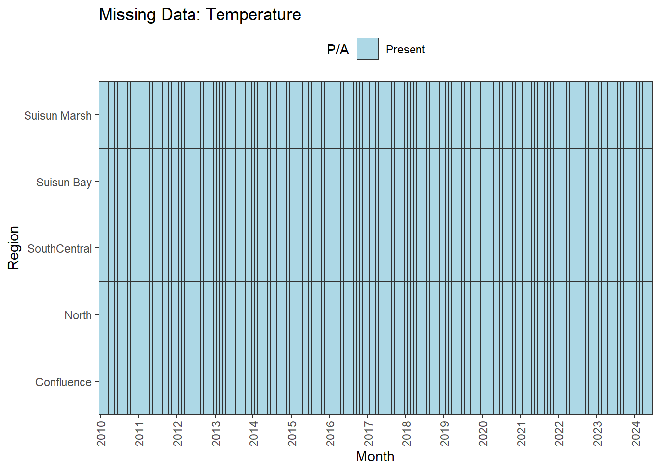
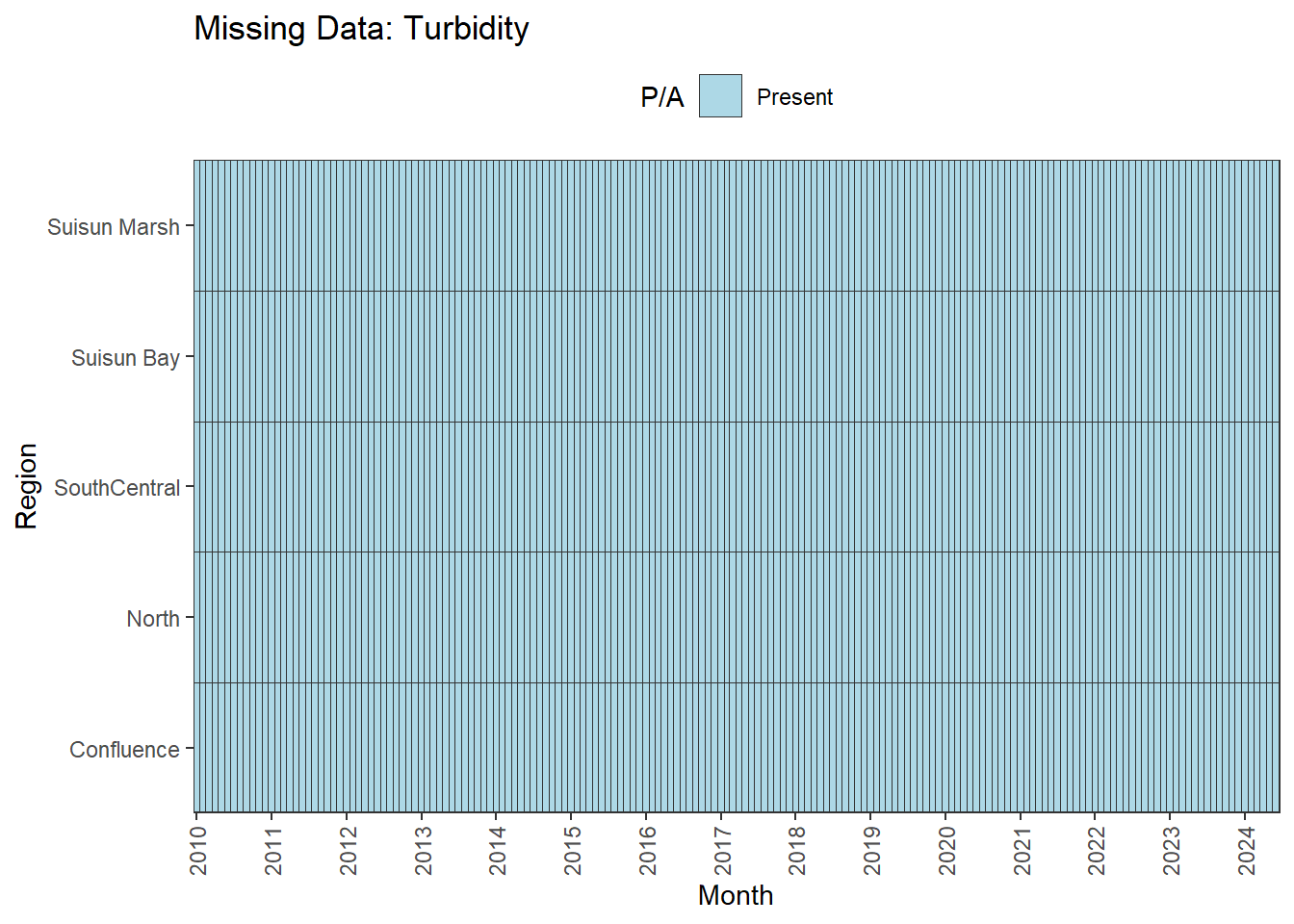
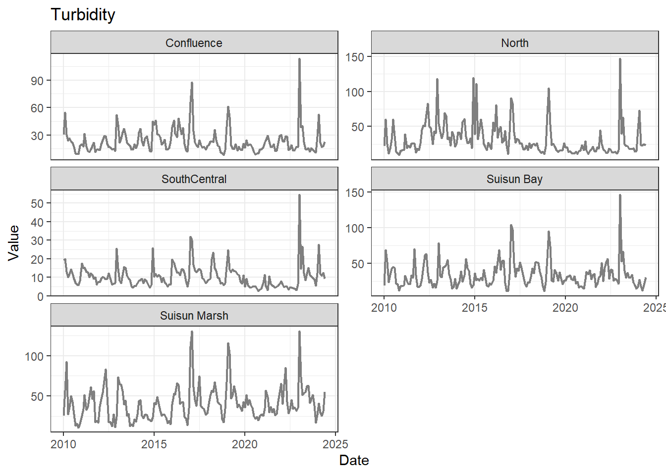
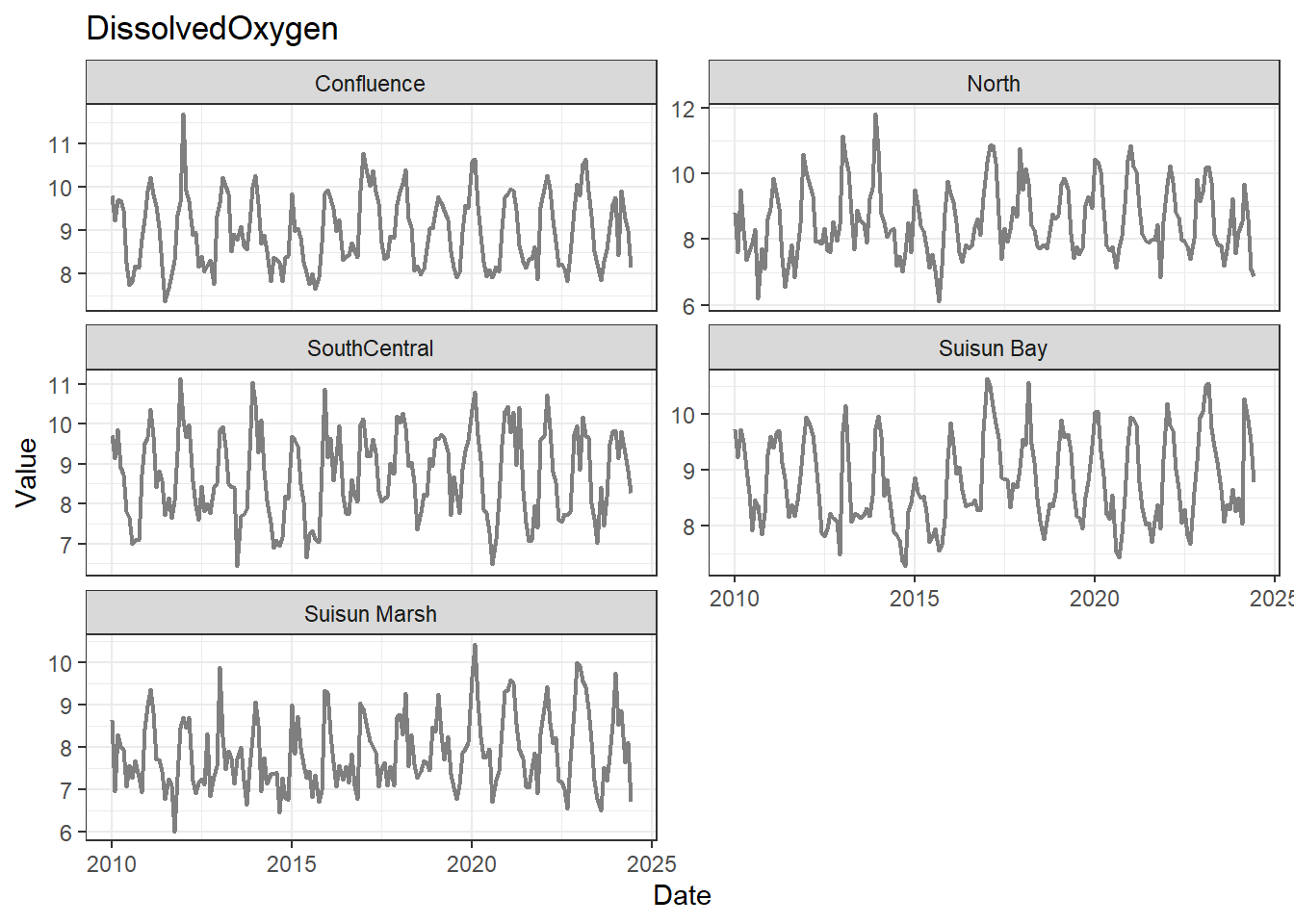
**No gaps:** Temperature, Salinity, Turbidity, DissolvedOxygen, Inflows
### Discussion
A few analytes can be used for the entire 01-2010 through 06-2024 time range:
- **Fully ready:** Temperature, Salinity, Turbidity, DissolvedOxygen, Inflows
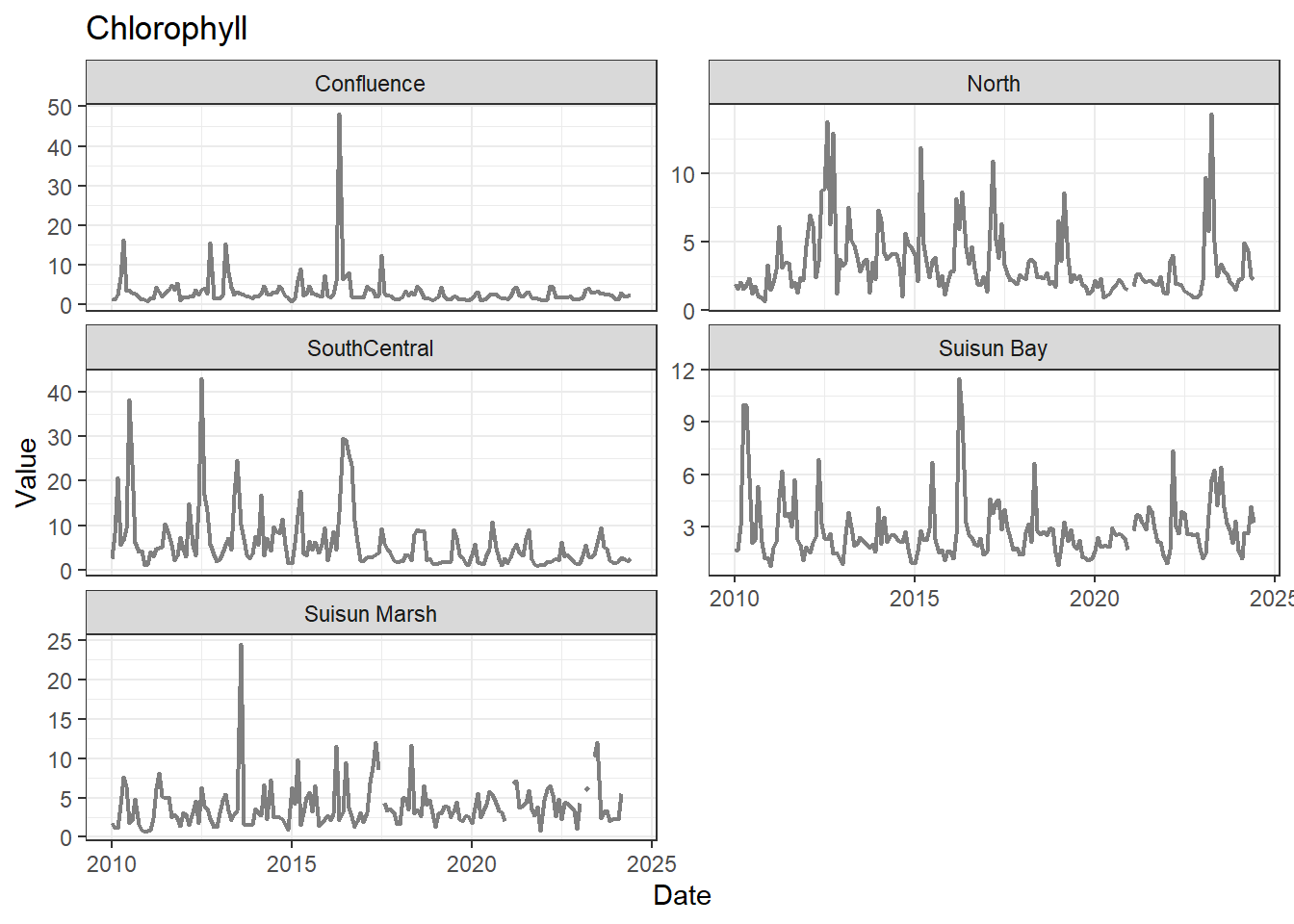
- **Possibly needs minor interpolation:** Chlorophyll
A few could be used for the entire range (with minor interpolation) for all regions except Suisun Marsh. The options are:
- cut the analysis range to begin on 02-2017
- remove Suisun Marsh from primary analyses, keep full range
- could run separately on narrower time frame
- analyze with full dataset, interpret with unbalanced design in mind
pH is missing data after 01-2023 for two regions; this feels like an error to me, so we might want to double check the original data. If not, the options are similar to above:
- cut the analysis range to end at 01-2023
- remove Suisun Marsh/Suisun Bay from primary analyses
- analyze with full dataset, interpret with unbalanced design in mind
MVI has multiple data gaps and some large, non-interpolable gaps. Options are similar to above. We also have chlorophyll data as a response variable to ground truth our results if analyses look off with MVI.
DissNitrate is missing large amounts of data and should be excluded.
## Visualize distributions
Next, I'm removing columns I won't be using for simplicity.
```{r}
df_monthly_rm <- df_monthly %>%
  select(-c(DissNitrate, DON, Microcystis, SJR_Inflow, Sac_Inflow, TKN, TotPhos))
```
Now I look at the shape of variable distributions to get a sense of what the data looks like.
```{r}
df_plt <- df_monthly_rm %>%
  pivot_longer(
    cols = DissAmmonia:Total_Inflow,
    names_to = 'Analyte',
    values_to = 'Value'
  )

ggplot(df_plt, aes(x = Value)) +
  geom_histogram(
    color = 'black',
    fill = 'lightgray'
  ) +
  facet_wrap(~Analyte, scales = 'free')
```
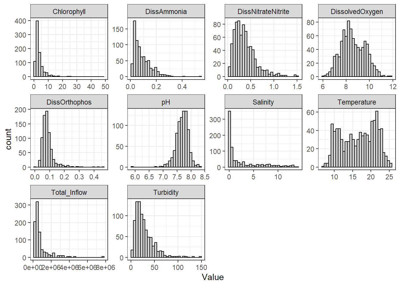
They're pretty much all right-skewed to various degrees, except for Temperature (which almost appears bivariate) and pH, which is slightly left skewed. A few graphs, such as chlorophyll and pH, indicate outliers exist.
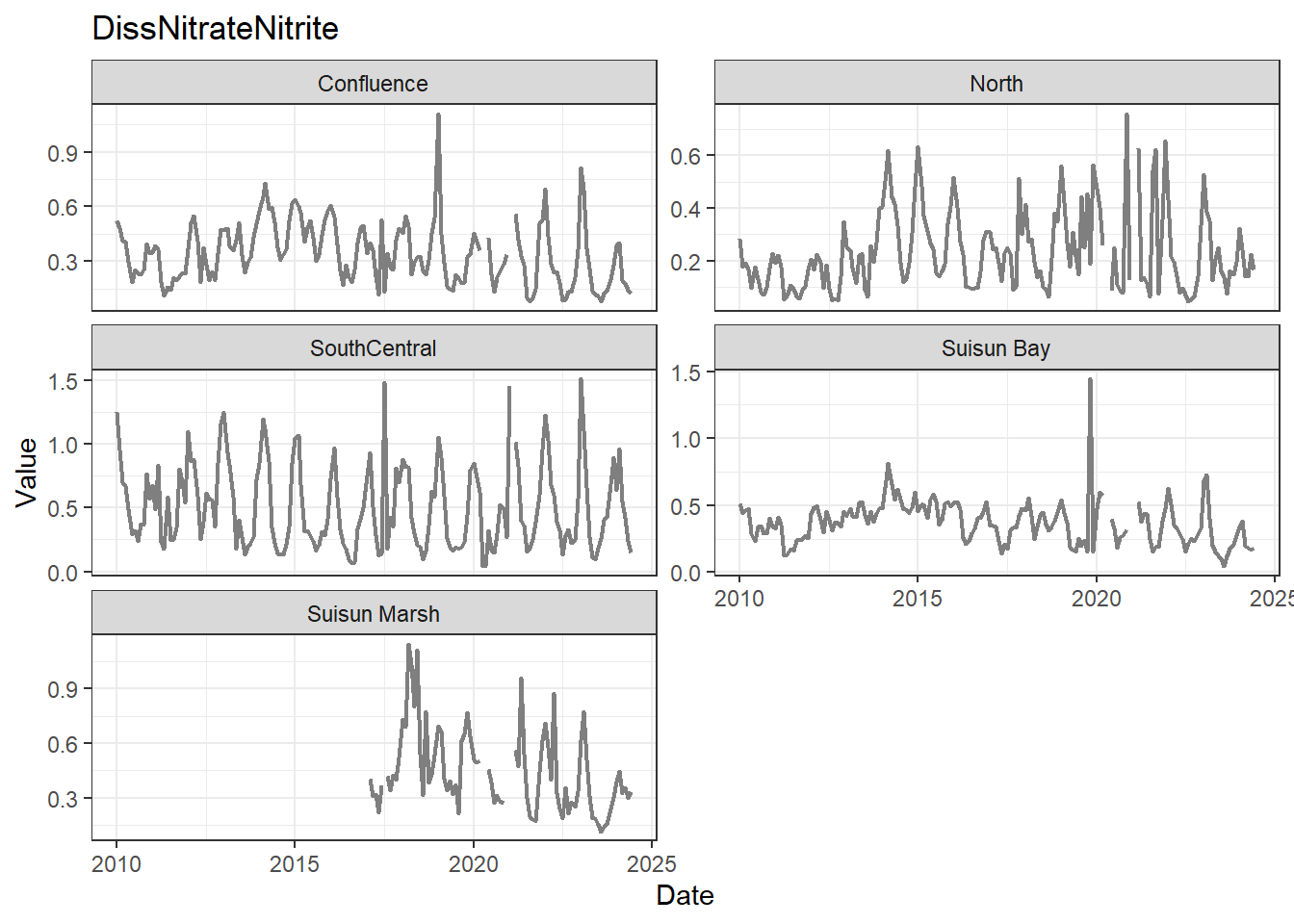
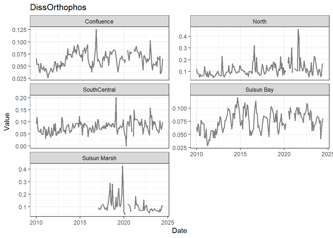
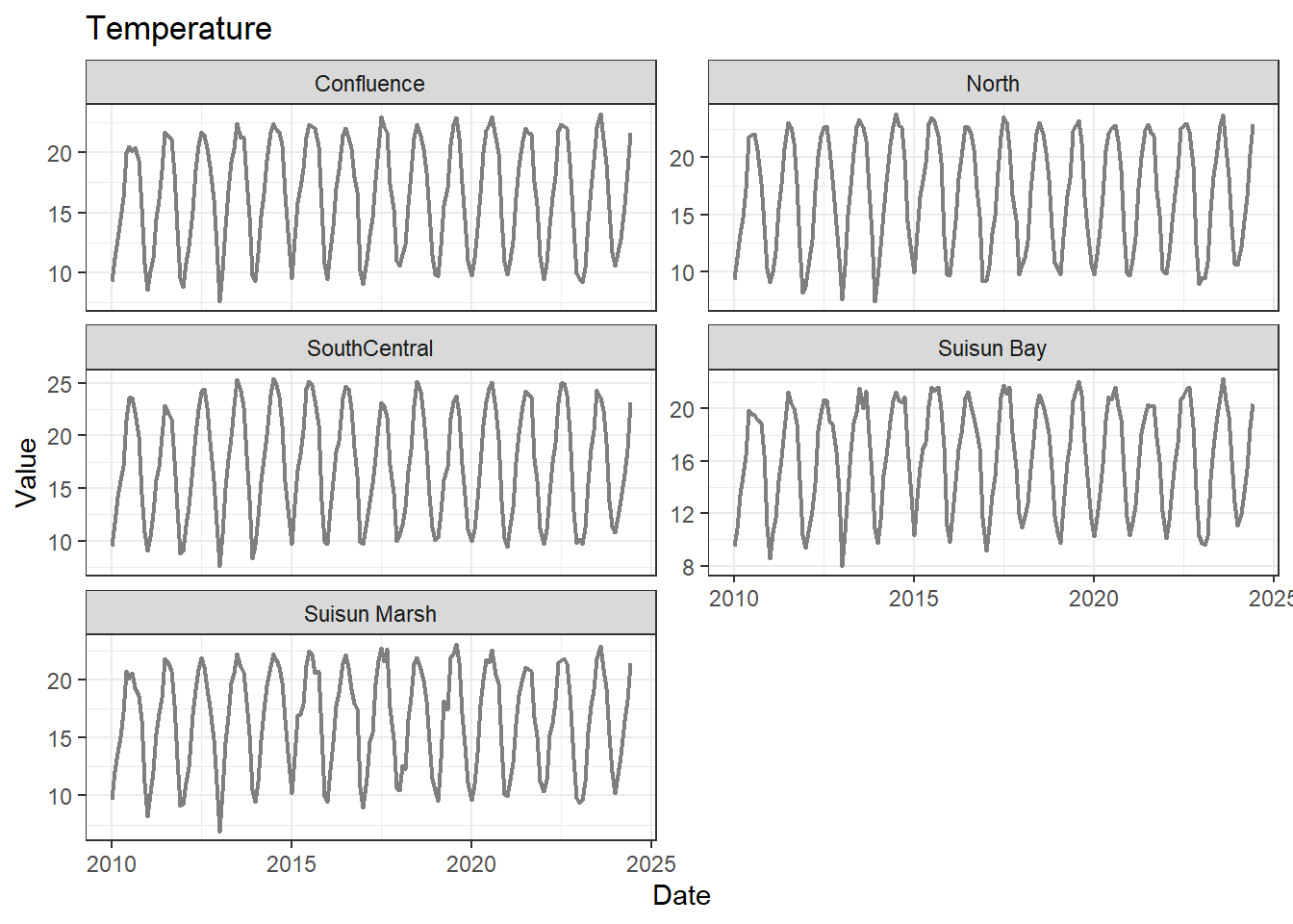
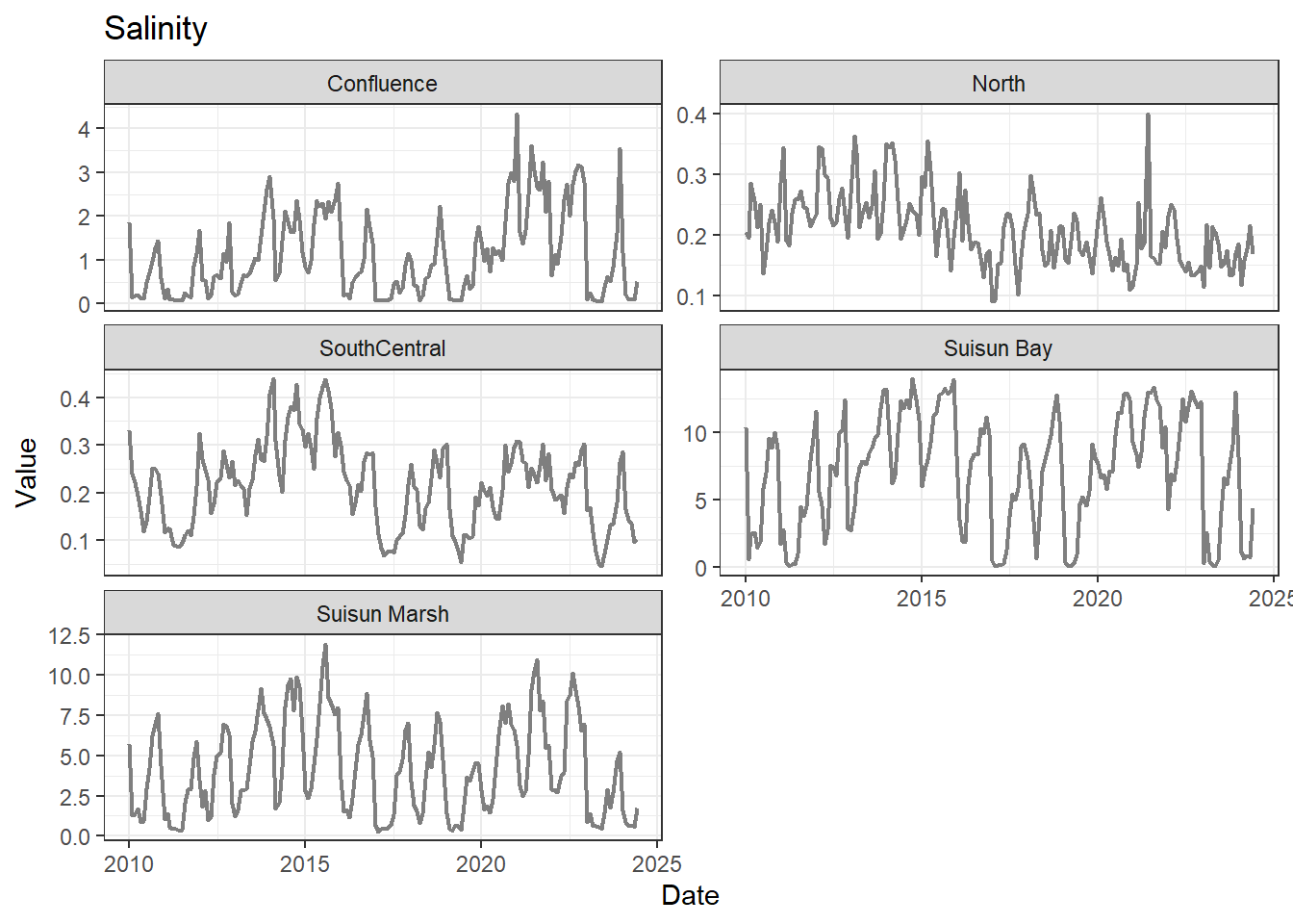
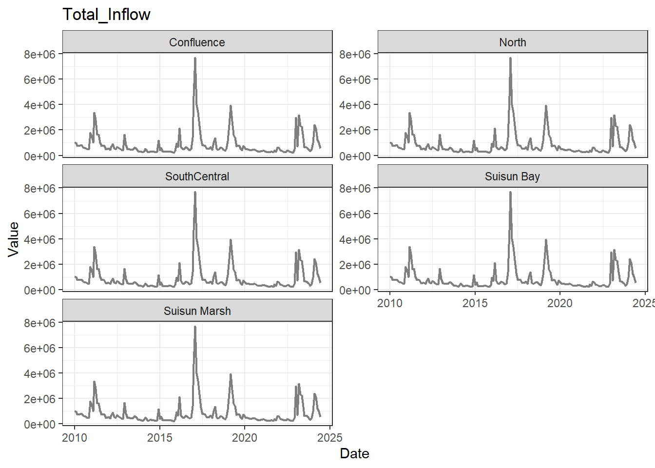
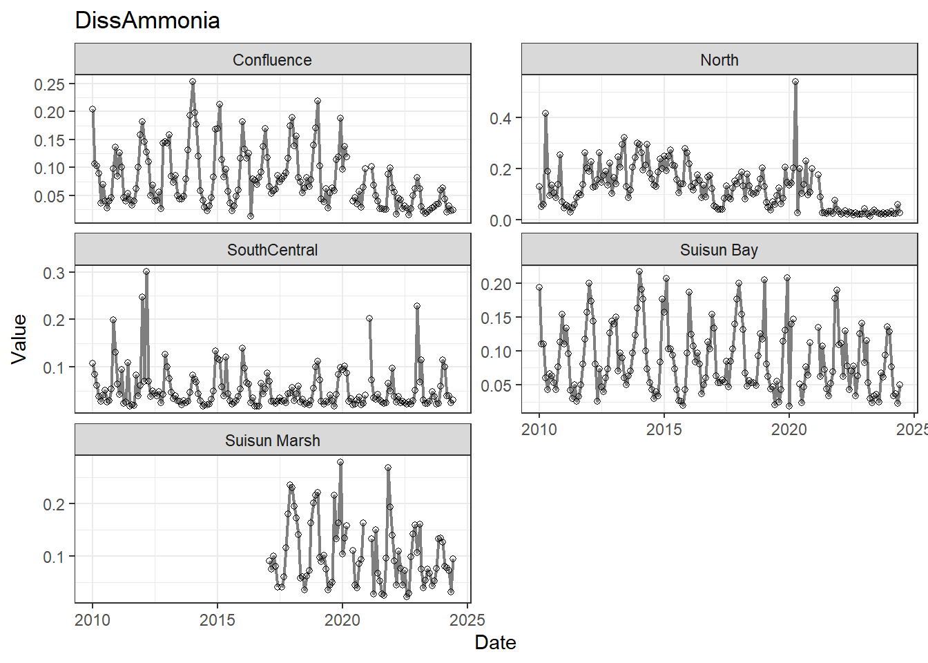
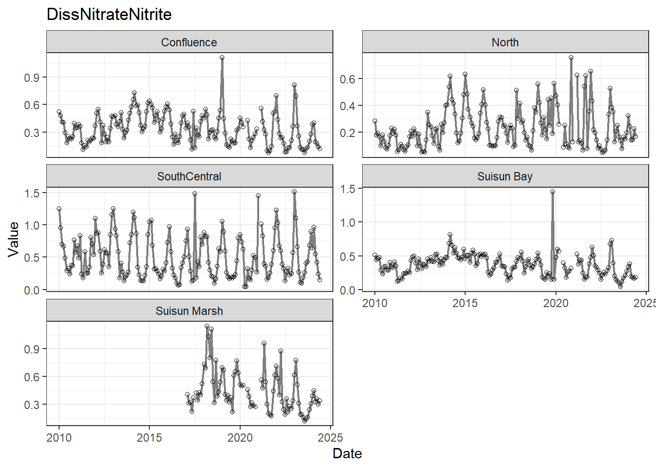
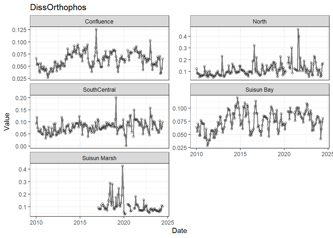
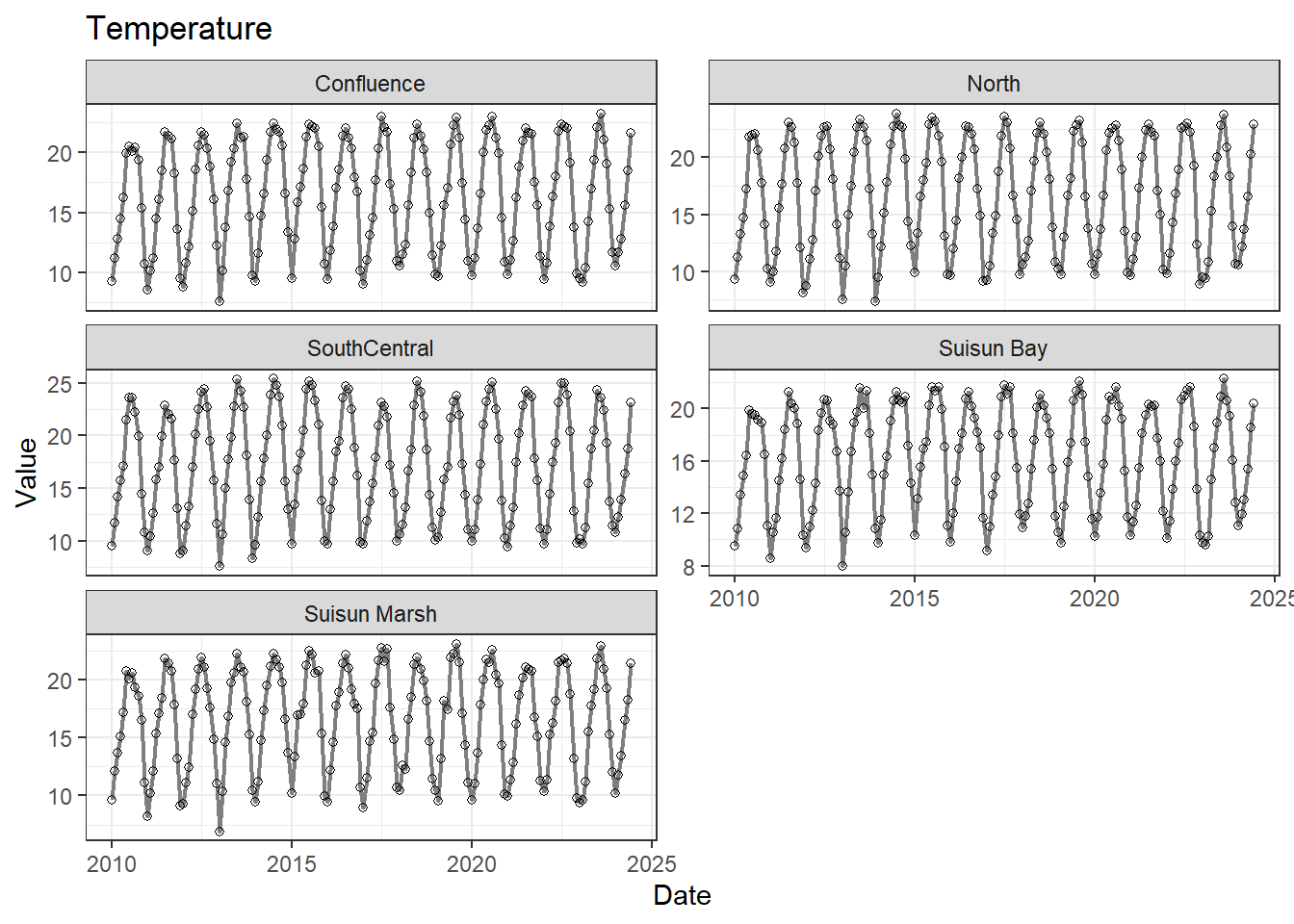
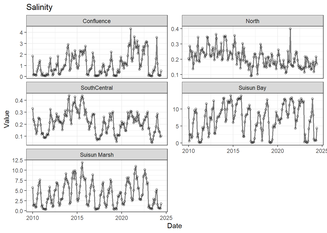
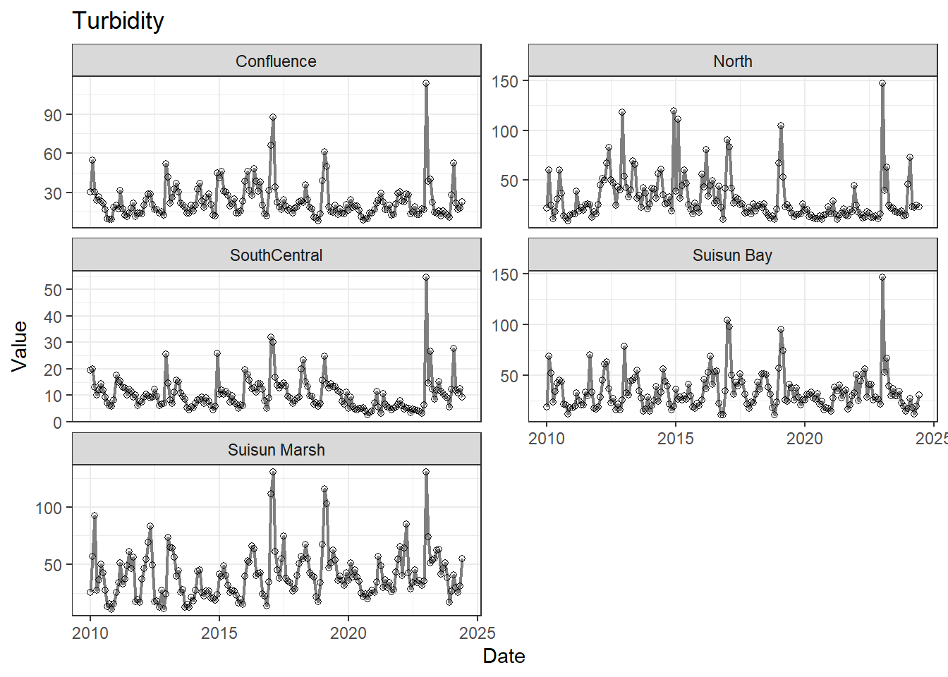
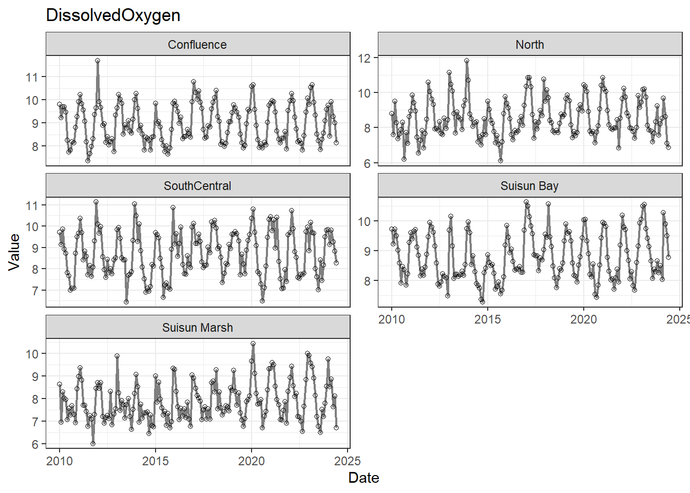
## Visualize time series
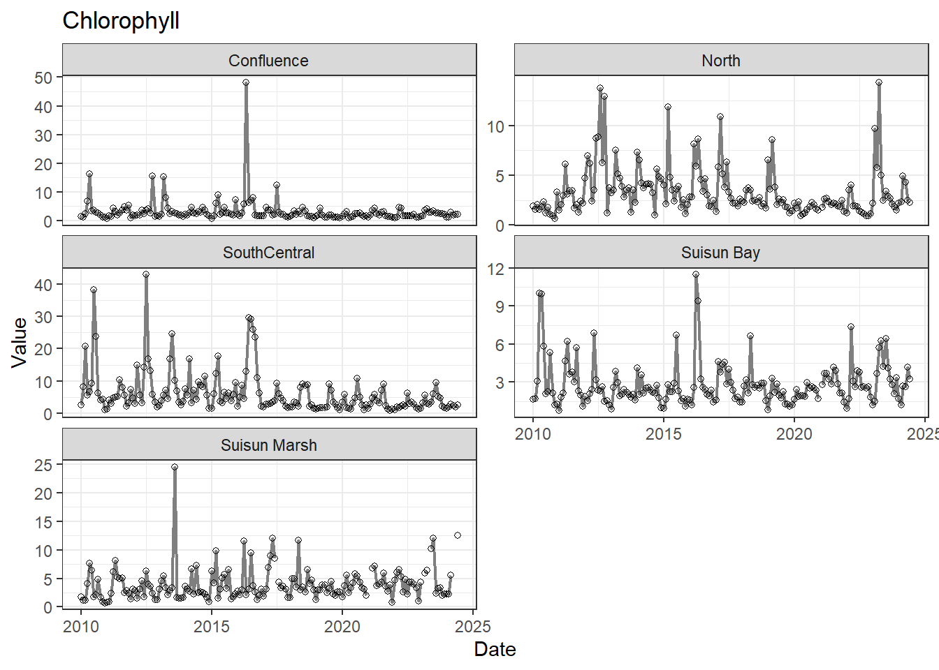
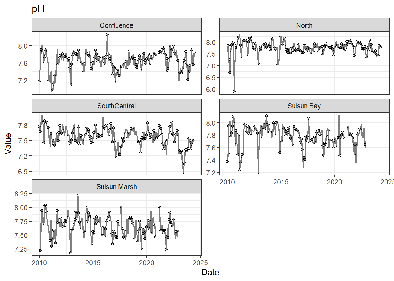
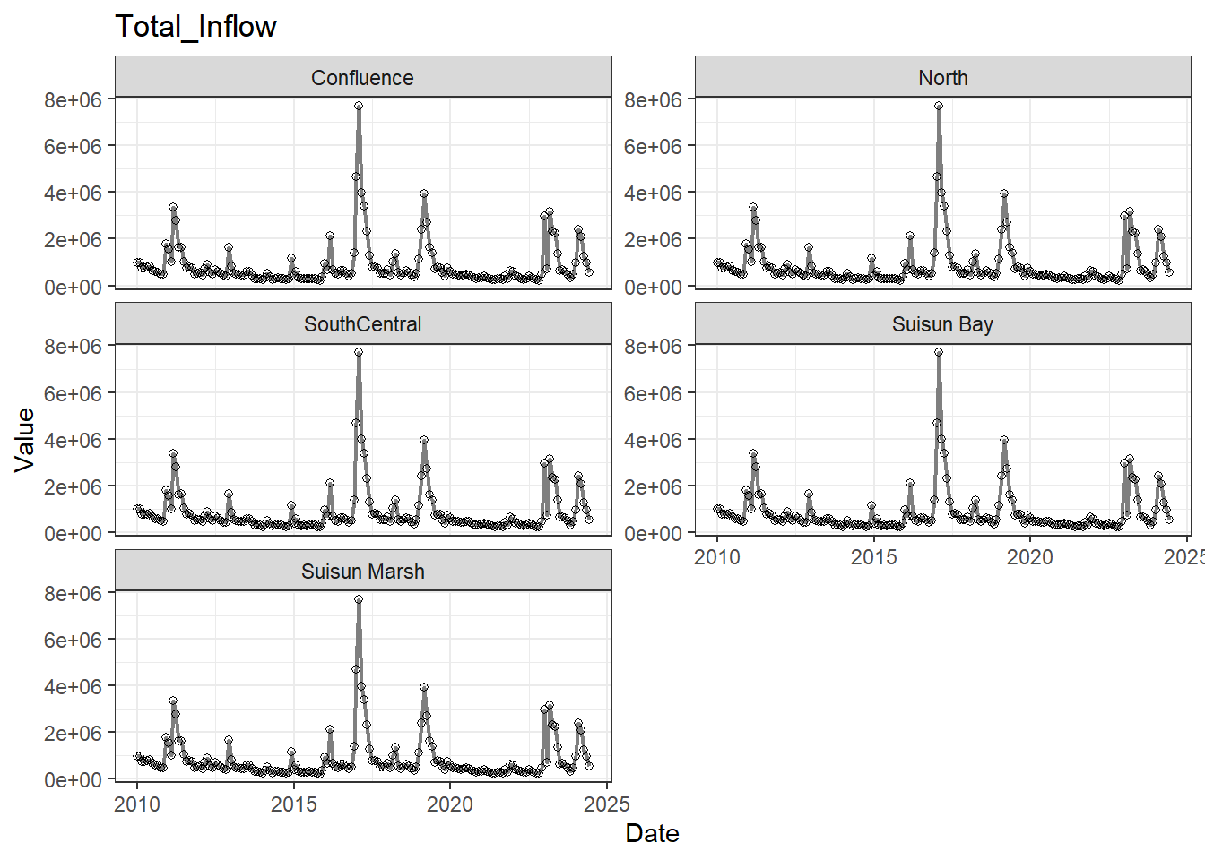
If your data has a time component, it's also useful to look at a time series of the analytes.
```{r}
# no points
for (a in unique(df_plt$Analyte)) {
  p <- df_plt %>%
    filter(Analyte == a) %>%
    ggplot(aes(x = Date, y = Value)) +
    geom_line(color = 'gray50', linewidth = 0.8, na.rm = TRUE) +
    facet_wrap(~Region, scales = 'free_y', ncol = 2) +
    labs(title = a)

  print(p)
}
```
```{r}
# with points
for (a in unique(df_plt$Analyte)) {
  p <- df_plt %>%
    filter(Analyte == a) %>%
    ggplot(aes(x = Date, y = Value)) +
    geom_line(color = 'gray50', linewidth = 0.8, na.rm = TRUE) +
    geom_point(shape = 21, na.rm = TRUE) +
    facet_wrap(~Region, scales = 'free_y', ncol = 2) +
    labs(title = a)

  print(p)
}
```
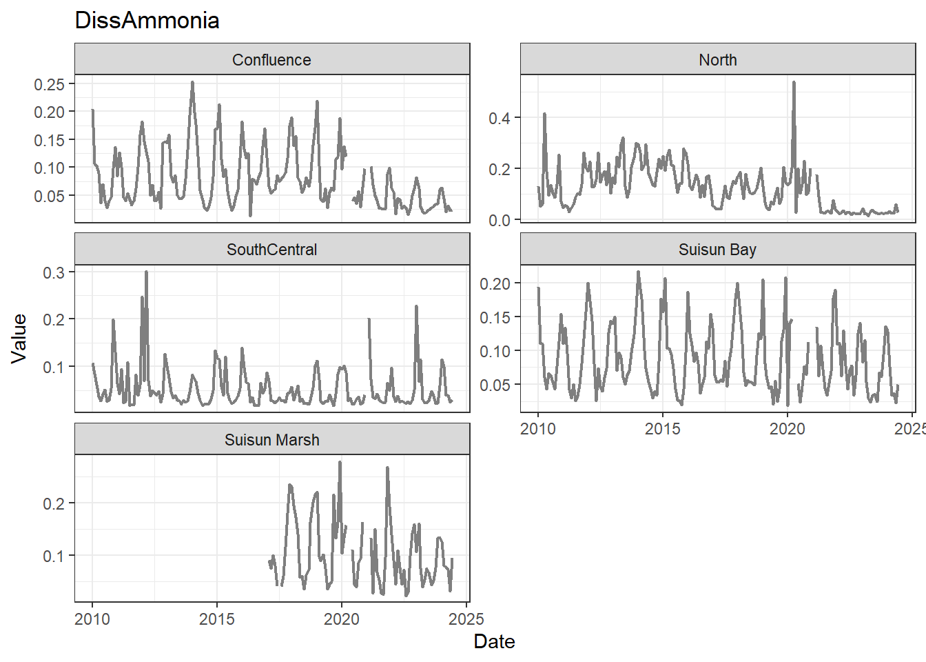
These are especially useful for identifying seasonal patterns within the data.
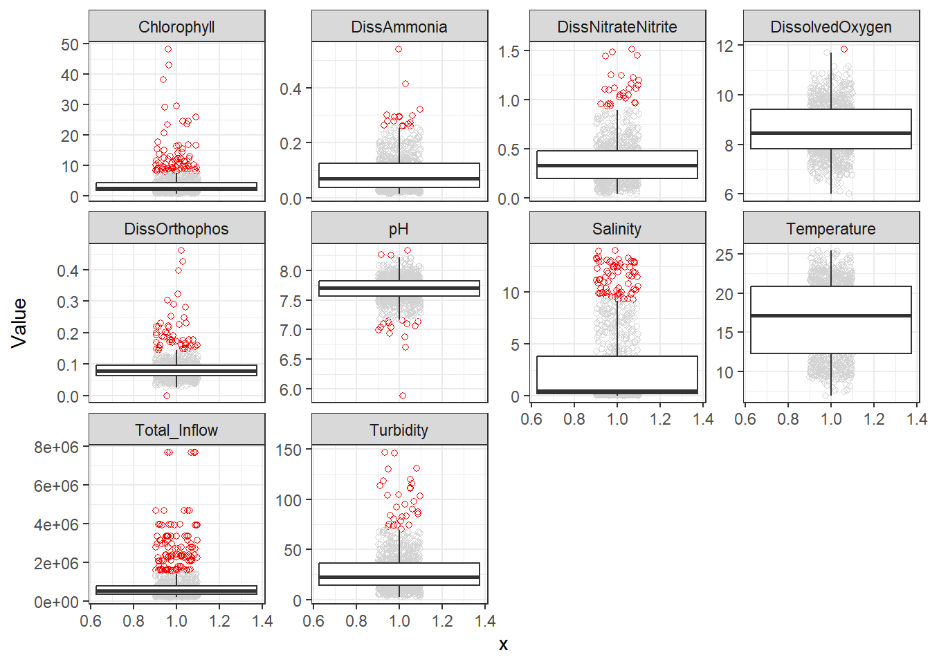
## Visualize outliers
Next, I like to note extreme outliers. Even if they're real data, they can negatively influence regressions either by influencing the coefficients or inflating the error.
If later on (eg. after model diagnostics) I decide to remove any of these, this is where I'd do it.
```{r}
df_plt <- df_plt %>%
  group_by(Analyte) %>%
  mutate(
    Q1  = quantile(Value, 0.25, na.rm = TRUE),
    Q3  = quantile(Value, 0.75, na.rm = TRUE),
    IQR = Q3 - Q1,
    is_outlier = Value < (Q1 - 1.5 * IQR) | Value > (Q3 + 1.5 * IQR)
  ) %>%
  ungroup()

ggplot(df_plt, aes(x = 1, y = Value)) +
  geom_jitter(
    aes(color = ifelse(is_outlier, 'Outlier', 'Normal')),
    shape = 21,
    width = 0.1,
    na.rm = TRUE
  ) +
  scale_color_manual(
    values = c('Normal' = 'lightgray', 'Outlier' = 'red')
  ) +
  geom_boxplot(
    outlier.shape = NA,
    na.rm = TRUE
  ) +
  facet_wrap(~Analyte, scales = 'free_y') +
  theme(legend.position = 'none')
```
There's a few outliers, though none I would remove outright. However, further on I decided I wanted to remove a few extreme DissAmmonia, pH, Chlorophyll, and DissOrthophos values (7 total), which I'll do here:
```{r}
df_monthly_rm <- df_monthly_rm %>%
  filter(!(DissAmmonia > 0.4 | pH < 6.5 | Chlorophyll > 35 | DissOrthophos < 0.01) |
           is.na(DissAmmonia) |
           is.na(pH) |
           is.na(Chlorophyll) |
           is.na(DissOrthophos))
```
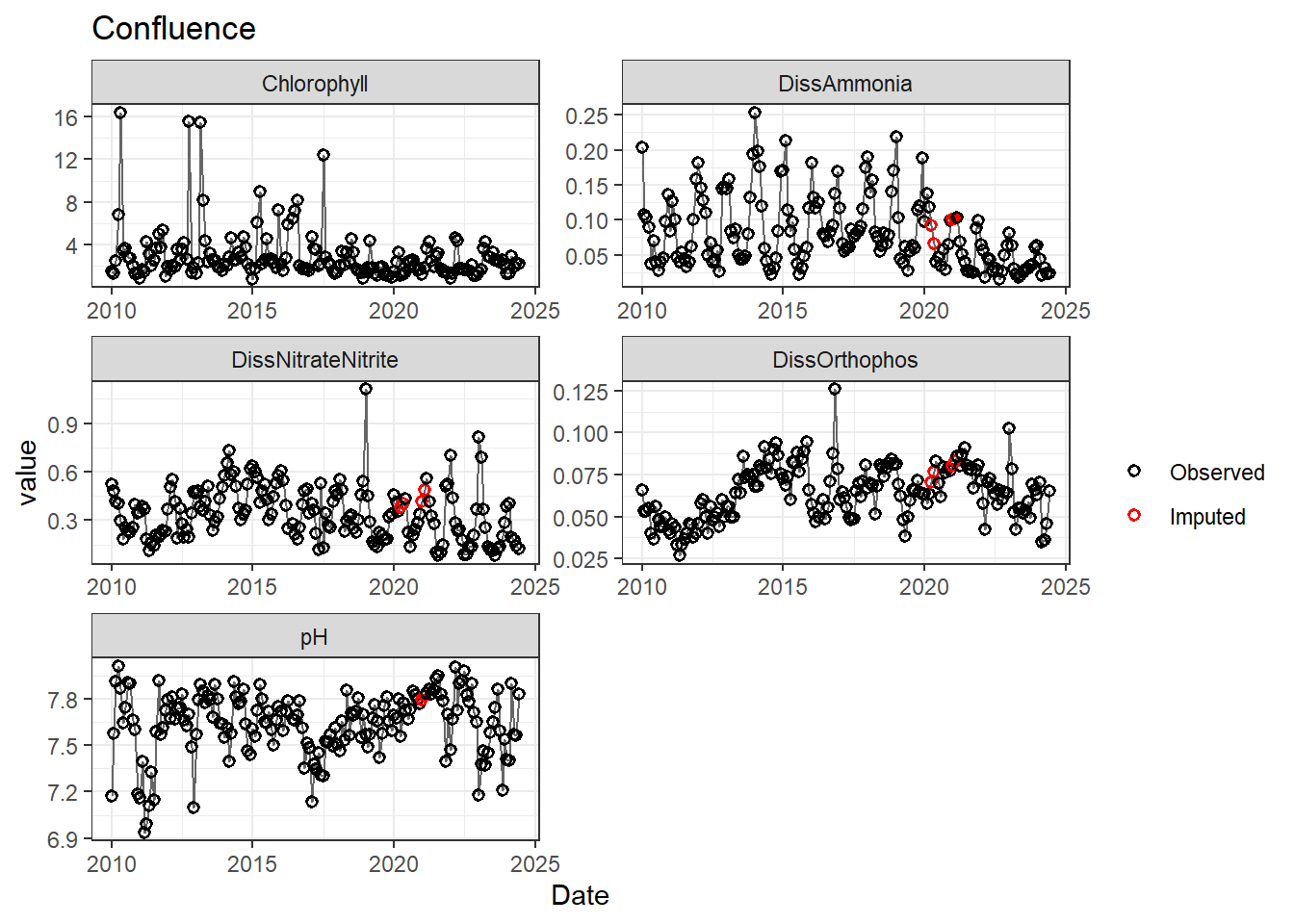
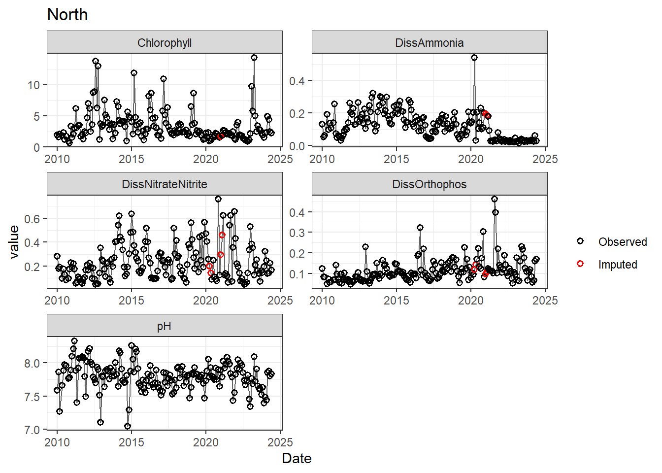
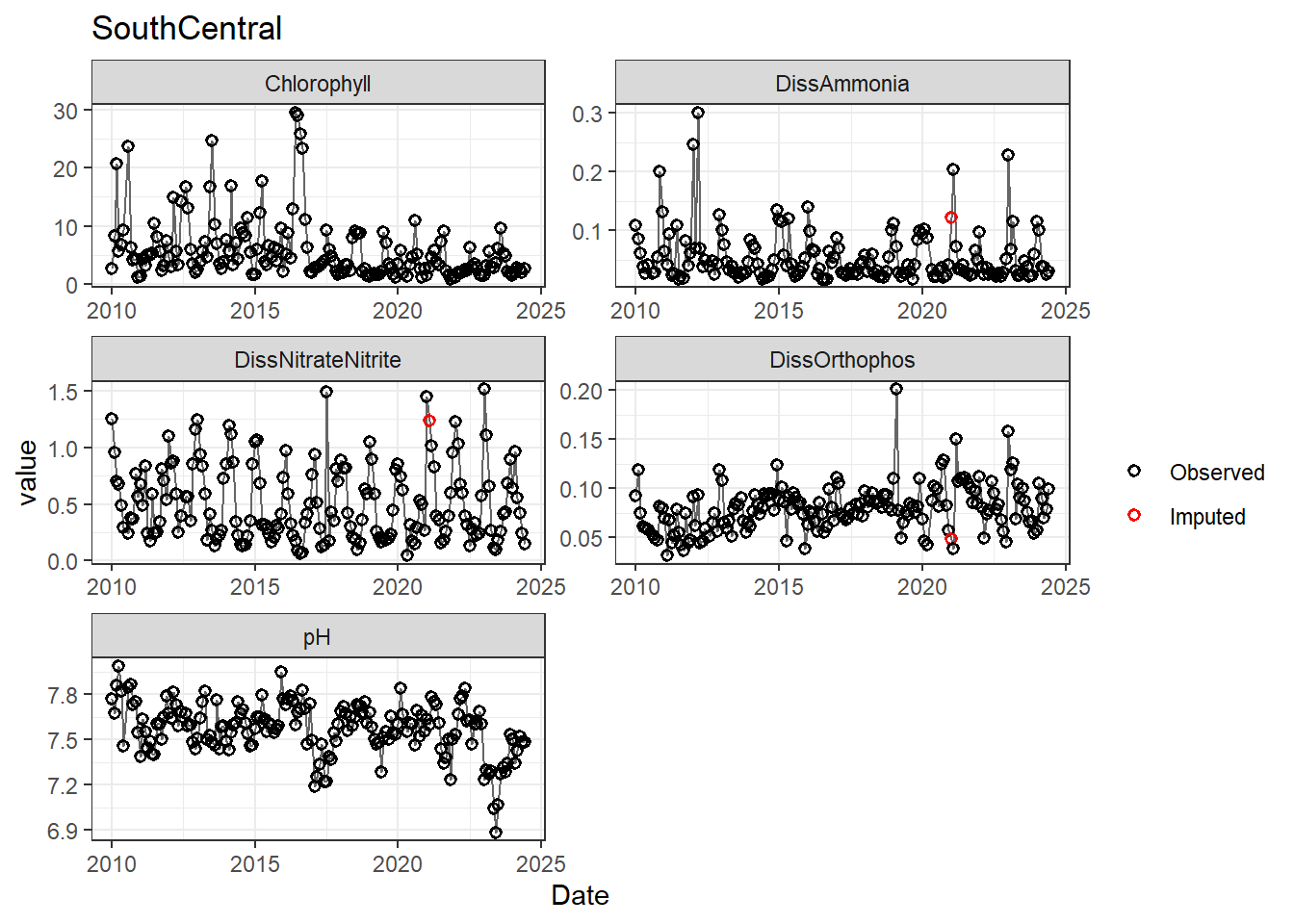
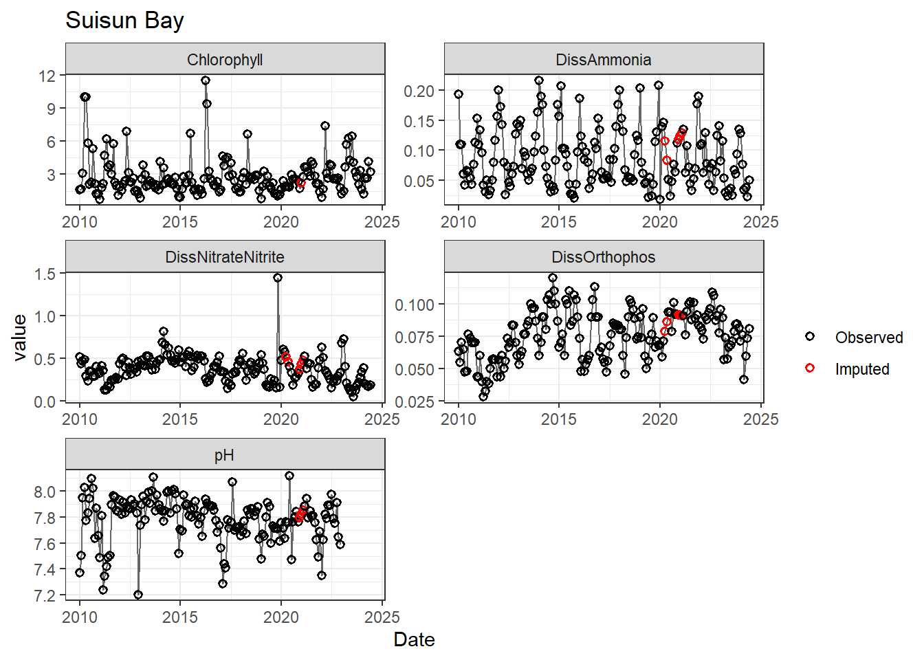
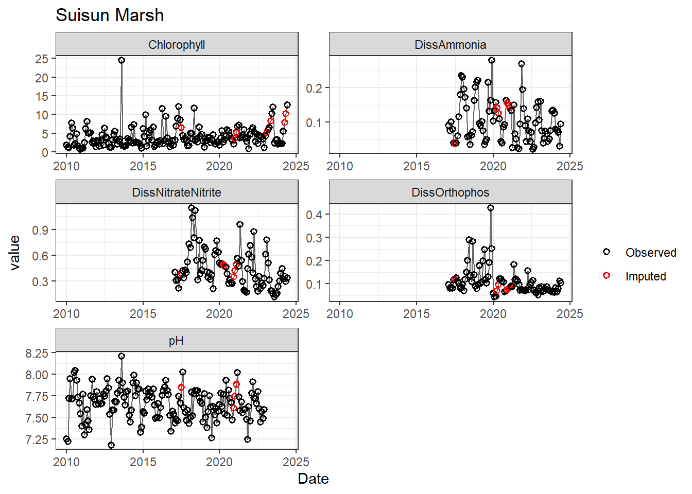
## Impute NAs (optional)
Next we'll impute missing data using a linear approximation. **If methods don't require a continuous, equally-spaced time series, this step is optional.** However, I like doing it (when feasible) to offset unbalanced design issues.
If your data has non-detects, make sure to uniformly impute those values between (slightly larger than) 0 and the reporting limit.
```{r}
df_monthly_imputed <- df_monthly_rm %>%
  arrange(Region, Date) %>%
  group_by(Region) %>%
  mutate(
    across(
      DissAmmonia:Total_Inflow,
      ~ is.na(.x),
      .names = 'imp_{.col}'
    ),
    across(
      DissAmmonia:Total_Inflow,
      ~ zoo::na.approx(.x, na.rm = FALSE),
      .names = '{.col}'
    )
  ) %>%
  ungroup()

values_long <- df_monthly_imputed %>%
  pivot_longer(
    cols = DissAmmonia:Total_Inflow,
    names_to = 'variable',
    values_to = 'value'
  )

flags_long <- df_monthly_imputed %>%
  pivot_longer(
    cols = starts_with('imp_'),
    names_to = 'flag_var',
    values_to = 'imp'
  ) %>%
  mutate(variable = sub('imp_', '', flag_var)) %>%
  select(Date, Region, variable, imp)

df_plot <- values_long %>%
  left_join(flags_long, by = c('Date', 'Region', 'variable'))

vars_imputed <- df_plot %>%
  group_by(variable) %>%
  summarise(any_imp = any(imp, na.rm = TRUE)) %>%
  filter(any_imp) %>%
  pull(variable)

regions <- unique(df_plot$Region)

for (r in regions) {
  p <- df_plot %>%
    filter(
      Region == r,
      variable %in% vars_imputed
    ) %>%
    ggplot(aes(Date, value)) +
      geom_line(color = 'gray40', linewidth = 0.5, na.rm = TRUE) +
      geom_point(aes(color = imp), size = 1.5, shape = 21, stroke = 0.8, na.rm = TRUE) +
      scale_color_manual(
        values = c('FALSE' = 'black', 'TRUE' = 'red'),
        labels = c('Observed', 'Imputed'),
        name = ''
      ) +
    labs(title = r) +
    facet_wrap(~ variable, scales = 'free', ncol = 2)

  print(p)
}
# clean dataframe
df_monthly_imputed <- df_monthly_imputed %>%
  select(-starts_with('imp_'))
```
# Exploratory Analysis (Relationships)
Next we can explore the relationships between our variables, primarily the response and its possible predictors, to determine what should go in our models.
Since SEMs are comprised of multiple "sub models", this step takes a while, since it's important to do this **for every response variable**. For simplicity, since log_Chlorophyll is my main response, I'll only examine it in these examples.
## Transform/modify data (optional)
If you know you're likely to transform/modify the data, you can do it here so you have those columns for further exploratory analysis. Here I:
- add log transforms: helps stabilize variance, fits certain data patterns
- add AR1 lag terms: this is so the previous time point can be used in regressions. I just do this for response variables (log_Chlorophyll and (for later) log_DissAmmonia).
```{r}
# log data
df_monthly_log <- df_monthly_imputed %>%
  mutate(
    across(
      DissAmmonia:Total_Inflow,
      ~ log(.x),
      .names = 'log_{.col}'
    )
  )

# add lags
df_monthly_log <- df_monthly_log %>%
  arrange(Region, Date) %>%
  group_by(Region) %>%
  mutate(
    lag_logChlorophyll = lag(log_Chlorophyll),
    lag_Chlorophyll = lag(Chlorophyll),
    lag_logDissAmmonia = lag(log_DissAmmonia)
  ) %>%
  ungroup() %>%
  relocate(c(Chlorophyll, log_Chlorophyll, Date),
         .after = last_col())
```
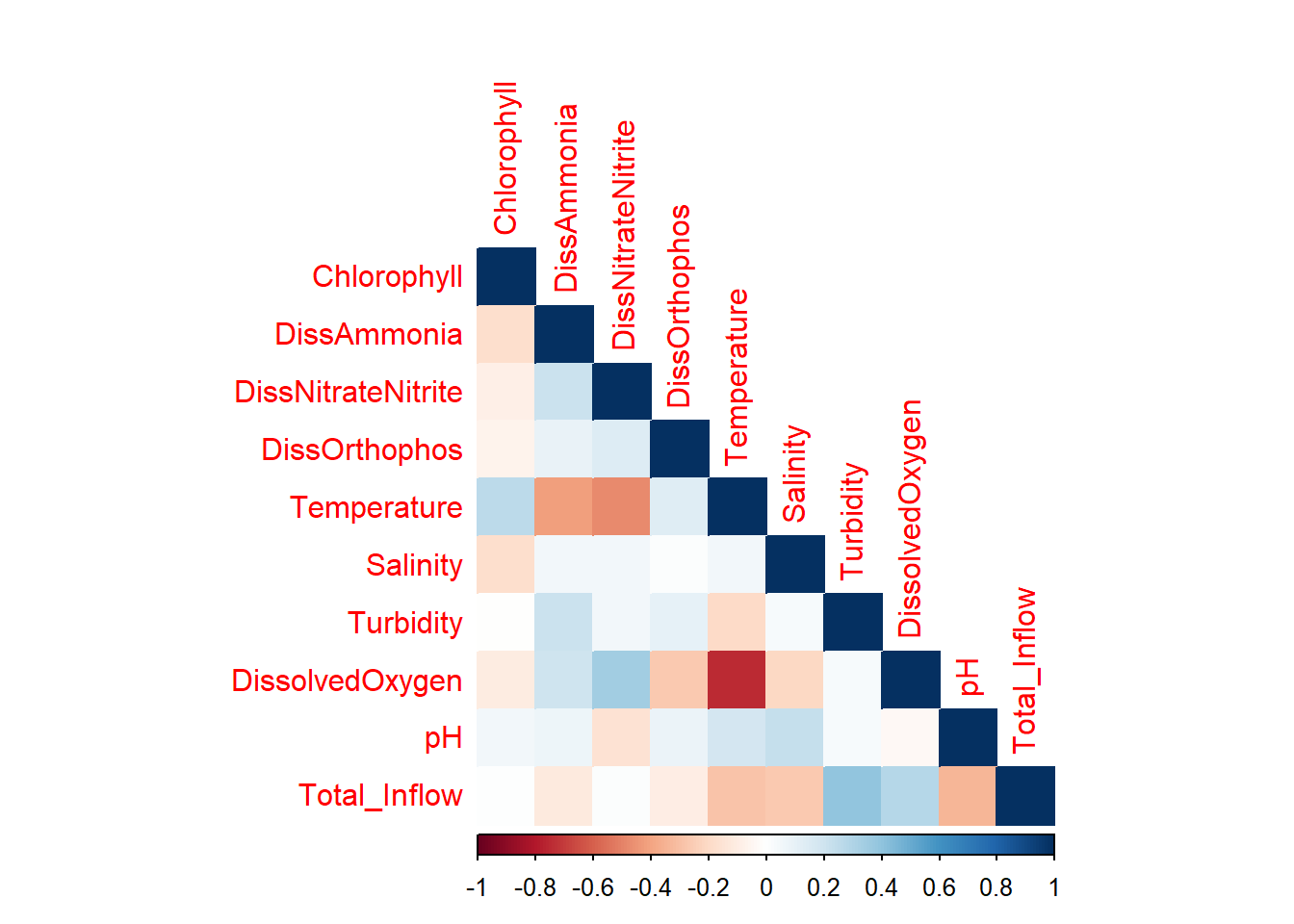
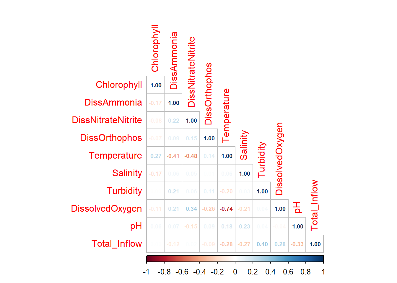
## Correlations
First we examine if any of our data is highly correlated (or not); high correlation between variables is an issue for causal inference models.
```{r}
corrplot::corrplot(
  cor(df_monthly_log %>% select(c(Chlorophyll,DissAmmonia:Total_Inflow)), use = 'pairwise.complete.obs'),
  method = 'color',
  type = 'lower',
  diag = TRUE
)
```
```{r}
corrplot::corrplot(
  cor(df_monthly_log %>% select(c(Chlorophyll,DissAmmonia:Total_Inflow)), use = 'pairwise.complete.obs'),
  method = 'number',
  number.cex = 0.6,
  type = 'lower',
  diag = TRUE
)
```
DissolvedOxygen and Temperature are strongly negatively correlated; DO is also correlated with DissNitrateNitrite. Temp is also slightly correlated with DissAmmonia and, more strongly, DissNitrateNitrite. DON/DissNitrateNitrite and Turbidity/Total Inflow are moderately correlated, which makes sense.
The strong DissolvedOxygen/Temperature relationship likely warrants further investigation (ie. determining their relationship/causal structure with respect to other variables).
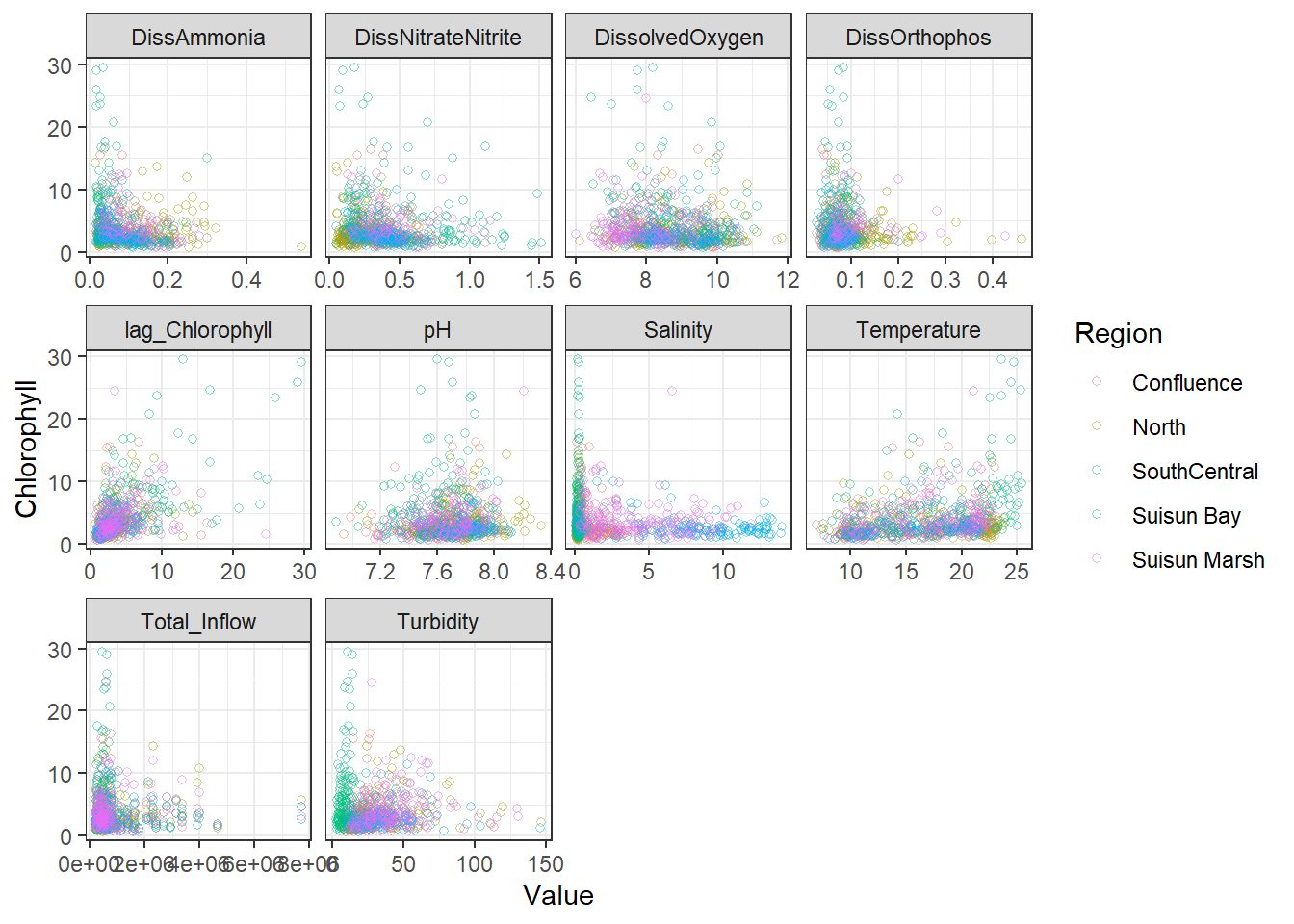
## Bivariate Plots (Continuous)
Next we graph our explanatory variables against our response variable. I like to look at the raw points (to get a true sense of the data) and interpolated splines to understand the functional relationship.
I ended up using log_Chlorophyll as my response, but kept the Chlorophyll graphs for reference.
```{r}
df_plt <- df_monthly_log %>%
  pivot_longer(
    cols = c(DissAmmonia:Total_Inflow, lag_Chlorophyll),
    names_to = 'Analyte',
    values_to = 'Value'
  )

df_plt_log <- df_monthly_log %>%
  pivot_longer(
    cols = c(log_DissAmmonia:log_Total_Inflow, lag_logChlorophyll),
    names_to = 'Analyte',
    values_to = 'Value'
  )
```
### Scatterplots
```{r}
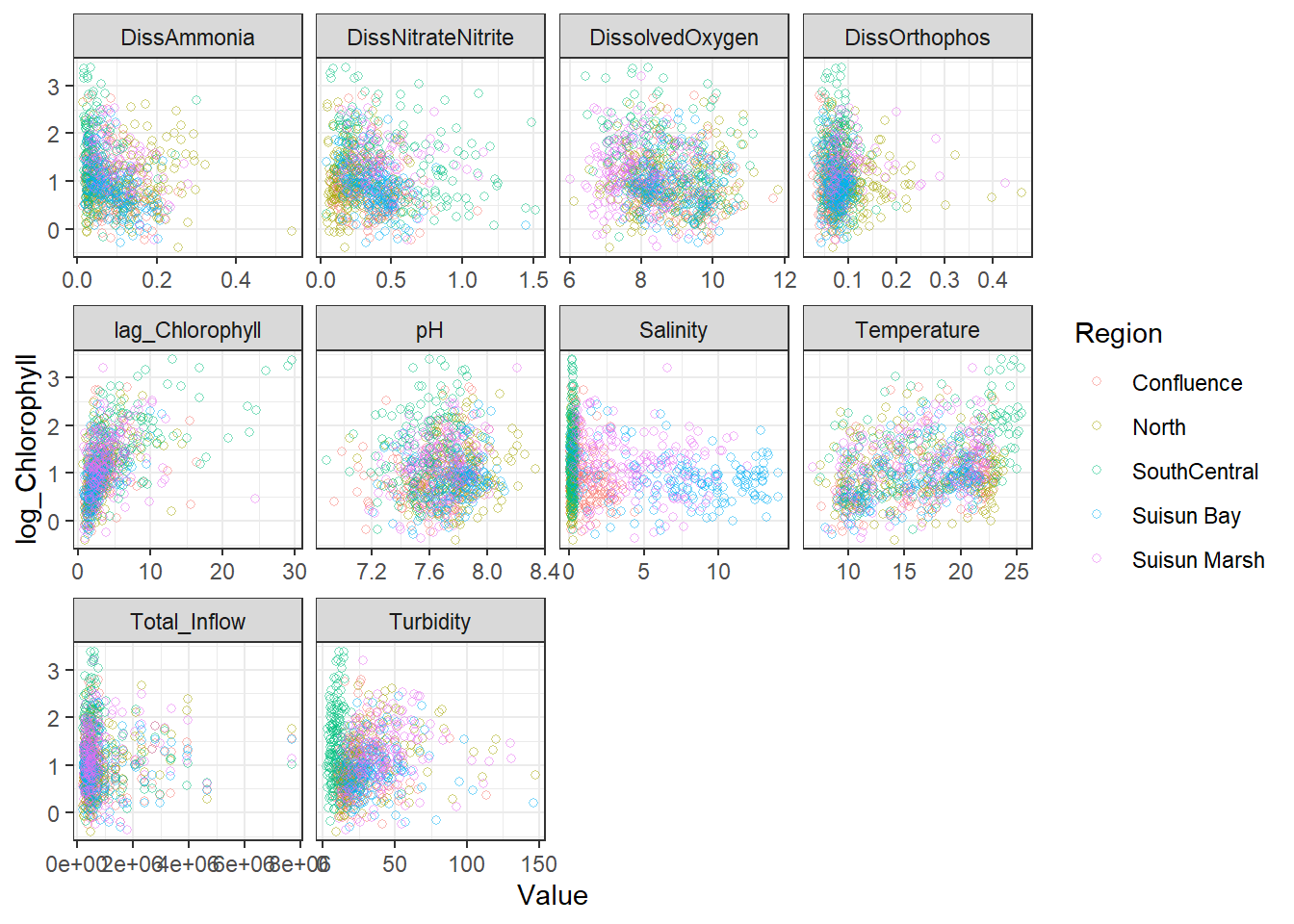
ggplot(df_plt) +
  geom_point(aes(Value, Chlorophyll, color = Region), shape = 21, alpha = 0.5) +
  facet_wrap(~Analyte, scales = 'free_x')
```
```{r}
ggplot(df_plt_log) +
  geom_point(aes(Value, Chlorophyll, color = Region), shape = 21, alpha = 0.5) +
  facet_wrap(~Analyte, scales = 'free_x')
```
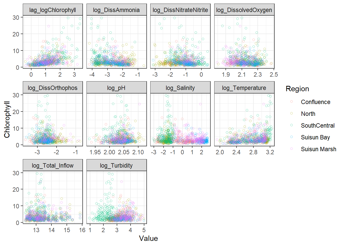
```{r}
ggplot(df_plt) +
  geom_point(aes(Value, log_Chlorophyll, color = Region), shape = 21, alpha = 0.5) +
  facet_wrap(~Analyte, scales = 'free_x')
```
```{r}
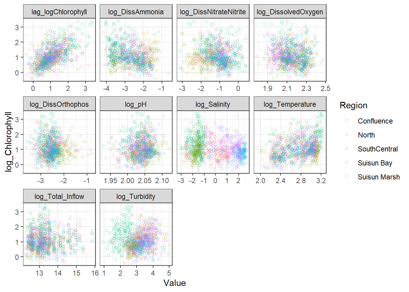
ggplot(df_plt_log) +
  geom_point(aes(Value, log_Chlorophyll, color = Region), shape = 21, alpha = 0.5) +
  facet_wrap(~Analyte, scales = 'free_x')
```
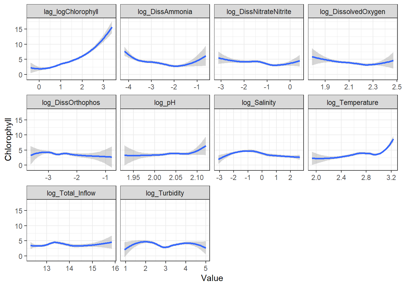
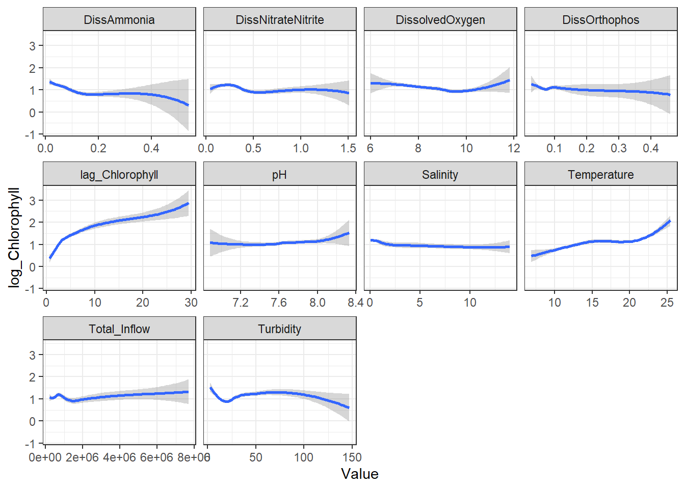
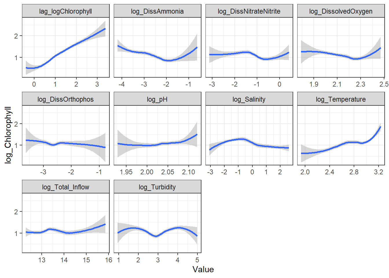
### Splines (Global)
```{r}
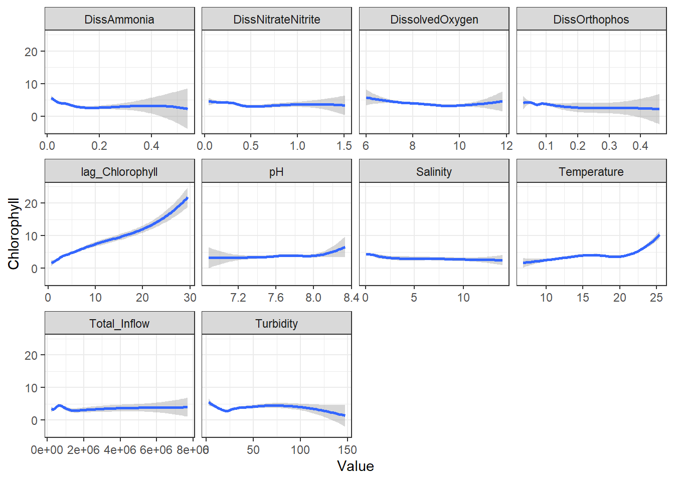
ggplot(df_plt) +
  geom_smooth(aes(Value, Chlorophyll)) +
  facet_wrap(~Analyte, scales = 'free_x')
```
```{r}
ggplot(df_plt_log) +
  geom_smooth(aes(Value, Chlorophyll)) +
  facet_wrap(~Analyte, scales = 'free_x')
```
```{r}
ggplot(df_plt) +
  geom_smooth(aes(Value, log_Chlorophyll)) +
  facet_wrap(~Analyte, scales = 'free_x')
```
```{r}
ggplot(df_plt_log) +
  geom_smooth(aes(Value, log_Chlorophyll)) +
  facet_wrap(~Analyte, scales = 'free_x')
```
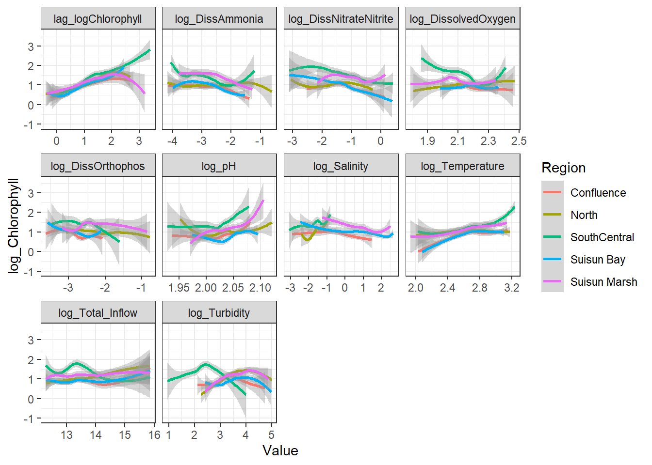
From these, I decided to keep log_DissAmmonia, log_Turbidity, and Temperature in my model. I also added log_DissOrthophosphate (since I think it's considered an important variable) and the response's lag term (lag_logChlorophyll) to account for autocorrelation. Note that Temperature appears to have a non-linear, almost cubic relationship with log_Chlorophyll.
I'm also adding log_Salinity, which is probably wrong, but it's useful for the SEM examples.
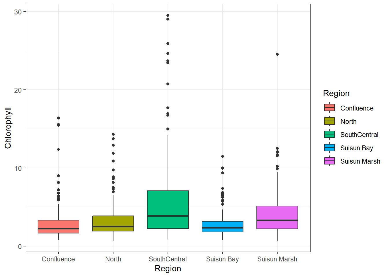
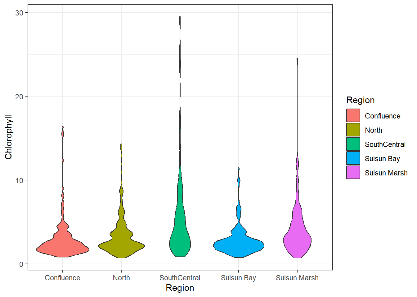
## Bivariate (Categorical)
It's also worth seeing how chlorophyll correlates with categorical variables, in this case Region:
```{r}
ggplot(df_plt) +
  geom_boxplot(aes(Region, Chlorophyll, fill = Region))
```
```{r}
ggplot(df_plt) +
  geom_violin(aes(Region, Chlorophyll, fill = Region))
```
South Central has the most variance, followed by Suisun Marsh. The other regions seem similarly distributed. Overall, the means are similar.
## Trivariate (Cat./Cont.)
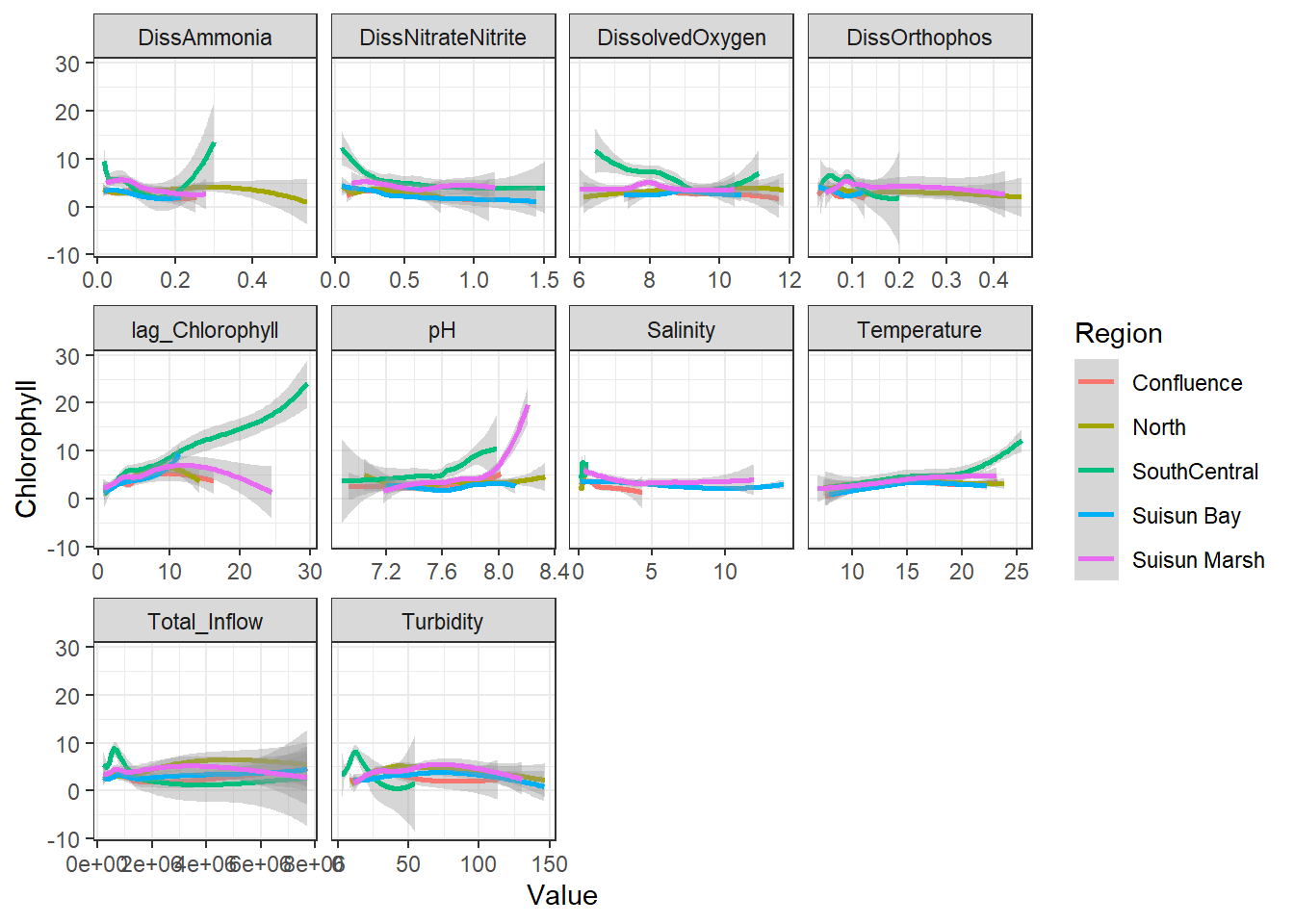
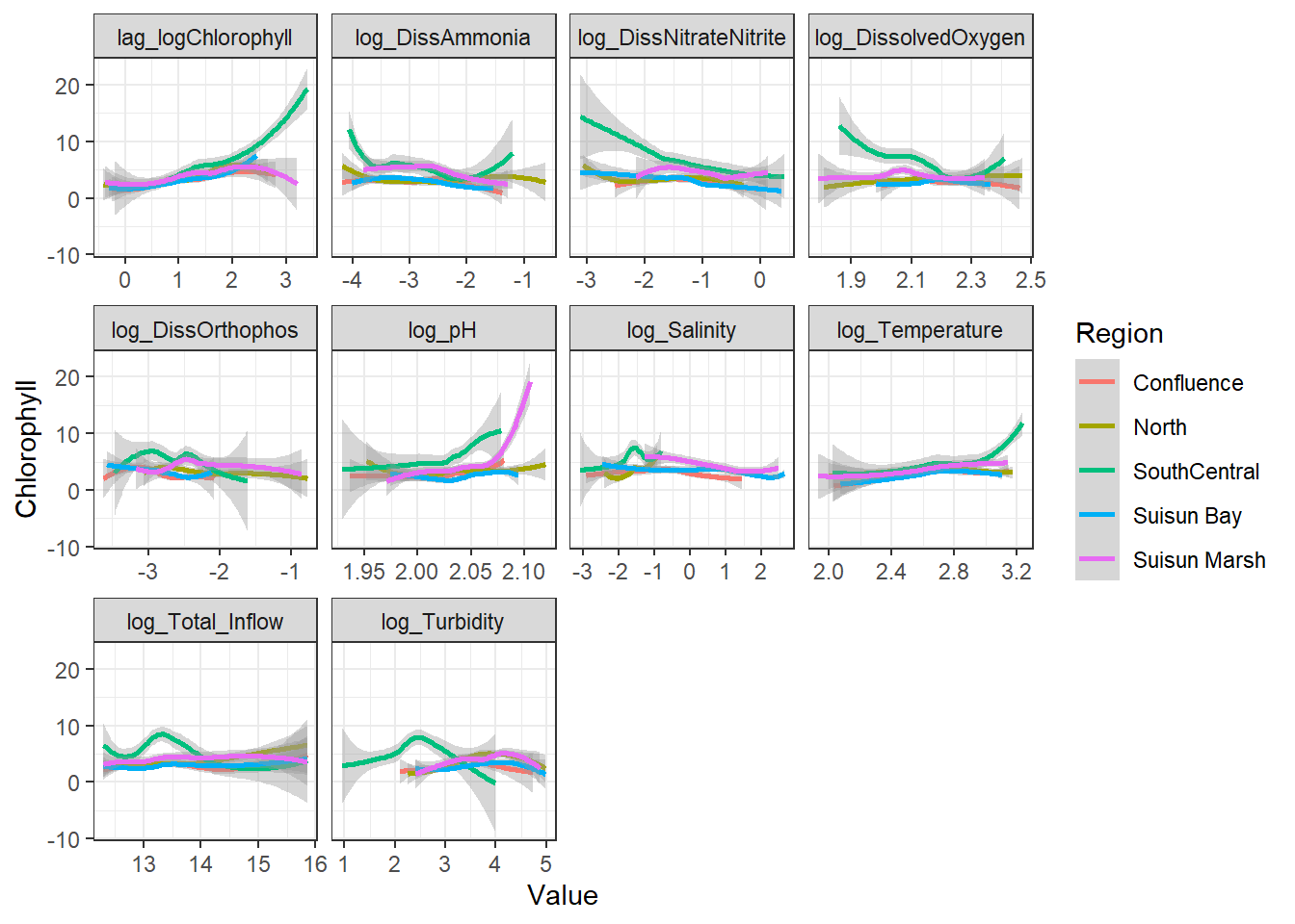
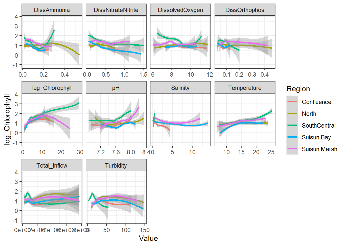
You can also visualize potential interaction effects between categorical and continuous variables (or cat:cat, though cont:cont is much more difficult; it's easier to choose those via background knowledge+model selection). If the relationship between the response and continuous predictor appears to change based on the categorical one, the interaction may be significant.
```{r}
ggplot(df_plt) +
  geom_smooth(aes(Value, Chlorophyll, color = Region)) +
  facet_wrap(~Analyte, scales = 'free_x')
```
```{r}
ggplot(df_plt_log) +
  geom_smooth(aes(Value, Chlorophyll, color = Region)) +
  facet_wrap(~Analyte, scales = 'free_x')
```
```{r}
ggplot(df_plt) +
  geom_smooth(aes(Value, log_Chlorophyll, color = Region)) +
  facet_wrap(~Analyte, scales = 'free_x')
```
```{r}
ggplot(df_plt_log) +
  geom_smooth(aes(Value, log_Chlorophyll, color = Region)) +
  facet_wrap(~Analyte, scales = 'free_x')
```
Here, no interaction effect particularly stands out. This makes sense, since Region is more of a grouping variable (which is why we'll likely use it as a random effect).
# Individual Models
Since SEMs are a series of related models (with shared covariance), it's worth checking each sub-model individually. For traditional SEMs, only `lm` (fixed effects) models can be used, though piecewiseSEM can handle other model types. Here, I used linear mixed effects models.
For simplicity, I subset the data from 02-01-2017 to 12-31-2022 to escape issues with unbalanced regional data. I also added three new variables: three basis splines for Temperature (essentially $T^1$, $T^2$, and $T^3$). This is so I can correctly model Temperature's likely non-linear dependence on Chlorophyll; with three terms, I'm assuming it's cubic. This is called *polynomial regression*.
I also remove some extreme outliers I found in the model.
```{r}
df_monthly_subset <- df_monthly_log %>%
  filter(Year < 2023 & Date > '2017-02-01')

df_monthly_subset <- df_monthly_subset %>%
  slice(-c(5, 337))

df_monthly_subset <- df_monthly_subset %>%
  mutate(
    Temp_poly = poly(Temperature, 3),
    Temp1 = Temp_poly[,1],
    Temp2 = Temp_poly[,2],
    Temp3 = Temp_poly[,3]
    )

# clean dataframe
df_monthly_subset <- df_monthly_subset %>%
  select(-contains('_poly'))

df_monthly_subset <- df_monthly_subset %>%
  drop_na(log_Chlorophyll, log_Salinity, log_DissAmmonia, log_DissOrthophos, log_Turbidity, lag_logChlorophyll, lag_logDissAmmonia, log_pH, log_Temperature)
```
### Note: Model Comparisons
Usually you help select an appropriate model via model comparison procedures such as `anova(mod1, mod2)` and looking at statistics such as AIC/BIC/log likelihood and/or doing likelihood ratio tests (as well as using background knowledge). I didn't here, though.
## LMM - Chla
### Testing/Training
*Usually not needed for causal inference, mostly just doing as a quick check that the model makes sense. Will re-run with full dataset.*
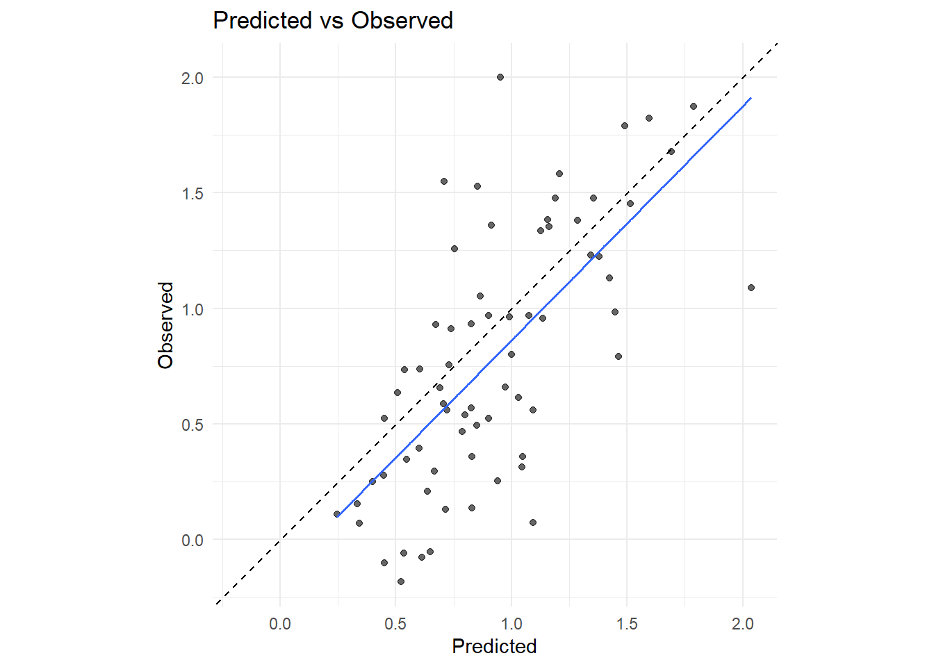
First I'll create a model based on training data and see how well it predicts my testing data. Temperature looked cubic to me, so I added cubic basis splines.
```{r}
# -- split testing/training --
sorted_dates <- sort(unique(df_monthly_subset$Date))

cut_idx <- floor(0.8 * length(sorted_dates))

train_dates <- sorted_dates[1:cut_idx]
test_dates  <- sorted_dates[(cut_idx + 1):length(sorted_dates)]

df_train <- df_monthly_subset %>% filter(Date %in% train_dates)
df_test  <- df_monthly_subset %>% filter(Date %in% test_dates)

# -- training model --
fit_chl <- lmer(
  log_Chlorophyll ~
    log_Salinity +
    log_DissAmmonia +
    log_DissOrthophos +
    log_Turbidity +
    lag_logChlorophyll +
    Temp1 +
    Temp2 +
    Temp3 +
    (1|Region),
  data = df_train,
  na.action = na.omit
)

summary(fit_chl)
# -- predicted model --
df_test <- df_test %>%
  drop_na(log_Chlorophyll, log_Temperature, log_DissAmmonia, log_Total_Inflow)

df_test <- df_test %>%
  mutate(pred_log_Chl = predict(fit_chl, newdata = df_test))

# -- plot --
rng <- range(c(df_test$pred_log_Chl, df_test$log_Chlorophyll), na.rm = TRUE)

ggplot(df_test, aes(x = pred_log_Chl, y = log_Chlorophyll)) +
  geom_point(alpha = 0.6) +
  geom_smooth(method = 'lm', se = FALSE, linewidth = 0.7) +
  geom_abline(intercept = 0, slope = 1, linetype = 'dashed') +
  coord_equal(xlim = rng, ylim = rng) +
  labs(
    x = 'Predicted',
    y = 'Observed',
    title = 'Predicted vs Observed'
  ) +
  theme_minimal()
```
Looks pretty good! It does overestimate, but it's a consistent offset and not horribly off.
Next is model diagnostics:
```{r}
RMSE <- sqrt(mean((df_test$log_Chlorophyll - df_test$pred_log_Chl)^2))
MAE  <- mean(abs(df_test$log_Chlorophyll - df_test$pred_log_Chl))
bias <- mean(df_test$pred_log_Chl - df_test$log_Chlorophyll)

print(RMSE); print(MAE); print(bias)
```
```{r}
varcomp <- as.data.frame(VarCorr(fit_chl))
var_re  <- varcomp$vcov[varcomp$grp == 'Region']
var_res <- varcomp$vcov[varcomp$grp == 'Residual']

ICC <- var_re / (var_re + var_res)

print(ICC)
```
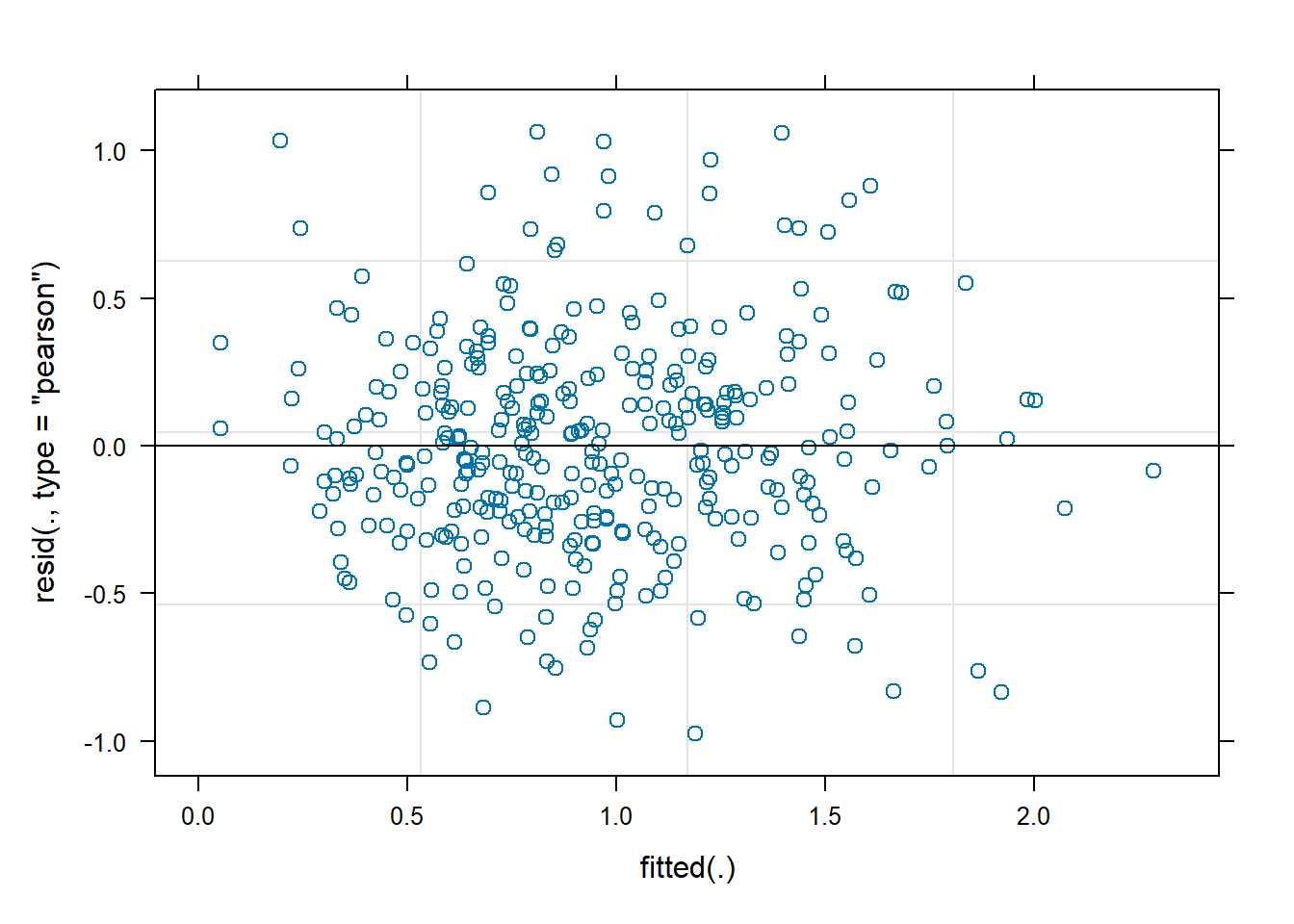
```{r}
plot(fit_chl)
```
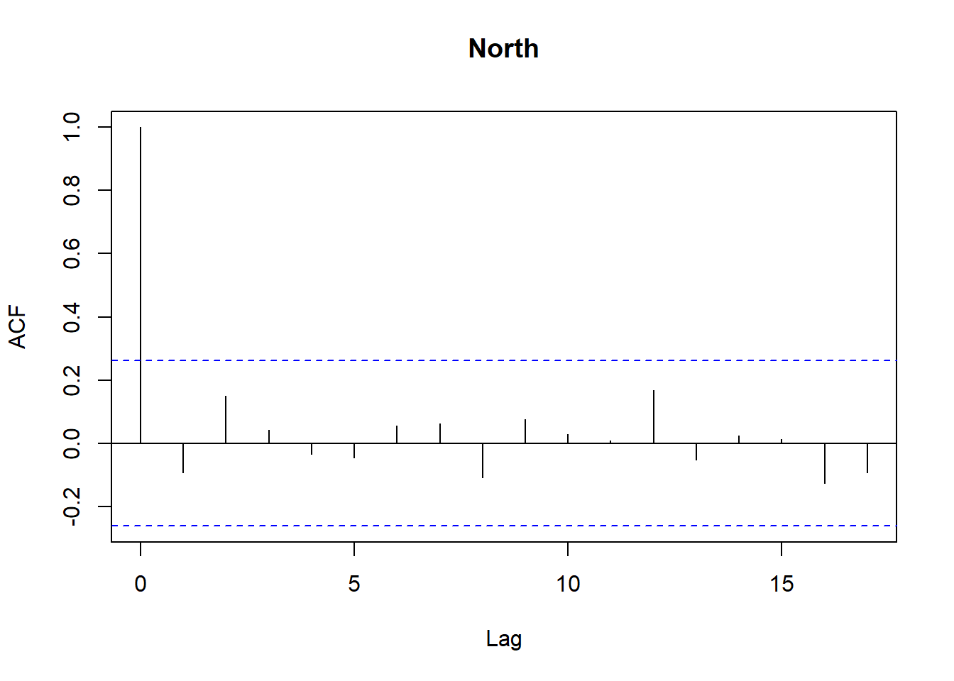
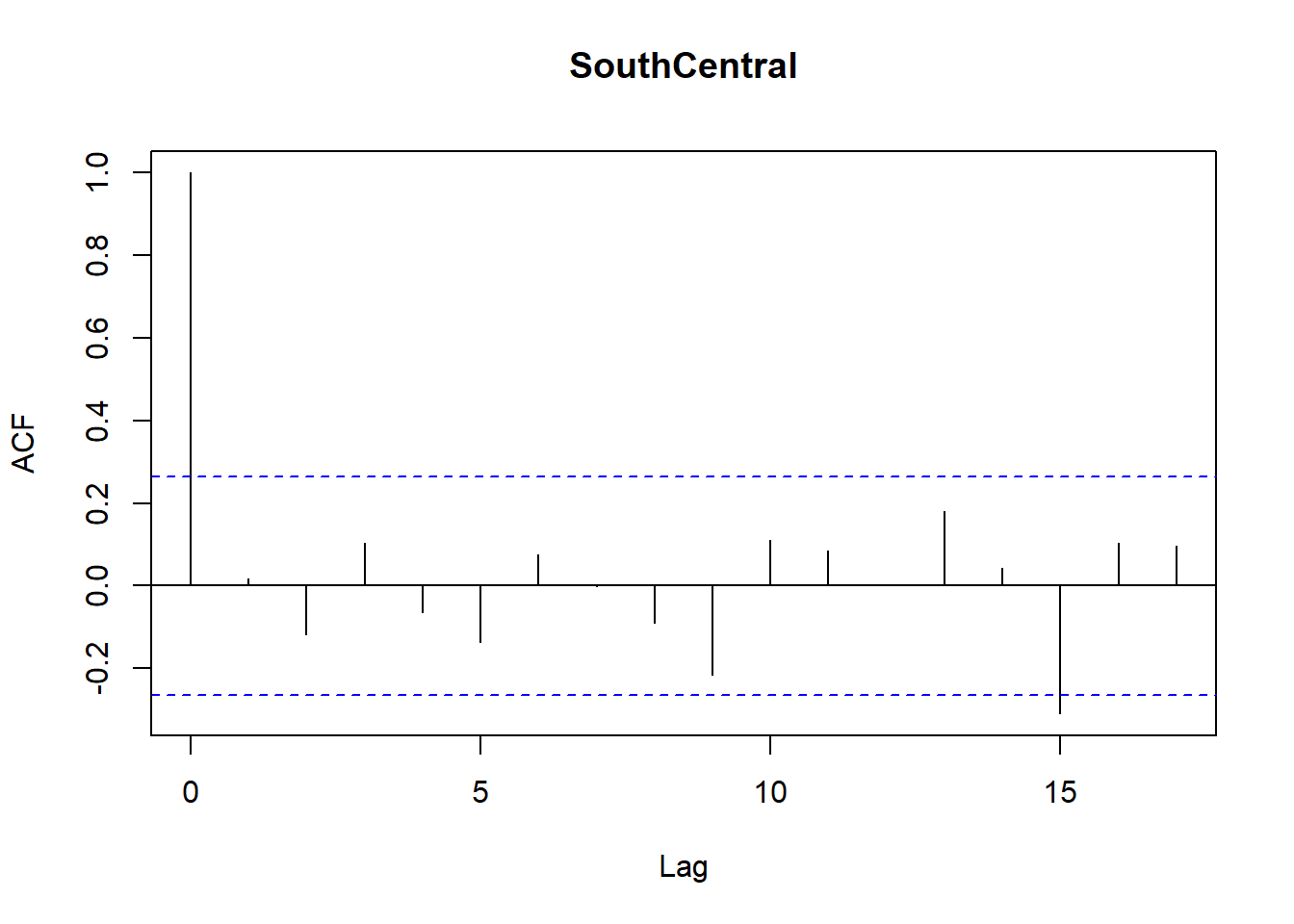
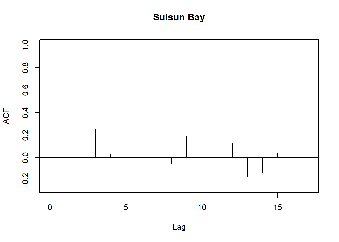
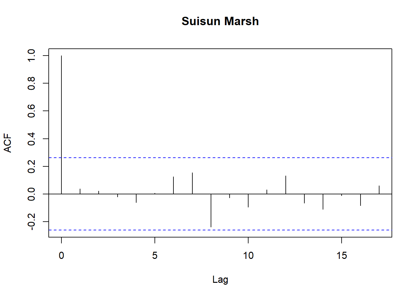
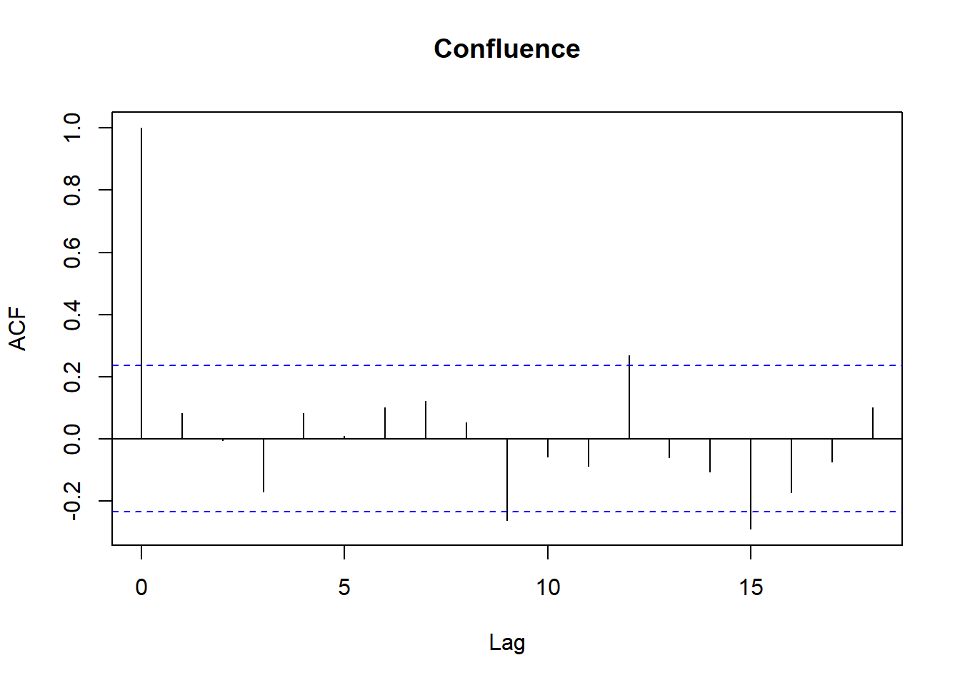
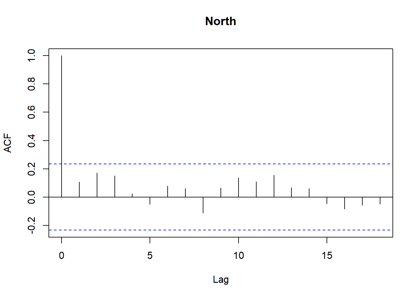
```{r}
res <- residuals(fit_chl)

df_res <- df_train
df_res$resid <- res

regions <- unique(df_res$Region)
n <- length(regions)

for (r in regions) {
  tmp <- df_res$resid[df_res$Region == r]
  acf(tmp,
      main = paste(r),
      na.action = na.pass)
}
```
```{r}
infl <- check_outliers(fit_chl)
infl
```
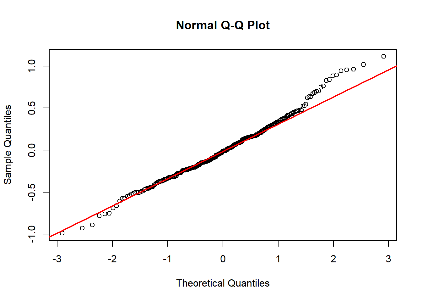
```{r}
res <- residuals(fit_chl)

qqnorm(res)
qqline(res, col = 'red', lwd = 2)
```
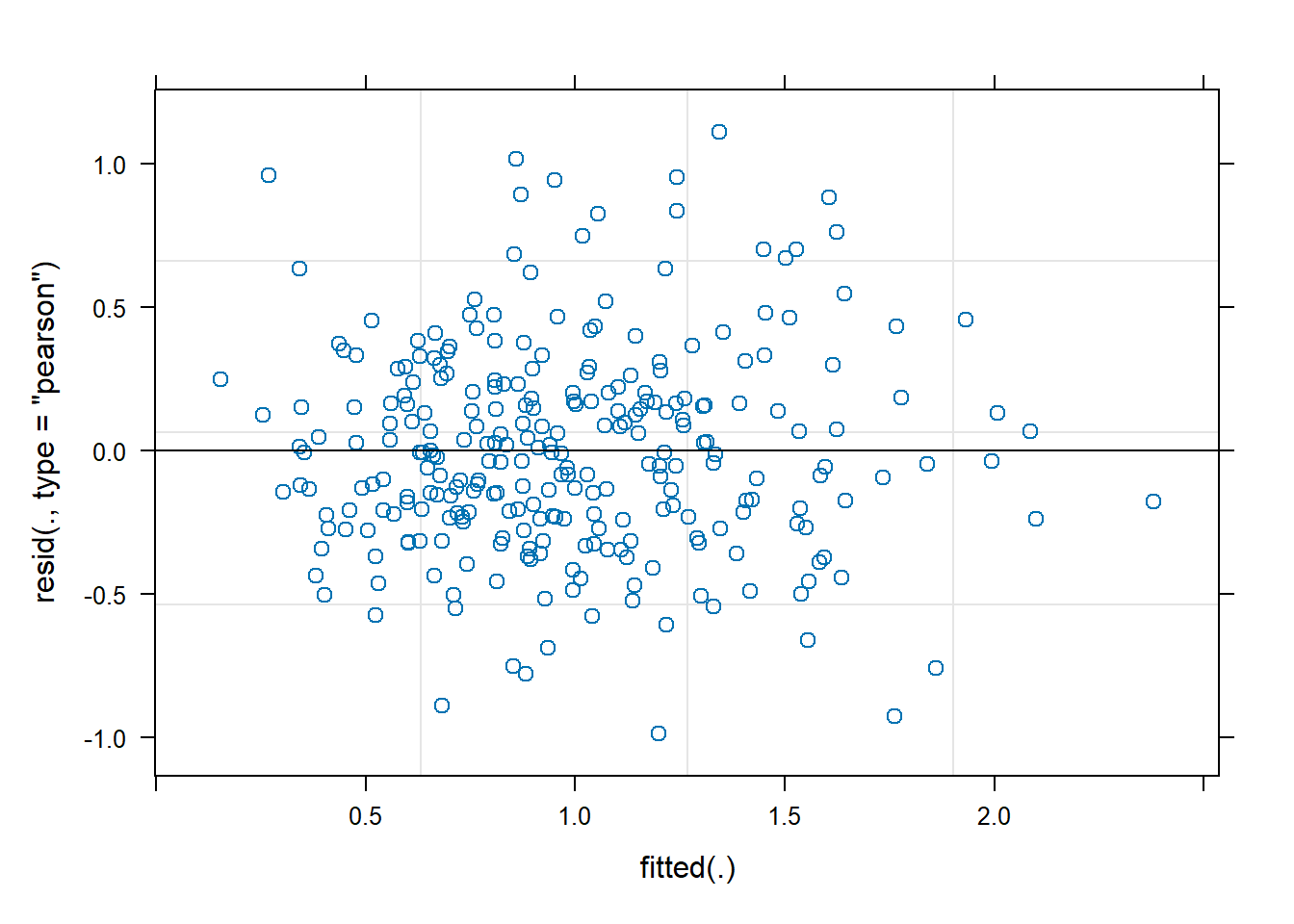
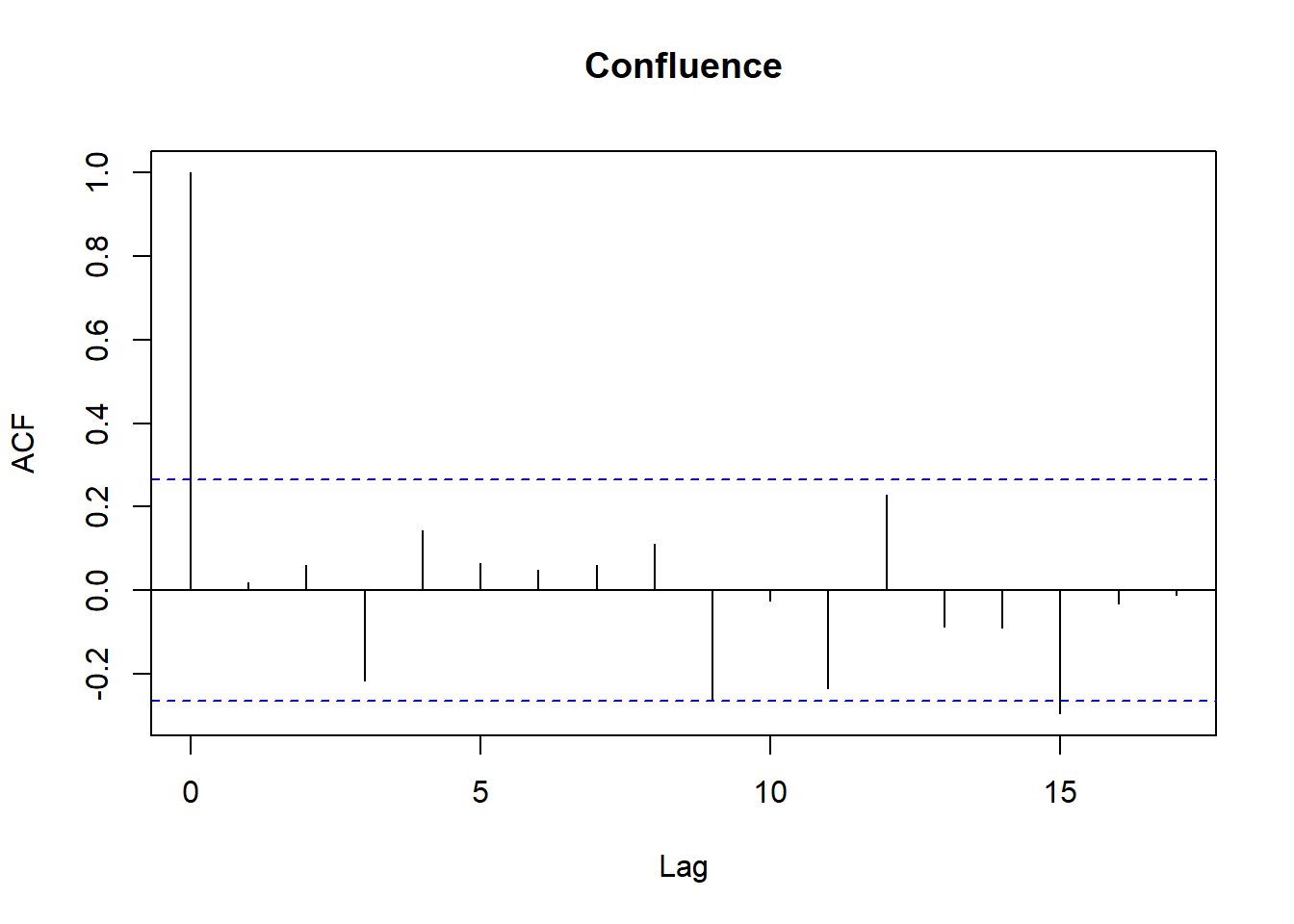
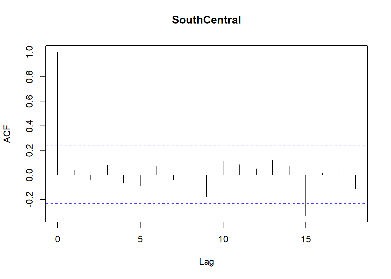
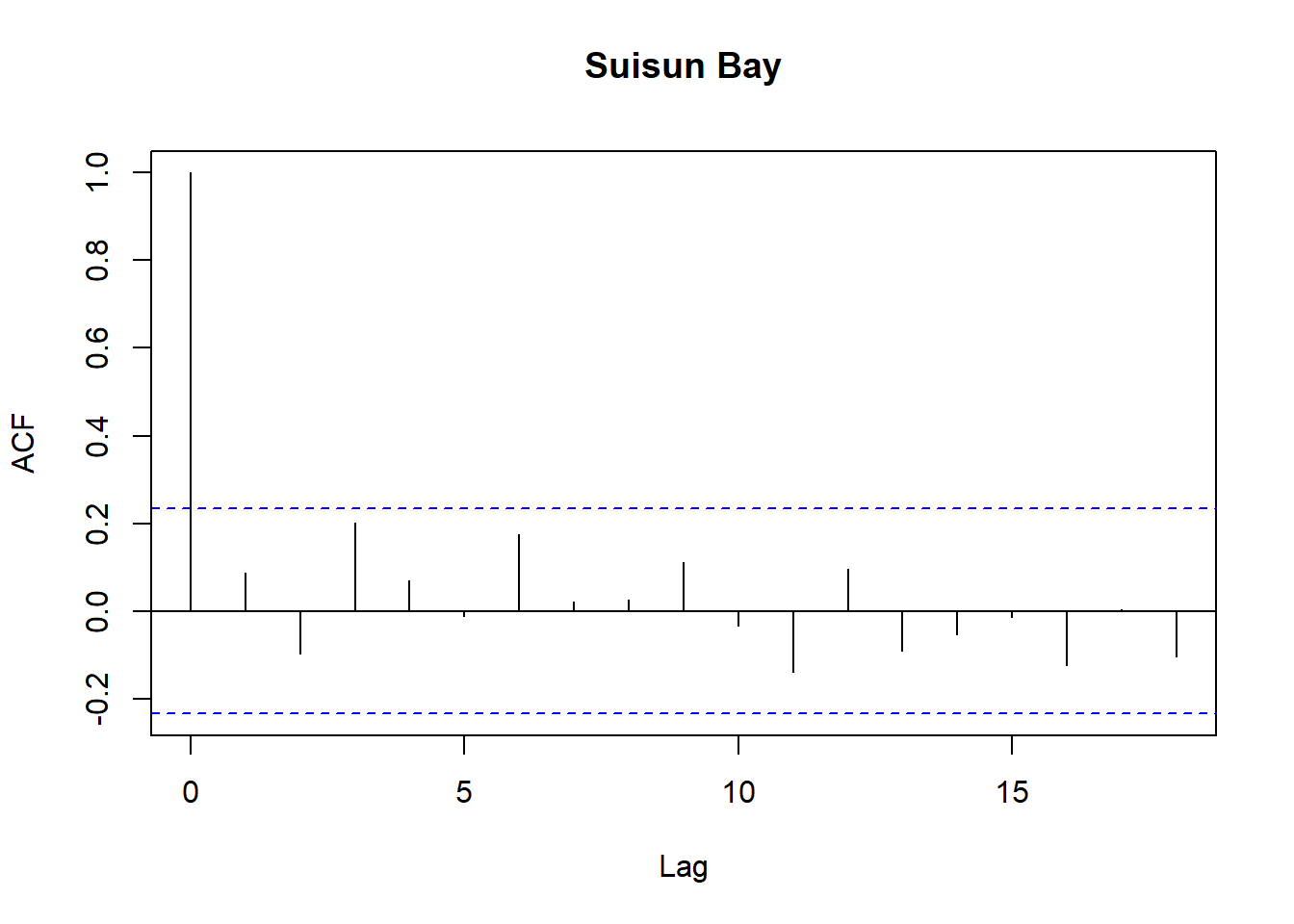
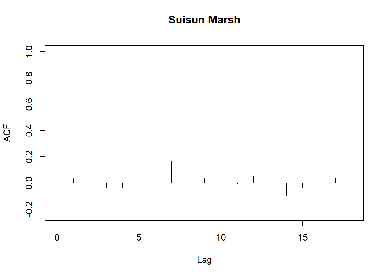
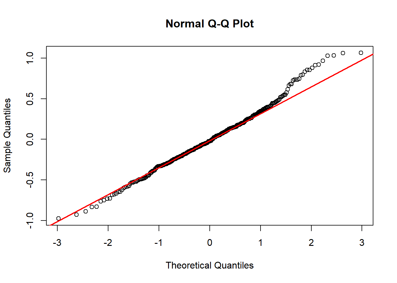
Model diagnostics look pretty good; a few minor lag spikes, and there's some right-tail skew, but neither are particularly noteworthy. A few acf graphs do show some seasonality but it's not significant.
### Full model
Now we run the full model:
```{r}
fit_chl <- lmer(
  log_Chlorophyll ~
    log_Salinity +
    log_DissAmmonia +
    log_DissOrthophos +
    log_Turbidity +
    lag_logChlorophyll +
    Temp1 +
    Temp2 +
    Temp3 +
    (1|Region),
  data = df_monthly_subset,
  na.action = na.omit
)

summary(fit_chl)
```
The coefficients are similar, which is expected.
Model diagnostics:
```{r}
varcomp <- as.data.frame(VarCorr(fit_chl))
var_re  <- varcomp$vcov[varcomp$grp == 'Region']
var_res <- varcomp$vcov[varcomp$grp == 'Residual']

ICC <- var_re/(var_re + var_res)

print(ICC)
```
```{r}
plot(fit_chl)
```
```{r}
res <- residuals(fit_chl)

df_res <- df_monthly_subset
df_res$resid <- res

regions <- unique(df_res$Region)
n <- length(regions)

for (r in regions) {
  tmp <- df_res$resid[df_res$Region == r]
  acf(tmp,
      main = paste(r),
      na.action = na.pass)
}
```
```{r}
infl <- check_outliers(fit_chl)
infl
```
```{r}
vif(fit_chl)
```
```{r}
mf <- model.frame(fit_chl)
row_map <- as.numeric(rownames(mf))
res <- residuals(fit_chl)

df_resrow <- tibble(
  row = row_map,
  resid = res,
  fitted = fitted(fit_chl)
)

df_res <- df_monthly_subset %>%
  mutate(row = row_number()) %>%
  left_join(df_resrow, by = 'row')
```
```{r}
res <- residuals(fit_chl)

qqnorm(res)
qqline(res, col = 'red', lwd = 2)
```
Looks similar to the test model, so we're good.
## LMM - DissAmmonia
Since SEMs ideally have at least two "sub models", I'll throw together a quick model for DissolvedAmmonia. I didn't bother with intense model diagnostics here, but they should definitely be done for real models.
```{r}
df_plt_log <- df_monthly_log %>%
  mutate(lag_logDissAmmonia = lag(log(DissAmmonia))) %>%
  pivot_longer(
    cols = c(log_DissNitrateNitrite:log_Total_Inflow, lag_logChlorophyll, lag_logDissAmmonia),
    names_to = 'Analyte',
    values_to = 'Value'
  )
```
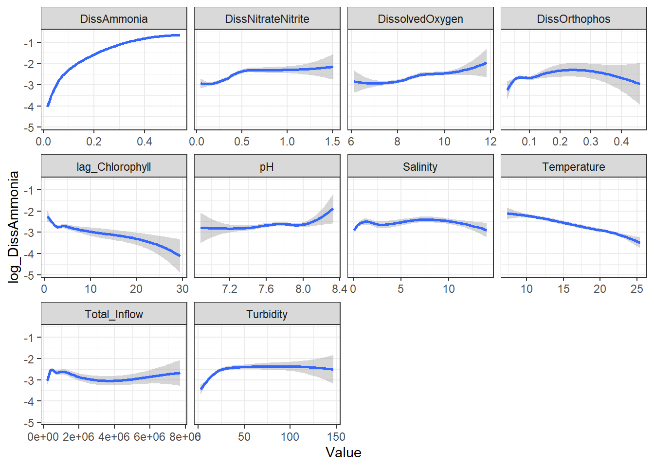
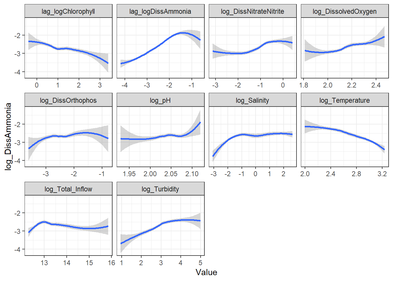
```{r}
ggplot(df_plt) +
  geom_smooth(aes(Value, log_DissAmmonia)) +
  facet_wrap(~Analyte, scales = 'free_x') +
  theme_bw()
```
```{r}
ggplot(df_plt_log) +
  geom_smooth(aes(Value, log_DissAmmonia)) +
  facet_wrap(~Analyte, scales = 'free_x') +
  theme_bw()
```
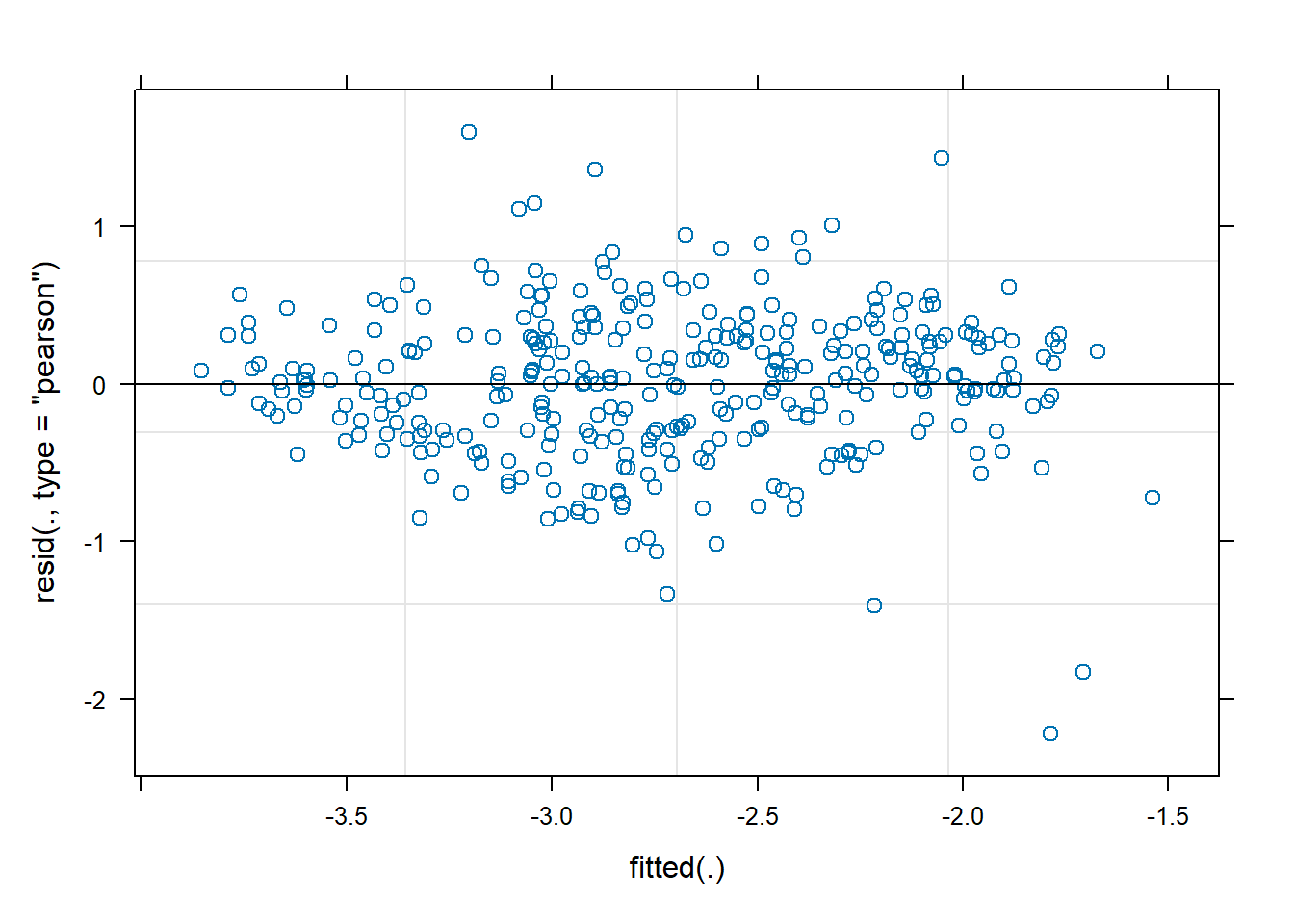
```{r}
fit_amm <- lmer(
  log_DissAmmonia ~
    lag_logDissAmmonia +
    Temp1 +
    log_Turbidity +
    (1|Region),
  data = df_monthly_subset,
  na.action = na.omit
)

summary(fit_amm)
plot(fit_amm)
```
# SEMs
## Linear Mixed Effects Model
### Piecewise
Now we can fit our models into an SEM. Since they're both LMMs, we have to use piecewiseSEM.
```{r}
fit_chl <- lmer(
  log_Chlorophyll ~
    log_Salinity +
    log_DissAmmonia +
    log_DissOrthophos +
    log_Turbidity +
    lag_logChlorophyll +
    Temp1 +
    Temp2 +
    Temp3 +
    (1|Region),
  data = df_monthly_subset)

fit_amm <- lmer(
  log_DissAmmonia ~
    lag_logDissAmmonia +
    Temp1 +
    log_Turbidity +
    (1|Region),
  data = df_monthly_subset)


psem_out <- psem(fit_chl, fit_amm, data = df_monthly_subset)
summary(psem_out, standardize = 'scale')
```
There seems to be a bug, since it says it can't test things that show up in the subsequent dataframes. Nevertheless, we note:
- AIC: this is only meaningful compared to other models (with the same RE structure)
- (relatively) smaller the better
- Chi-squared (Goodness of Fit): not significant, which means our model fits the observed data well
- Fisher's C: significant, there's some missing paths in our causal structure
- we can look at the independence claims (first df) to see which (eg. log_DissAmmonia and log_Salinity)
- the second dataframe gives the coefficients (standardized)
- the third dataframe gives the $R^2$ values
- marginal are without the random effects while the conditional ones are
Also note that the coefficients can be interpreted (1 SD change in x corresponds to $\beta$ SD change in y, conditional on other variables) *except* for the three Temperature ones. Together, they define a nonlinear chl–temperature curve, which is not constant (but can be graphed).
## Linear Fixed Effects Model
### Piecewise
For comparison, we can run the same model without the random effect; this makes it comparable to traditional SEM.
```{r}
fit_chl <- lm(
  log_Chlorophyll ~
    log_Salinity +
    log_DissAmmonia +
    log_DissOrthophos +
    log_Turbidity +
    lag_logChlorophyll +
    Temp1 +
    Temp2 +
    Temp3,
  data = df_monthly_subset)

fit_amm <- lm(
  log_DissAmmonia ~
    lag_logDissAmmonia +
    Temp1 +
    log_DissOrthophos +
    log_Turbidity,
    data = df_monthly_subset)

psem_out <- psem(fit_chl, fit_amm, data = df_monthly_subset)
summary(psem_out, standardize = 'scale')
```
### Traditional
```{r}
model <- '
    log_Chlorophyll ~ log_Salinity +
    log_DissAmmonia +
    log_DissOrthophos +
    log_Turbidity +
    lag_logChlorophyll +
    Temp1 +
    Temp2 +
    Temp3

    log_DissAmmonia ~ lag_logDissAmmonia +
    Temp1 +
    log_DissOrthophos +
    log_Turbidity
'

fit <- sem(model, data = df_monthly_subset)

summary(fit, fit.measures = TRUE, standardized = TRUE)
modindices(fit, sort = TRUE)
```
We note that the coefficients are very similar; the main difference is in interpretation. Here, the high RMSEA, especially, points to missing structural paths (as does the somewhat low TLI). By looking at the modification indices, we see that (similar to the d-separation tests from psem) a log_DissAmmonia \~ log_Salinity link is likely missing.
Note that traditional SEM can also evaluate residual covariance *between response variables*, while psem cannot (the log_Chlorophyll \~\~ log_DissAmmonia row in the MI table).
Also note that, if we include latent variables, we *must* use traditional SEM. See the `stats examples` SEM file for that code.
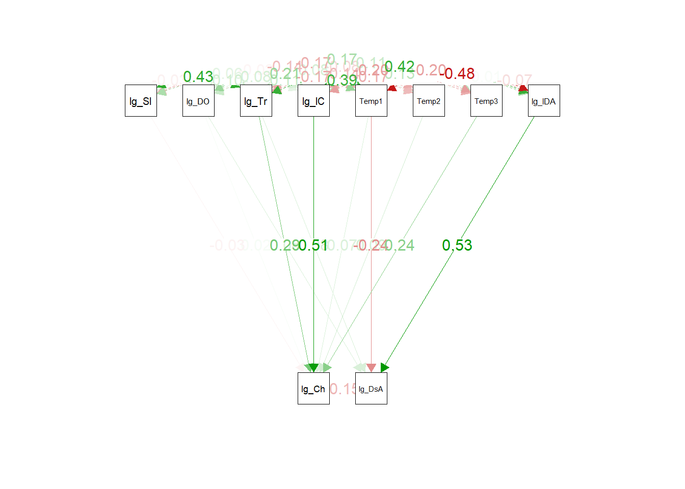
#### Traditional: Plot
We can also plot traditional SEMs, just for fun:
```{r}
semPaths(
  fit,
  what = 'std',
  whatLabels = 'std',
  layout = 'tree2',
  nCharNodes = 5,
  edge.label.cex = 1.1,
  sizeMan = 5,
  edge.width = 1,
  esize = 1,
  residuals = FALSE,
  mar = c(7, 7, 7, 7)
)
```
## General Additive Model (GAM)
Piecewise SEMs can also handle GAMs, which are another type of linear model. The advantage is how they handle non-linear relationships.
In the previous models, we identified the relationship between Chlorophyll and Temperature as non-linear, so we added polynomial basis functions to our formulas. GAMs essentially do the exact same thing but use splines instead, which are more sophisticated.
(I won't go into model diagnostics for GAMs here.)
#### LMM-like GAM
We can essentially re-create the LMM model by switching out the Temperature terms for a smooth function and keeping the others as linear predictors:
```{r}
# default basis spline = thin plate
gam_chl <- gam(
  log_Chlorophyll ~
    log_Salinity +
    log_DissAmmonia +
    log_DissOrthophos +
    log_Turbidity +
    lag_logChlorophyll +
    s(Temperature, k = 6) +
    s(Region, bs = 're'), # random effect (ridge penalty)
  data = df_monthly_subset,
  method = 'REML'
)

gam_amm <- gam(
  log_DissAmmonia ~
    lag_logDissAmmonia +
    log_Turbidity +
    s(Temperature, k = 6) +
    s(Region, bs = 're'),
  data = df_monthly_subset,
  method = 'REML'
)

psem_gam <- psem(gam_chl, gam_amm, data = df_monthly_subset)
summary(psem_gam, standardize = 'scale')
```
Our results are very similar, which makes sense:
- $R^2$ values are almost the same (though the GAM is slightly better)
- linear coefficient and p-values are almost the same
However, the big difference is that Temperature is now included as a smooth function instead of multiple polynomial terms. This changes the shape of its partial effect curve:
```{r}
df_temp_plt <- df_monthly_subset %>%
mutate(
poly_temp = poly(Temperature, 3)
)
fit_chl <- lmer(
log_Chlorophyll ~
log_Salinity +
log_DissAmmonia +
log_DissOrthophos +
log_Turbidity +
lag_logChlorophyll +
Temp1 +
Temp2 +
Temp3 +
(1|Region),
data = df_temp_plt
)
poly_obj <- attr(df_temp_plt$poly_temp, 'coefs')
temp_seq <- seq(
min(df_monthly_subset$Temperature, na.rm = TRUE),
max(df_monthly_subset$Temperature, na.rm = TRUE),
length.out = 300
)
new_poly <- poly(temp_seq, degree = 3, coefs = poly_obj)
new_dat <- data.frame(
log_Salinity = mean(df_monthly_subset$log_Salinity, na.rm = TRUE),
log_DissAmmonia = mean(df_monthly_subset$log_DissAmmonia, na.rm = TRUE),
log_DissOrthophos = mean(df_monthly_subset$log_DissOrthophos, na.rm = TRUE),
log_Turbidity = mean(df_monthly_subset$log_Turbidity, na.rm = TRUE),
lag_logChlorophyll = mean(df_monthly_subset$lag_logChlorophyll, na.rm = TRUE),
Temp1 = new_poly[,1],
Temp2 = new_poly[,2],
Temp3 = new_poly[,3]
)
new_dat$partial <- predict(fit_chl, newdata = new_dat, re.form = NA)
new_dat$partial_centered <- new_dat$partial - mean(new_dat$partial)
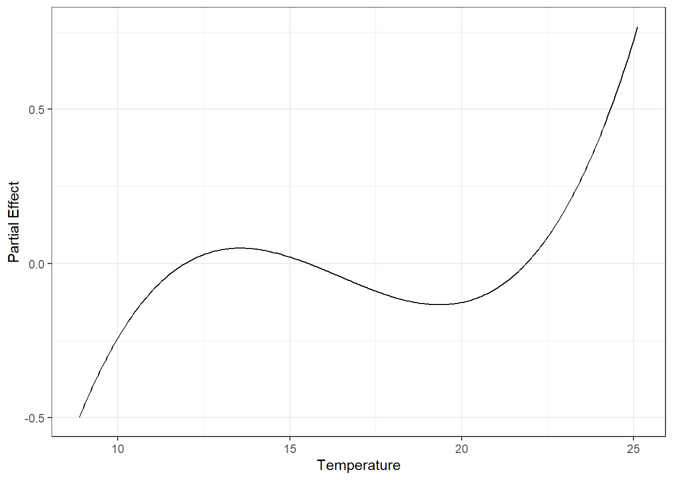
ggplot(new_dat, aes(x = temp_seq, y = partial_centered)) +
geom_line() +
labs(
x = 'Temperature',
y = 'Partial Effect',
)
```
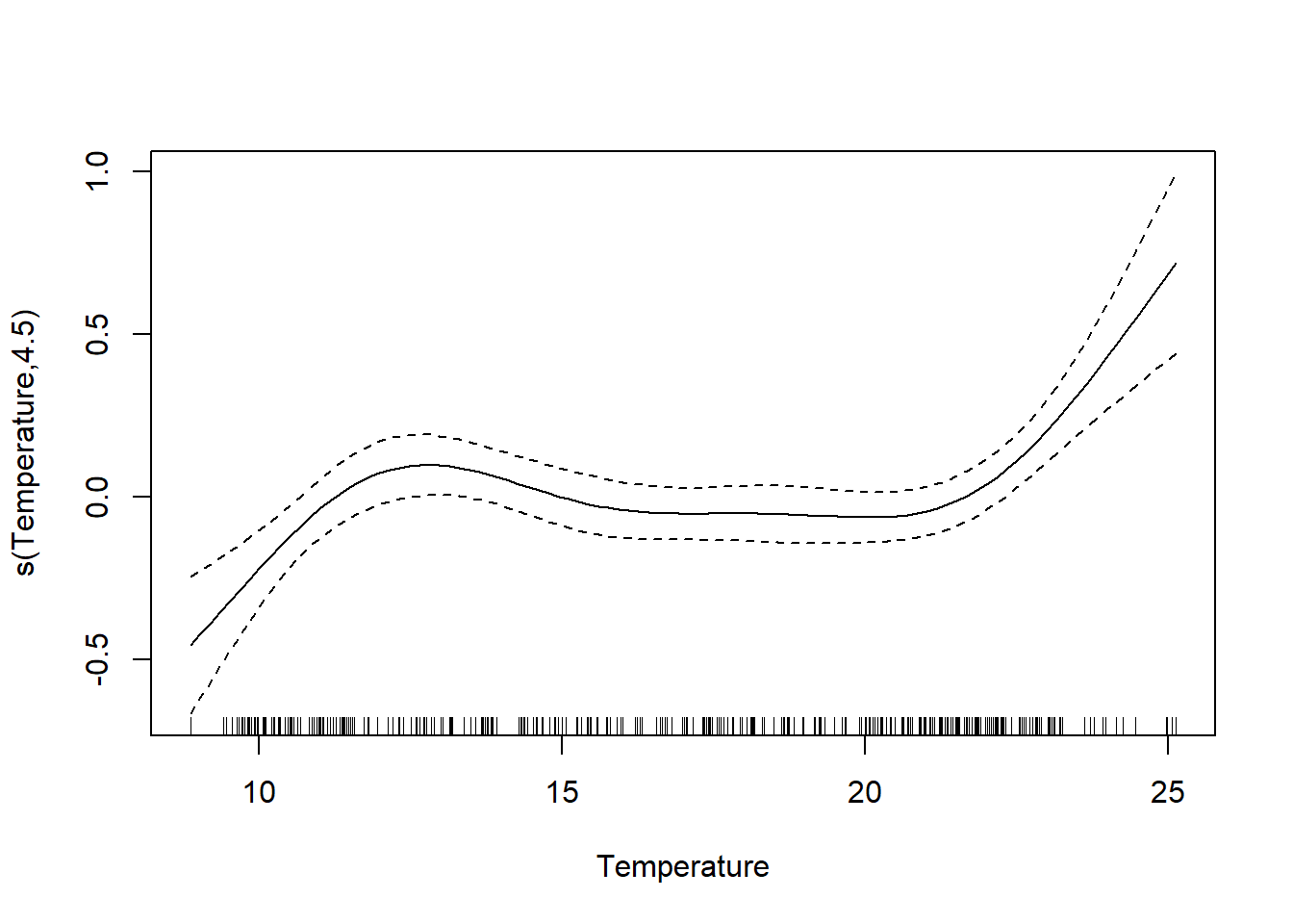
```{r}
plot(gam_chl, select = 1)
```
They're similar, but the GAM function is more flexible (it also more closely fits our original log_Chlorophyll \~ Temperature plot; this makes sense if Temperature is an influential predictor). We also note that our chi-square goodness of fit test is now significant, meaning this model (with a more correctly modeled Temperature) is a poorer fit, possibly due to missing variables.
This all being said, for practical purposes, the LMM gives us a similar overall picture to the GAM; both are valid *if you correctly specify the model structure.*
### All Smooths
You could also make all variables smooth terms if you suspect other relationships may be non-linear (though for truly linear relationships it's better not to).
```{r}
gam_chl <- gam(
  log_Chlorophyll ~
    s(log_Salinity, k = 6) +
    s(log_DissAmmonia, k = 6) +
    s(log_DissOrthophos, k = 6) +
    s(log_Turbidity, k = 6) +
    s(lag_logChlorophyll, k = 6) +
    s(Temperature, k = 6) +
    s(Region, bs = 're'),
  data = df_monthly_subset,
  method = 'REML'
)

gam_amm <- gam(
  log_DissAmmonia ~
    s(lag_logDissAmmonia, k = 6) +
    s(log_Turbidity, k = 6) +
    s(Temperature, k = 6) +
    s(Region, bs = 're'),
  data = df_monthly_subset,
  method = 'REML'
)

psem_gam <- psem(gam_chl, gam_amm, data = df_monthly_subset)
summary(psem_gam, standardize = 'scale')
```
Our $R^2$ improved, though our interpretations of significance didn't change much, which makes sense. The biggest advantage is that, by examining the individual GAMs, we can visualize/interpret any underlying non-linear relationships in a way that LMMs can't.